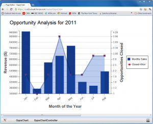
 A couple of weeks ago Dave Carroll and myself hosted a webinar highlighting some of the new Platform features in the Winter ’12 release. One of the new features that I demoed during that webinar was Visualforce Charting – a new Pilot feature in Winter ’12 that allows you to develop custom and complex charts using standard Visualforce components/tags.
I demoed two Visualforce pages during the webinar – a very simple Pie Chart and a more complex Bar and Line Chart, all rendered using standard VF Charting components. Lets look at the more complex page in greater detail (see screenshot on the left). The page plots two data series on the same VF Chart – a Bar series that shows the total booked $ revenue (i.e. total amount of all Closed Won Opportunities) for each month of the year, and a Line series that plots the number of Closed Won Opportunities in that month (i.e. how many Opportunities did it take to book the monthly revenue). Here is the VF markup for the page.
And here is the Apex controller for the page.
Lets break down this code into digestible chunks.
1) New VF Charting components/tags: In Winter ’12, a couple of new components/tags have been added to the VF library to support various chart types. The parent/high-level component that is required in any page that displays a VF Chat is <apex:chart> (line 3). That component has a couple of attributes to control how the charts displays, but the most important attribute is ‘data’. As expected, that attribute lets you bind data that will be plotted on the chart (more on this later). The <apex:chart> component can have one or more child components that correspond to various chart types. The three types of charts currently supported by Visualforce are Pie charts (<apex:pieSeries>), Bar charts (<apex:barSeries>) and Line charts (<apex:lineSeries>). As shown in the example above, you can even plot multiple Bar and Line series on the same chart. Each Bar and Line series also needs 2 axis defined using the <apex:axis> component. You can define the position and type (‘Numeric’ or ‘Category’) for the axis using the respective attributes. Note that you can have 2 different data series share an axis. For example, the Bar and Line series defined above share the same X axis (the month of the year).
2) Binding data to a VF chart: VF Charting supports a couple of different ways to bind data to a Chart. You can bind the ‘data’ attribute of the <apex:chart> component to a method on the controller/extension that returns a List of SObjects or a List of any Apex objects. If your method returns a list of SObjects, you can then simply use the SObject fields to plot data on the chart. Alternatively, you can return a list of any Apex object. In the example above, I could have just returned the List<AggregateResult> that is returned by my aggregate SOQL query. The issue there is that the SOQL CALENDAR_MONTH function returns a numeric value (1-12) and so my Chart would have shown numbers instead of text on the X axis. Instead, I choose to convert the month value to a string and populate a simple wrapper class (OpportunityData) with the appropriate data.
In addition to binding the ‘data’ attribute of the <apex:chart> component to a controller method, you also need to specify which SObject/Object field/property should be used to extract the X and Y values for a Bar or Line series. You do so via the ‘fields’ attribute of the <apex:axis> component and the ‘xField’ and ‘yField’ attributes of the <apex:barSeries>/<apex:lineSeries> components.
Finally, for a more advanced use case, you can also bind a Chart to a JavaScript function or JavaScript Array that you define in your VF page. Binding to a JS function for example would allow you to get data from Salesforce using JavaScript remoting and then mash/manipulate that data in JS before rendering in on the VF chart. Check the Visualforce Developers Guide for more details about this option.
3) The extras: VF Charting also has a couple of other components like <apex:chartTips> and <apex:chartLabel> that let you fine tune what gets displayed on the Chart. For example, notice how I use the <apex:chartLabel> component on line 9 to rotate the month text on the X-axis. Again, check the Visualforce Developers Guide for more details on what you can do with these components.
Hopefully this simple sample gives you a taste of what’s possible with the new VF Charting feature. With just a couple of lines of code you can produce complex charts that may not be otherwise possible using our standard Reporting and Analytics engine. And the best part is that you can always create a Dashboard that uses your custom VF page as its source to display these custom charts to end users. Since the Charts themselves are rendered using JavaScript (no Flash or external plugin required), you can even display a custom chart on any mobile device that supports Visualforce pages.
Before you get started, remember that VF Charting is still a Pilot feature in Winter ’12. You’ll therefore have to contact Salesforce support in order to have it enabled in your DE or Sandbox Org. Now go forth and Chart!