Configure a Component for Experience Builder
Make a custom Lightning web component available in Experience Builder, where users can add it to the page. After you configure the component, it’s then available to all Experience Builder sites in your org.
A component’s project folder must include a configuration file—componentName.js-meta.xml file—that defines the metadata values for the component. To use a component in Experience Builder, edit the file to define the component’s design configuration values.
- To make your component usable in Experience Builder, set
isExposedtotrue. Then, intargets, add one of these values as atarget:lightningCommunity__Pageto create a drag-and-drop component that appears in the Components panellightningCommunity__Page_Layoutto create a page layout component for LWR sites that appears in the Content Layout windowlightningCommunity__Theme_Layoutto create a theme layout component for LWR sites that appears in Settings in the Theme area
- To include properties that are editable when the component is selected in Experience Builder, define
lightningCommunity__Defaultintargetsand define the properties intargetConfigs. Only properties defined for thelightningCommunity__PageorlightningCommunity__Page_Layouttargets are editable in Experience Builder. - For enhanced LWR Experience Cloud sites, make your component’s integer or string property screen-size responsive. Declare both the
screenResponsiveattribute with a value oftrue, and theexposedToattribute with a value ofcss. You then must define media queries by using CSS variables for each screen size, and specify the property values for each view mode using Experience Builder. For more information, see Make a Custom LWR Component Screen-Size Responsive.
See the complete list of XML Configuration File Elements.
Here’s the sample code for a simple drag-and-drop Hello World component that includes editable properties.
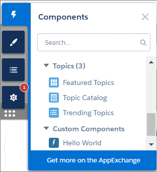
To define a custom icon for a drag-and-drop component, add an SVG resource to your component’s folder. If you don’t include an SVG resource, the system uses a default icon ( ) in the Components panel.
An SVG resource must be named componentName.svg. You can only have one SVG per folder.
Here’s a simple red circle SVG resource to go with the “Hello World” component.
For new sites, Strict CSP is set as the default security level in Experience Builder. If your Lightning web component references third-party resources, you must configure the security level in Experience Builder and allowlist hosts as appropriate.
Lightning web components in a managed package that aren’t configured with the lightningCommunity__RelaxedCSP tag are disabled in the Components panel in Experience Builder for any site with Lightning Locker disabled. For more information, see XML Configuration File Elements.
See Also
- XML Configuration File Elements
- Get Information About the Current Experience Builder Site
- Component SVG Icon
- Salesforce Help: Experience Builder Overview
- Salesforce Help: CSP and Lightning Locker in Experience Builder Sites
- Experience Cloud Developer Guide
- LWR Sites for Experience Cloud