The Winter ’18 release is here, bringing lots of features to delight developers (and users of the apps we build). We shared some of the cool stuff in this release during our Winter ’18 webinar, and in a post about the new style added to Lightning. It’s probably obvious by now that this release brings some major changes for Salesforce developers. We’ve pulled together a few more highlights for you here.
Make Users Productive in More Languages
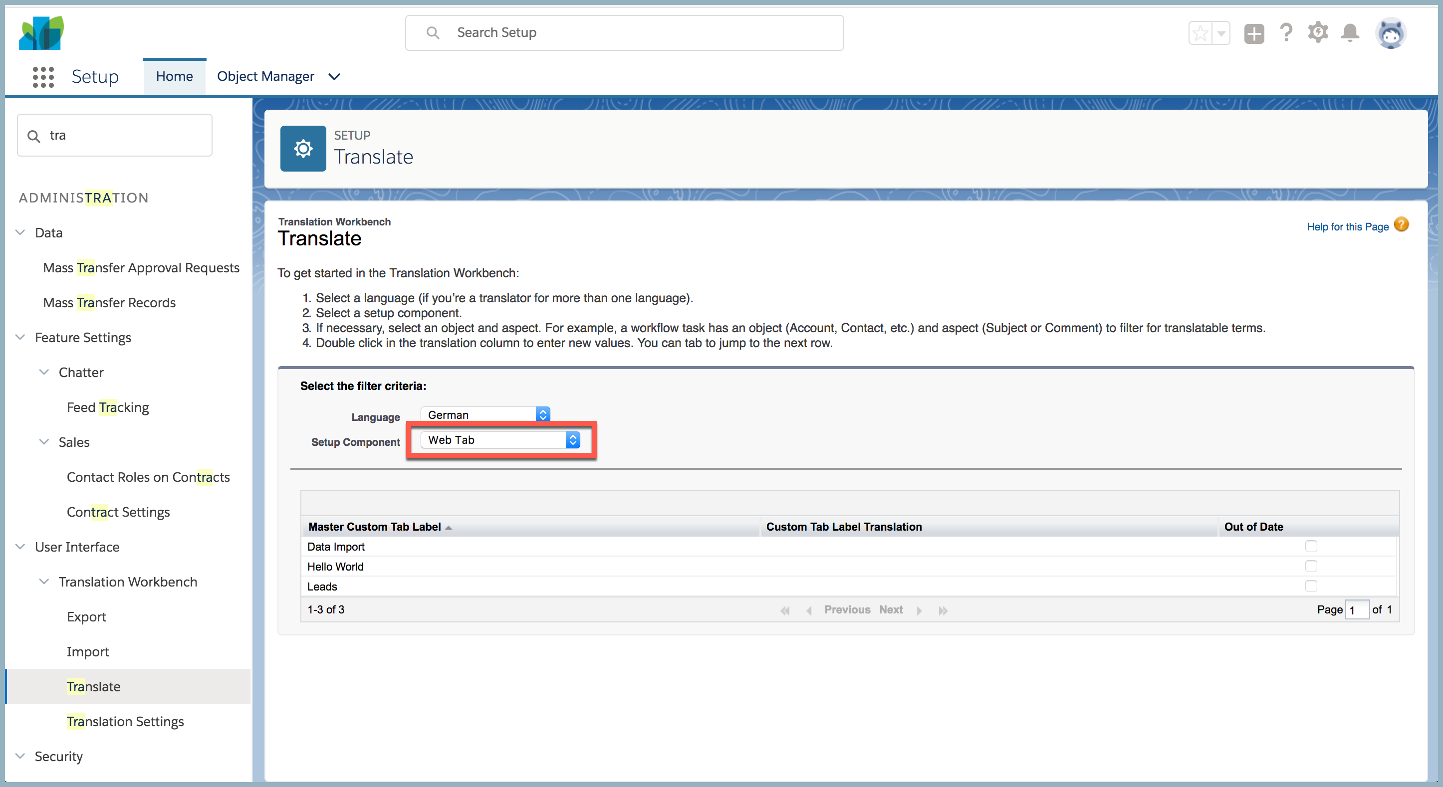
Winter ’18 brings a new look and feel to Lightning, and you can go through those changes in-depth in the post mentioned above. In addition to potentially changing to look of your org with these theme changes, developers can also help users working in different languages feel more at home in Lightning. If you’ve built custom Lightning Component tabs (using the force:appHostable interface), you can now use Translation Workbench to translate them.
To find your Lightning Component tabs, you’ll need to navigate to the ‘Web Tab’ option in Translation Workbench:
Also new in Winter, you can manage translations for visual flows from Translation Workbench, too. Flow name, version name, and elements in flow screens (fields, help/error text, choices) are all available. You’ll see a new option for Flow in Translation Workbench. You can read more about this feature in the Winter ’18 release notes here and here.
Custom Lightning components used as Quick Actions are supported in Translation Workbench under ‘Actions,’ along with all other Global or Quick Actions in your org.
Catch Common JavaScript Errors Sooner
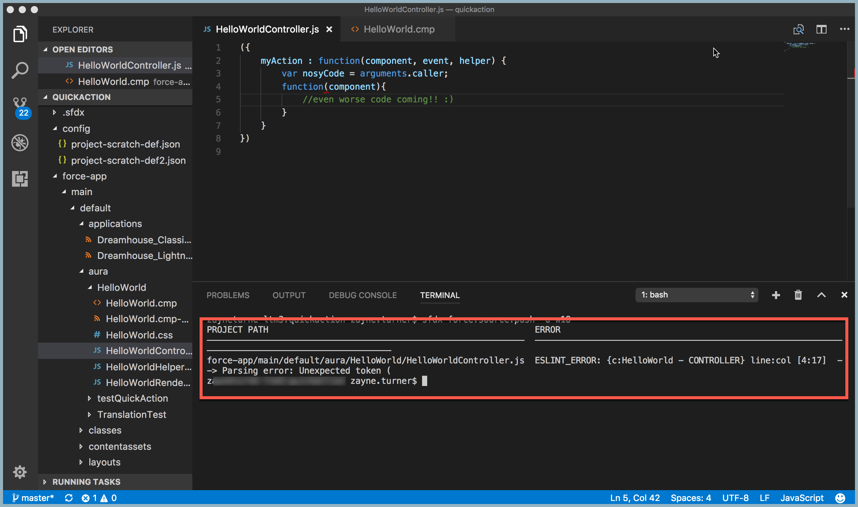
One of the biggest changes for Lightning developers in API 41.0 is the introduction of a validation service for Lightning JavaScript markup. This means that controller.js and helper.js files in AuraDefinitionBundles built on API 41.0 will show validation errors and fail to save until errors are resolved. In earlier API versions, Lightning controller and helper JavaScript aren’t subject to a validation check and will save without throwing errors.
If you or your team explore Salesforce DX, keep in mind that the linting capabilities built into the Salesforce DX CLI (with force:lightning:lint) and the new validation service for Lightning JavaScript are different. They are both based on ESLint, but they enforce or check for different rules. This is largely because they are doing different things: the validation service enforces certain code quality (and security) standards by not allowing ‘dirty’ markup to save, while SFDX’s linting service will flag a variety of code quality issues but it won’t impact the ability to save.
You’ll see errors in the Developer Console as a modal/pop-up (just like Apex validation errors). If you’re using an IDE, you’ll see errors listed with other save/deploy results. This is an example from VS Code, using the Salesforce DX CLI:
Create Lighting Page Layouts from Scratch
To build applications in Lightning, you choose to work with one of three types of Lightning Pages, provided by the platform. Within those three basic types, you can then choose from a variety of page layouts also provided by the platform. Developers haven’t been able to create a completely custom layout for Lightning Pages. However—drum roll, please—this changes with Winter ’18!
Three new interfaces, available with API 41.0, allow you to define a Lighting Component as a Lightning Page template. The three interfaces align with current Lightning Page types, and you can only use one interface per component. Learn more in the release notes.
However, just using one of the new interfaces in your component markup doesn’t automatically make your template available for use in Lighting App Builder. There are also new tags available for design resource files, and aligning those tags with your component markup is what makes your custom page template ready to use.
Let’s look at simple example. Here’s a component that we’d like to use as a template for Record Home pages:
Code Highlights:
We’re setting the component as a template for Lighting Record Home Pages with the lightning:recordHomeTemplate interface. The attributes for this component have a data type of component array Aura.Component[]. We’re then binding the values of the layout sections in our component markup to these attributes. This is what will (eventually) allow the drag-and-drop of custom and standard components onto your page from Lightning App Builder.
But first, we need to finish our template with the correct markup in our design resource file:
Code Highlights:
The flexipage:region tag in the design file is what connects the shape we’ve created in our component markup with Lightning App Builder. Notice that we match the ‘name’ attributes of the region tags with our component attributes. The flexipage:formfactor tag (which is optional) helps provide sizing information for regions of your template when displayed on different devices. You can find more information on form factor values and these tags in the Winter 18 version of the Lightning Components Developer Guide.
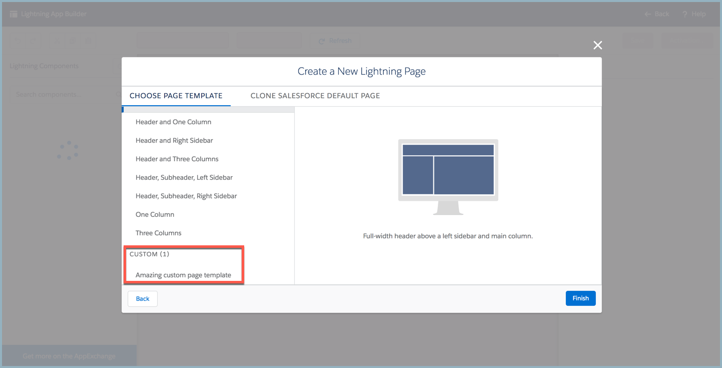
Now that we’ve added these tags and saved our changes, our new custom template is ready to roll. When we navigate to Lightning App Builder > New > Record Page, we can now choose to use our custom layout:
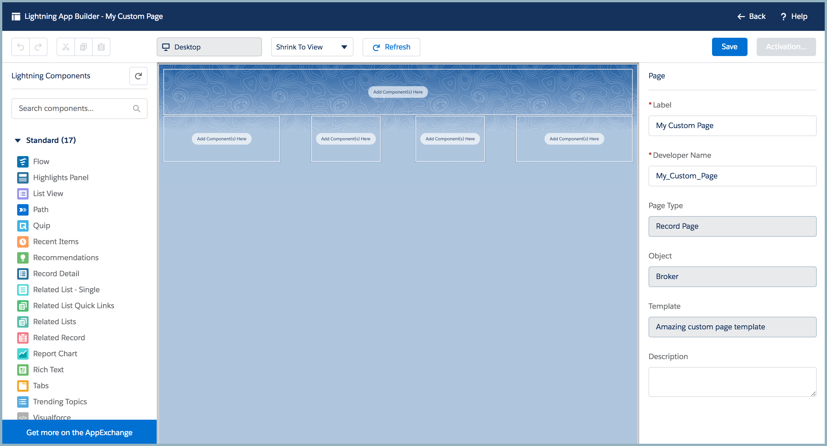
And this is what our custom page will look like in the Lightning App Builder canvas:
We can also add things like a custom background image and spice things up even more. We’ve uploaded an image file called ‘lake’ as a static resource. If we modify the css of our component like so:
Our template now looks like this:
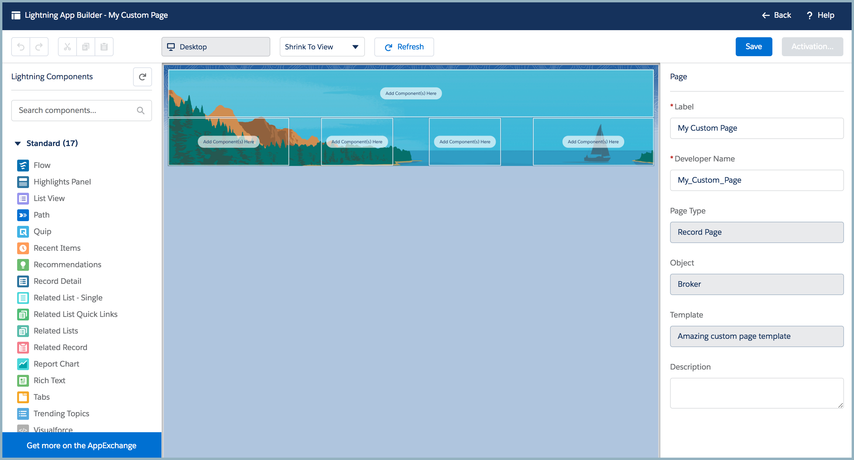
Note that custom page templates appear on the canvas in the Lightning App Builder a bit differently than standard Lighting Pages. See how our example page template doesn’t fill the canvas completely? Standard Lighting Pages have a longer vertical span than custom pages—but this is just an effect you’ll notice in Lightning App Builder.
The Winter ’18 release is packed with new features and resources for developers. Go forth and build!
Resources:
- Lightning Components Developer Guide (Create a Template Component for App Builder)
- Winter 18 Release Notes (Translate Flows)
- Winter 18 Release Notes (Translate Lightning Tabs)
- Winter 18 Release Notes (Lighting Page Templates)
- Winter 18 Release Notes (Component Validation)
- Winter ’18 Developer Preview