Have you ever wished for a new layout for your home page? How about more control over the columns on your record page? With the custom Lightning page template feature and a little bit of code, you can go way beyond the out of the box templates. This blog post is going to help you get started with your own templates and then we will dive into some cool things you can do!
What is a Lightning page template anyway?
Lightning page templates are components that define a page’s regions and can be used for Home, Record or App pages. Both standard and custom templates appear in the App Builder’s New Page Wizard and can be used to create new pages for an app. They are pretty easy to create, so let’s dive in!
Getting started
There are a few things you need to be aware of when building a new Lightning page template. The most important thing is to decide where you want your template to be used. You must specify if you want it available on an App, Home or Record page. You have to pick only one, since you can’t use more than one interface.
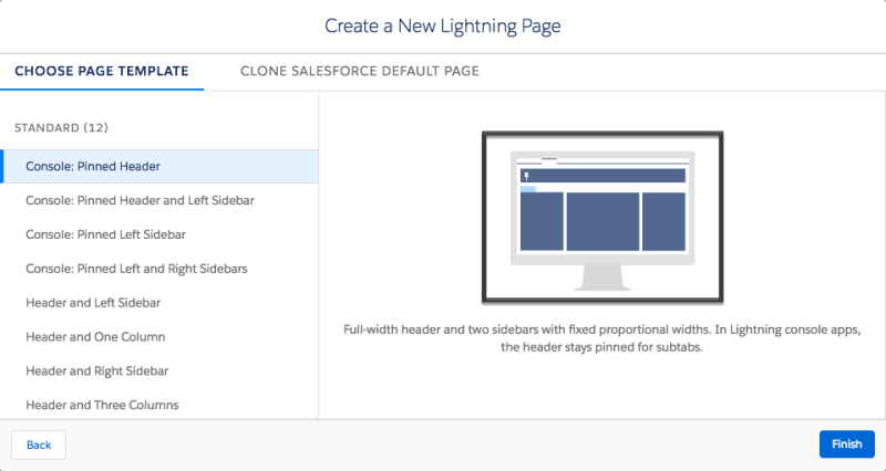
The next thing to be aware of the .svg file, which is an image type. This file works differently for Lightning page templates than Lightning components. For a component, an .svg would show up in the left-hand bar of the Lightning App Builder. For a Lightning page template, it shows up on the screen where you select which template you want to use. No matter what you do, your custom templates will appear in the new page wizard, but if you leave the .svg alone, it will be hard to distinguish your templates from each other. You can add an .svg file to provide App Builder users with an image preview of the template.

The black box here identifies where the .svg will appear.
Exactly what your users asked for: A Home Page with three regions
We’ve just received a request for an amazing custom Lightning page template in our org. Our first step is to dream about what kind of page we would like. Let’s imagine that your users have requested a Home page with three columns. It’s a pretty standard ask with a simple look and feel, but you draw it up anyway, just to be sure.
Next, we are going to create a brand new Lightning component. So we can remember, we’ve called it ThreeRegionHome (so creative, right?). We’ve got to make sure we implement the right interface for a Home page and we add a description, because we are great developers. Since we know we only need three regions and they are going to be columns, we create some attributes for those. So far our component looks like this:
ThreeRegionHome.cmp
It is pretty simple but it doesn’t do anything yet — it won’t even show up in the Lightning App Builder! Oh no! Thankfully the fix is pretty easy — we just have to write our design file. The label in our design file is the label that will show up in the Lightning App Builder, so we make sure it is something you and your admins will understand.
ThreeRegionHome.design
Now our page shows up in Lightning App Builder, but we don’t see any place to add components to our columns. This is because all we’ve done so far is say there will be attributes, but we haven’t told the page what it should look like. This is when we start leveraging lightning:layout and lightning:layoutItem.
ThreeRegionHome.cmp
We can keep working on this page by doing a few other custom things, the most important of which is creating the .svg file. You can create an .svg for your page with tools like Photoshop, Sketch or any other design creation tool. Once we’ve created that .svg file and added it as ThreeRegionHome.svg we have completed the template.
Now you can use it in action! In Lightning App Builder we can create a new home page (or edit an old home page) and have it leverage our fancy new template.
Making a Record page with collapsing regions
Our users have fallen in love with the new home page and already have brilliant ideas about other kinds of record pages that they would love.
Picture this scenario: You set up a whiteboarding session and everyone agreed on a brand new design. It’s a simple page, but it will allow users to collapse and expand an area on the right side of a record page.

This is the new svg your users defined.
Just like before, you start with your amazing component file and you dive right into the nitty gritty. But WHOA, your users requested that some regions collapse, and you’ve never done that before!
Let’s take a quick look at the component code to do this.
However, it won’t work until we write a simple Javascript method to toggle what is open. It turns out to be pretty simple!
Of course, we can’t forget our design file. You’ll notice that we decided to make our columns and the left and right smaller than the middle column.
Finally, we add our custom .svg and it’s off to the races to update our record pages to our new layout!
Pulling it all together
Now that you’ve seen a few really snazzy ways to make a Custom Lightning Page Template, you can check out even more examples on Github or download them into your own org through the Salesforce App Exchange. We also encourage everyone to dive in and make your own! Share your custom template with us on Twitter and tell us about your amazing use cases.
Heather Dykstra
Developer Evangelist, Salesforce
@SlytherinChika