We’re continuing to enhance the Lightning Experience UI in response to customer feedback. In Winter ‘19, we’ll give individual users the power to control their UI “Density Setting” in Lightning. In addition to the current view we’ve had through Summer ‘18, which we now call “Comfy”, we’re releasing a higher-density view option called “Compact.” The difference between the two views can be summarized as:
- Comfy: a spacious view with labels on the top of fields and more space between page elements.
- Compact: a denser view with labels to the left of fields and less space between page elements.
We’ve also darkened some of our text colors to go above and beyond the color contrast requirements of the W3C’s WCAG 2.0 AA, the industry standard for web accessibility.
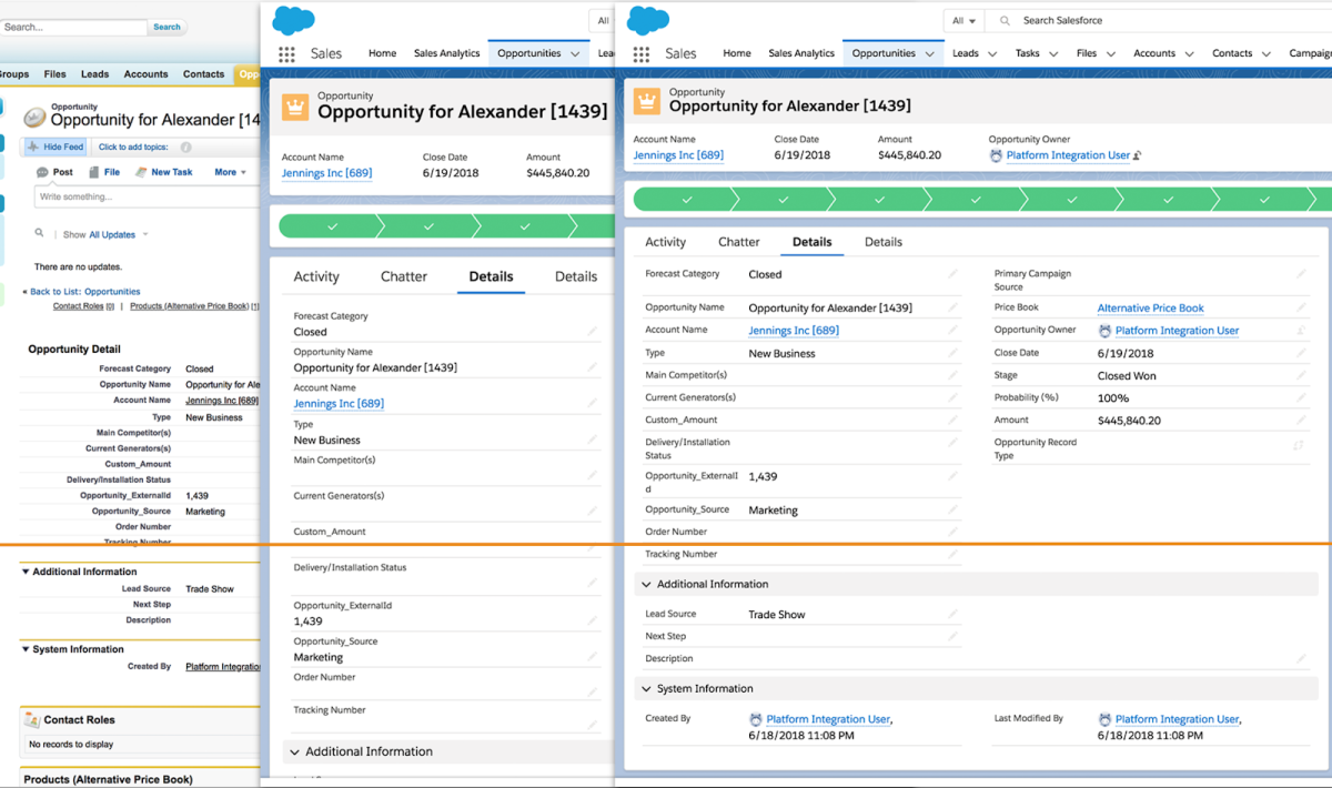
The above image compares the same record view across Salesforce Classic (left), Lightning Experience Comfy view (middle) and the new Lightning Experience Compact view (right) when looking at record details. As can be seen, the Compact view provides a 30% increase in information density compared to the Comfy view and reaches information density parity with Salesforce Classic.
As a developer of custom pages and components for Lightning, you may need to make some simple changes to your code to ensure the UI looks responsive to the user’s display density setting.
Below we cover the different ways you might’ve implemented your custom pages and components, plus recommendations on what steps to take.
First, and as context, we discuss the guiding principles from a User Experience perspective.
Guidelines from the User Experience team
This feature is all about giving users choices about how much information density suits their individual needs in the Lightning Experience user interface. Rather than compromising on “middle of the road” values that are not ideal for anyone, we are defining separate sets of optimized values for a “Comfy” view that has larger spacing and a “Compact” view that prioritizes the amount of information displayed on screen.
The Comfy view remains as close to previous Lightning releases as possible. The Compact view is designed to meet, or exceed, Salesforce Classic information density in key screens such as list views and record detail forms.
For the Winter ’19 release we concentrated on three main areas in the UI:
- Spacing
- Applied to padding and margin values between elements
- Line height for text blocks
- Form element alignment on record details
- Top aligned in Comfy mode
- Left aligned in Compact mode (when the details are shown in the wide region). Note: if available form width falls below a predetermined threshold in the wide region (e.g. because of browser viewport resizing), labels will automatically shift to top alignment.
- Title font size
- Applied to higher level text elements (not body copy)
We power these changes through Salesforce Lightning Design System (SLDS) variable design tokens and classes. These give the most dramatic changes to the UI, while allowing developers to apply simple and defined CSS changes to ensure their components and features can take advantage of the different view settings.
In-product examples of density setting differences

Card in Comfy view
Card in Compact view
As you can see in the above related list card example, multiple visual elements have changed to reduce space in Compact mode:
- Internal card paddings and margins have been reduced from 1rem to 0.5rem vertical and 0.75rem horizontal
- Title font size reduced from 1rem to 0.875rem
- Overall text line-height reduced from 1.5 to “normal” (1.3)
This gives a 20% increase in information density in terms of the most important vertical height.

Form elements in Comfy view

Form elements in Compact view
Using left aligned form elements for record details result in a 30% increase in information density in terms of vertical height.
Recommendations
- Consider how your component will change based on the two views available to users.
- Compare how your component/feature is looking in relation to the rest of the elements on the page.
- Use semantically correct Salesforce Lightning Design System (SLDS) variable tokens to power your changes for spacing and typography in the intended areas.
- Consider using SLDS container components such as Cards and Tabs that will give you the correct variable spacing and text titles “out of the box.”
- Consider using base Lightning components for your component / feature. We provide these components so you don’t have to spend time re-implementing them yourself. Base components are built on SLDS and therefore they automatically get the updated styling.
- Consider how your component / feature looks in various regions (e.g. left aligned form elements can actually use more vertical space if placed within a narrow region).
Using SLDS for your custom components & pages
New tokens will be available for use once Winter ‘19 is deployed. Update your components and pages in your Winter ‘19 development environment (e.g. sandbox or scratch org) and then be prepared to push updates in mid-October after production instances have been upgraded.
When the Winter ’19 development environment becomes available, you will have access to our new SLDS variable spacing tokens to help leverage densification in your own components. If using tokens to power your component’s styling is new to you, please refer to documentation for more information.
If you are currently using the HTML blueprints from SLDS within your component or leveraging Lightning base components, you are ahead of the game! The HTML and Lightning component come with predefined variable spacing tokens that leverage each setting of densification. The following components and blueprints will give you densified spacing out of the box:
Not using SLDS (e.g. using custom CSS) for your components and pages
SLDS has become the gold standard way to build your user experience here at Salesforce. The platform-agnostic HTML blueprints are a great way to jumpstart your development to build within the Lightning Experience. The CSS framework gives you prebuilt accessible, responsive and well-tested HTML and CSS to use within your Lightning components. Of course, you can also use it in any kind of web stack because it is all based on standard HTML5 and CSS3.
If you are not using an out of the box SLDS blueprint or Lightning base component, you can still leverage variable spacing tokens within the CSS for your component. For Winter ’19, we shipped 18 new tokens that will change your vertical and horizontal spacing independently.
Every spacing token that reacts to a user’s density preference is prefixed with var . If you want your component to adapt to densification, instead of using a token with a static value like t(spacingMedium) , you would change to a token that begins with var with the same name: t(varSpacingMedium) .
The spacing will maintain the existing default value of Summer ’19 when in Comfy mode, but will render a denser experience in Compact mode. For example, t(varSpacingMedium) defaults to 1rem/16px in Comfy mode and adapts to 0.5rem/8px in Compact mode.
As a best practice, if you only want to change your vertical or horizontal spacing, you may do so by using t(varSpacingVerticalXxSize) or t(varSpacingHorizontalXxSize) independently. The vertical token can be used for the top and bottom and the horizontal token will change the left and right padding or margin properties within your CSS resource.
For example:
We allow you to change your vertical or horizontal spacing separately to give you an optimized experience when you need the top and bottom values to tighten up more than the left and right value. If you simply want to modify the padding or margin around your entire component or an element of your component, simply use the general variable spacing tokens mentioned above.
For example:
Here’s an overview of the tokens available for your use:
| General | Vertical | Horizontal |
| varSpacingXxSmall | varSpacingVerticalXxSmall | varSpacingHorizontalXxSmall |
| varSpacingXSmall | varSpacingVerticalXSmall | varSpacingHorizontalXSmall |
| varSpacingMedium | varSpacingVerticalMedium | varSpacingHorizontalMedium |
| varSpacingLarge | varSpacingVerticalLarge | varSpacingHorizontalLarge |
| varSpacingXLarge | varSpacingVerticalXLarge | varSpacingHorizontalXLarge |
| varSpacingXxLarge | varSpacingVerticalXxLarge | varSpacingHorizontalXxLarge |
The publicly available tokens are listed in our developer documentation.
Visualforce pages
You can use either Lightning Experience stylesheets or the <apex:slds/> component to style your Visualforce pages with the look of Lightning Experience. Both Lightning Experience Stylesheets and <apex:slds/> will adapt to the users current density settings. See this page for more information on Lightning Experience Stylesheets and this page for more information on <apex:slds/> .
Keeping your own styling
If you want to continue to use your own styling, you can now reference a new property in the Theme API to find out which density setting the current user is on. Our API docs have more information on this. Since this blog post is being published before the release docs are officially updated, the relevant new property info available in Winter ‘19 is copied below for reference:

This density property will tell you how the styling of your component or page should appear in order to conform. Refer to the guidelines from the Salesforce User Experience team (covered earlier in this blog post) on how to differentiate the styling between a Comfy and a Compact view setting.
Future
Winter ’19 is the first release that takes advantage of this functionality. We will continue to make improvements in future releases, so please let us know what you’d like to see added by posting your feedback in the Lightning Now group on the Trailblazer Community.
To learn more about the Lightning Experience UI, check out the Lightning Experience Development module in Trailhead.