In this blog post, we will explore how easy it is to learn and build out proof of concept Lightning web components and share them with your colleagues and Salesforce Ohana friends. When we released our updates to the Component Library for Lightning Web Components, we included an exciting enhancement: the Lightning Web Component Playground. We built this tool to bring ourselves in line with the JavaScript community standards and give you the ability to write the best possible code as quickly as possible.
The quest: We want a shrubbery
I was asked recently to build a Lightning web component that showed off what they could do. It was a tall task, only because it’s so open-ended. With such requests, I feel like I am about to embark on a grand quest, similar to finding that perfect shrubbery — one of learning, innovation and likely many meetings to understand the scope of what exactly they want the component to do.
Until recently, if you wanted to prototype something in Salesforce, you might have had to use a separate tool to build out mock-ups and start coding right in a Sandbox or scratch org. With the addition of the Lightning Web Component Playground, anyone can start prototyping Lightning Web Components from inside any modern browser. You can view the playground alongside our developer documentation through the Salesforce Developers website or inside any org by navigating to http://your-domain.my.salesforce.com/docs/component-library (Replace “your-domain” with your domain’s name).
Starting out with a base component
Base components are lightweight components provided by Salesforce that help you to quickly create functionality without having to start from scratch. They use the Salesforce Lightning Design System, are accessible, and are built with Lightning Web Components. If I want to make an amazing application (or prototype), I always start by looking at the available base components on the Component Reference tab.
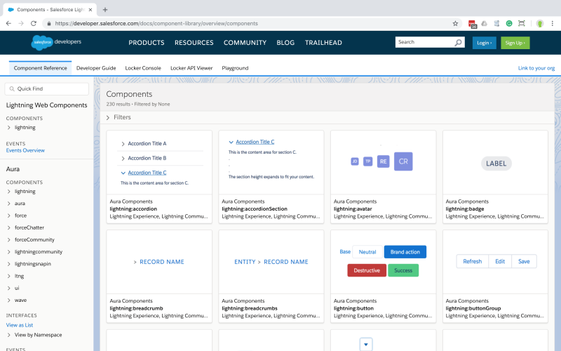
If you previously leveraged base components for Aura development, the Component Reference tab may be familiar to you. We’ve recently updated the interface to allow for you to filter for Lightning Web Component base components, and we continue to show you all of the Aura base components. If you view this through your own org, you’ll also be able to access your custom Aura documentation.
Deciding on a perfect component – displaying shrubberies!
In order to continue along my quest to show off Lightning Web Components, I decided to make a component to display some different local shrubberies. I started by looking for a base component that will let me have multiple tabs.
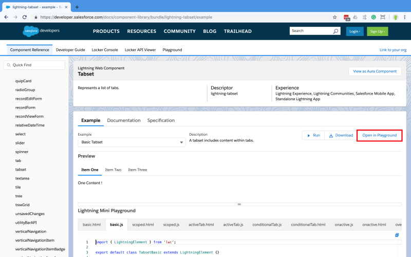
There are a few different ways I could have looked for this, but I’m open to being inspired by a new base component, so I started by simply looking through the list of all the available base components on the Component Reference tab and eventually selecting the tile called lightning-tabset. I am developing with Lightning Web Components framework, so I’ve made sure the tile I’ve clicked on indicates the correct framework and syntax.

Once I select my tile, I’m taken to the documentation page. This page helps ground me by showing me an example of code I can get started with, but also allows me to dive deeper into the documentation or specification if I want to. Since it opens straight onto the Example tab, I am able to immediately see a mini version of the playground. I can see that the component looks like what I am wanting to use, and I can open up a full version of the playground with all this example code by clicking the Open in Playground button.
If you have ever used a tool like JS Fiddle or Codecademy before, this playground may look and feel familiar to you. That is on purpose. This is a space meant for learning and discovery of Lightning Web Components.
Writing the component
I can adjust the content in my component quickly by typing into the file I want to change on the left-hand side, and because live compilation is enabled, I can view the newly rendered code on the right in real-time. I’ve decided I want a tab for shrubbery photos and a second tab for rankings.
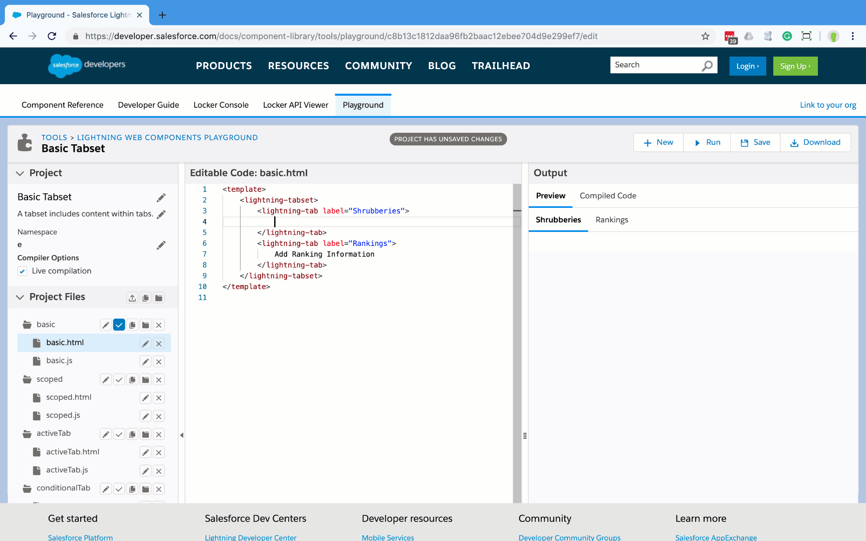
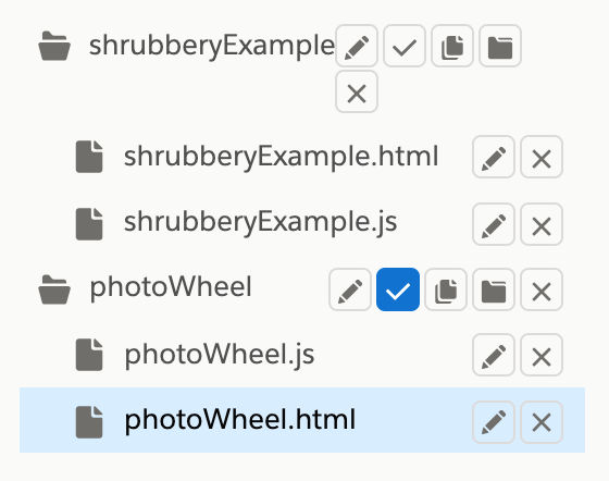
I’ve decided to keep my tabs and the code I’m working on in the “basic” folder under project files. This isn’t a very good name for the component I’m writing, so I decide to rename it “shrubberyExample.” I also cleaned up all the other examples by removing them from my playground so everything is clean when I go to add in my shrubbery photos.
Since this isn’t a Salesforce instance, I can’t pull down images from records or static resources. For my prototype, I have to pull my images from somewhere else. I know I have a few photos of shrubberies, so I decided to host them up on GitHub pages and then pull in the images to my component using an image tag.
Since I want to explore what’s really possible with Lightning Web Components, I used another base component to help me display the images in a fun way. I had already worked on a component in the playground that would do just this, so I decided to just download my old files from my old playground. Then I uploaded only the files I want into my current playground by dragging and dropping the ZIP file of the files I needed to add.
I can check to make sure the new code I’ve added works properly by changing which component to render. To do this, I simply click the checkbox over on the left- hand side by the component bundle name — in this case, my photoWheel component.
Now that my photoWheel component is available in my playground, I can actually use the component in my shrubberyExample component just like I could in a developer org. The adjusted code in shrubberyExample.html now looks like:
To finish and verify my work, I re-render my shrubberyExample component bundle.
Fancy features
By pressing “F1” while in the playground, we can pull up a helpful submenu that is based on the Visual Studio Code pallet that lets us be more effective as developers. My favorite is to auto-format my document — by searching for “Format” we can see the built-in function to format our document. This is huge if we forgot to tab our code properly somewhere along the way. Now that we have an amazing looking file, our code is shaping up to be exactly what we need, and we can share it!
Present your shrubbery
Now that I’ve built out an example with the playground, I can share it out with whomever by sending a direct link to the work. This is done by pressing the Save button and then going and copying the unique URL.
There are, of course, a few warnings here. If you want people to collaborate with you, their edits and saves will have URLs unique to them. In other words, they cannot change your playground, only add further revisions. Also, please be careful with what you share and create. This is a public URL, which means if someone guessed it, they could see your code. Finally, you cannot delete a playground. If you want to see my finished component, you can view it and continue to iterate on it here.
You can also click Download to save the component locally, empowering you with another way to share your ideas. When you click this, you only retrieve the raw files. Since you won’t have any metadata, you can’t deploy your work to production as is — you’ll need to properly create the component in your development environment first.
Now that you’ve built out a prototype of a component, hopefully you can start to see how you can continue to use this playground environment to experiment with Lightning Web Components and base components.
Resources
- Get hands-on with Lightning Web Components on Trailhead
- Check out our developer video gallery
- Dive in with our Sample Apps
- JS Fiddle
- Codecademy
Heather Dykstra
Developer Evangelist, Salesforce
@HeatherLDykstra