Discover Summer ’20 Release features! We are sharing five release highlights for Developers and Admins, curated and published by our evangelists as part of Learn MOAR. Complete the trailmix by July 31, 2020 to get a special community badge, and unlock a $10 contribution to Libraries Without Borders (Bibliothèques Sans Frontières).
The Summer ’20 Release is here! With it you get shiny new development features for Lightning Web Components, including new coding features, security enhancements and more capabilities for independent software vendors (ISVs). You can check the full release notes here, or you can continue reading this blog post and get a summer-y created just for you!

Share CSS styles among Lightning Web Components
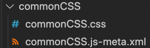
Struggling with CSS sharing? With Summer ’20 it’s now easier to share CSS styles. To share a CSS file among different components, create a CSS-only module. A CSS-only module contains a CSS file and a metadata file (see below).
Write the CSS rules that you want to share in the module, and then import it into the Lightning Web Components you want them to be shared with. It’s that simple!
For example, let’s create the following CSS-only module:
cssLibrary.css
In this module, we style h1 elements using CSS properties and an SLDS design token. Conveniently, design tokens can automatically update visual elements. So if we decide to change a color in our branding, there’s no need for you to modify your code.
Important! The module should only have a CSS file in it, otherwise it will not work.
Import the CSS module into a Lightning Web Component. You can import as many modules as you need.
In the following example, we create a CSS module called c-css-library and import it into a component called c-salary-adjustment (More on this example later).
salaryAdjustment.css
salaryAdjustment.html
The styles in c-css-library apply to c-salary-adjustment. So the h1 tag will be styled as specified in the shared CSS module. This is the result:

Styles imported using static resources are injected into the global scope and can leak into other components. For this reason, importing CSS using modules is preferred, as styles are then scoped to the component.
Read more information about this feature in the Summer ‘20 Release notes.
Get Elements by Tag or Class Name
The getElementsByTagName() and getElementsByClassName() methods of the Element class are now supported in LightningElement! This gives you more flexibility to query elements in the component Light DOM. For instance, in the c-salary-adjustment component we can do the following to get the h1 element:
Note: You won’t be able to use this method to query elements that belong to the component Shadow DOM, as the ShadowRoot interface doesn’t expose this method. Instead, use querySelector / querySelectorAll.
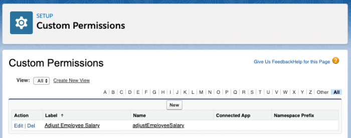
Check user and custom permissions from Lightning Web Components
User permissions are out-of-the-box permissions that control what tasks a user can perform and which features a user can access. You assign user permissions via profiles or permission sets. Similarly, you can create custom permissions. A typical use case is to show / hide a portion of a UI based on user or custom permissions.
For example, let’s say that you have a custom permission in your org that allows you to readjust employee salaries. You want to create a custom Lightning Web Component that allows you to increase an employee’s salary, as well as launch the processes that adjust related records, notify managers and so on. However, this action should only be possible if the running user has the correct custom permission assigned.
Before, you had to query for the permission in Apex. Now, with the Summer ’20 Release, you can check user and custom permissions easily in LWC. Simply import a static reference to the permission from the ‘@salesforce/userPermission’ or ‘@salesforce/customPermission’ module and use it in your JavaScript code.
Let’s see an example in which we conditionally show the c-salary-adjustment component in a parent component called c-employee-salary , checking for a custom permission called adjustEmployeeSalary.
employeeSalary.html
employeeSalary.js
In this example, the imported hasAdjustEmployeeSalaryPermission value will be true if the permission is assigned to the current user. Otherwise, it will be false. Thus, the c-salary-adjustment component will only be visible if the current user has that custom permission assigned.
In this example, we don’t see the c-salary-adjustment component code, but in a real implementation that component would likely call an endpoint to adjust salaries. Note that the server code for the endpoint should check for the custom permission too. That way you’d avoid an attacker who desires to reverse engineer the code and adjust salaries unexpectedly.
Check whether a component is connected to the DOM
Components can be connected / disconnected from the DOM many times in their lifetime. For example, a component could be disconnected because the user navigated away to another page, or because an if:true template condition changed. It is the responsibility of the developer to handle asynchronous operations correctly in case the component has been disconnected from the DOM.
Before the Summer ‘20 Release, you could use the connectedCallback and disconnectedCallback to hook in the moments the component was connected to the DOM or not. With Summer ‘20, Lightning Web Components reflect the value of the isConnected Web API property so that you can check it in JavaScript at any time.
This can be very handy in some cases. For instance, let’s say that the SalaryAdjustments component includes a chart that shows the employee salary history built with Chart.js, a third-party JavaScript library. The component asynchronously loads the library. When the library is loaded, in order to avoid errors we can check if the component is still connected before performing more actions.
Delete Lightning Web Components from managed packages
Attention ISVs! You can now delete Aura and Lightning Web Components from managed packages (and also global ones). This works in the same way as the deletion of most other metadata types. Despite deletion in your package, the component will remain in the subscriber’s org until the subscriber deletes it. A two-stage deletion process is recommended.
Continue Learning
In this blog we have summarized some of the new LWC features, but there are more to check out:
- Communicate Across Salesforce UI Technologies with Lightning Message Service (Generally Available)
- Develop Flow Screen Components That Work for Multiple Objects (Beta)
- Aura Components in the
uiNamespace Are Being Deprecated - Get Information About the Current Lightning Community
- Set an Uppercase JavaScript Property Via an HTML Attribute
- DOM API Changes May Require UI Test Updates
- Lightning Components Use Native Android Date Picker
- Lightning Web Components in Custom Tabs Are Reactive
- Restricted Access to @AuraEnabled Apex Methods Based on User Profile
You can check the complete list here.
Want to get hands on? Sign up for a pre-release developer org and give it a try to experience all the new LWC features. Do you use sandboxes? Read Summer ‘20 sandbox preview information here. Enjoy!