Ah, the Lightning Experience! It’s fast. It’s beautiful. It’s accessible. If you’re designing or developing, building your experiences using the Lightning look and feel is effortless. Whether you’re using App Builder to compose your layouts visually or writing HTML/CSS/JS, thanks to the Lightning Design System, the Lightning Experience is always along for the ride with no extra effort on your part.
While the default look and feel (and I may be a bit biased) is pretty great, those of us on the Lightning Design System team also know that many of you like to customize the default Lightning look and feel to better reflect your customers, brand, and needs. There have been many technical solutions for making this customization in the past, but all of those approaches (such as overriding styles or extending the default styles) were fragile:
- With Lightning Web Components, applying styles that affect the component internals became more difficult thanks to greater DOM encapsulation via native shadow
- Any changes we would make to the component DOM would result in your styles no longer getting applied. If we updated our styles to meet new requirements, there was a chance your overrides would prevent our styles from getting applied as well
As part of exploring how to solve these two problems, we wanted to reimagine how you can better express your look and feel in a more maintainable way and better take advantage of web standards.
Meet styling hooks
Starting with the Winter ‘21 release and further refined in the Spring ’21 release, we’re introducing styling hooks as a beta feature. What styling hooks do is pretty cool. Styling hooks provide a way for you to customize the default appearance of your LWC-based Base Components in a supported, maintainable, and intuitive way that doesn’t rely on you depending on the component’s DOM:

Behind the scenes, styling hooks are powered by CSS Custom Properties, a standards-based way to define reusable style values that work well in an encapsulated, web component-based environment. To customize the default appearance, all you have to do is target the component and specify the CSS Custom Property we have exposed for the type of visual change you are interested in making.
For example, let’s say we have a lightning-button defined in our HTML that looks as follows:
The following is one way of customizing the appearance of this button where we have the default appearance on the left and a customized experience on the right – where the button’s appearance has been modified using styling hooks:
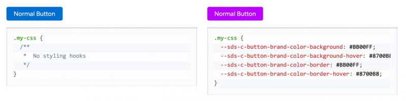
That’s all there is to it. To learn which styling hooks are exposed on each component, check out our SLDS documentation for the appropriate component you’re interested in customizing:
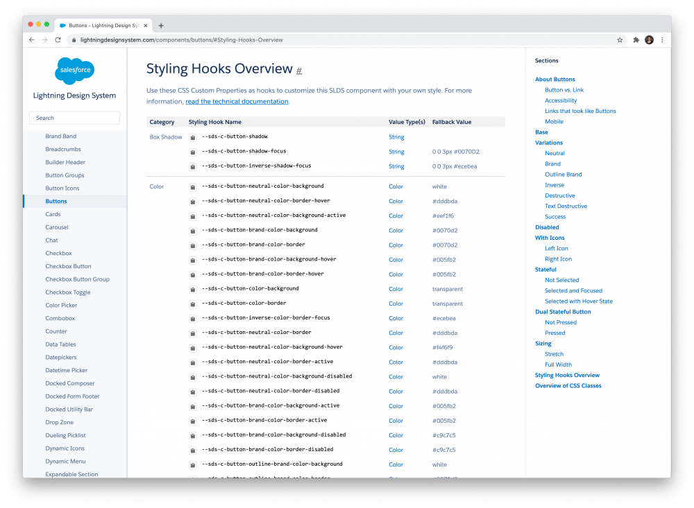
To dive deeper into what styling hooks are, how to use them, and to look at examples of varying complexity, the Styling Hooks Overview page is just what you need.
Steps you should take
Styling hooks provide a supported, maintainable way to customize the default Lightning Experience at the component level. If you’re currently overriding styles or using other mechanisms to change the default appearance, I strongly encourage you to have a plan to migrate to styling hooks – either now, or once this feature emerges out of beta in the near future. Some steps you should take:
- Identify all the areas you are overriding the appearance of the base components inside your LWC by specifying style overrides.
- Ensure that a styling hook for the type of customization you are making exists on the component.
- If a particular styling hook you require isn’t available or doesn’t meet your exact needs, please file a request for it using our feedback form. We will evaluate your feedback as part of future updates we’ll make to styling hooks.
- Migrate to using a styling hook to make your customization.
By using styling hooks for all of your custom styling needs, you’re buying yourself a level of future-proofing from changes coming down the road. You no longer need to worry if DOM changes we make to the underlying component will require you to go back and revisit the styles you’ve set.
You’re also more prepared for making customizations in a world where we provide deeper component encapsulation via the Shadow DOM. CSS Custom Properties are also one of the primary ways to style the internals of a web component from the outside.
Sounds exciting, right? Read our larger documentation for essential details and…happy styling!
About the author
Kirupa Chinnathambi is the Senior Director of Product Management where he pushes pixels to their limit as part of the Lightning UI Platform team. He has been helping designers to code and coders to design as part of his long-running KIRUPA blog, and you can follow him on Twitter @kirupa.