


We know that many of you rely on Salesforce Omnistudio every day to build fast and intuitive digital experiences across Salesforce. However, we know that long wait times can be a major headache. We’re talking about that moment when you finish designing a complex Omniscript or Flexcard, click the ‘Activate’ button, and then… wait. The process of compiling and deployment can be lengthy. This cuts into your productivity and can be frustrating when you just want to see your changes live.
The good news? The new Omnistudio Standard Designers, runtime, and components are now built directly into the Salesforce Platform. This eliminates the old packaged installation process and ensures everything runs natively on the Platform.
What are Omnistudio standard designers?
The Omnistudio standard designers are tools that run directly on the Salesforce Platform, rather than a separate managed package. This includes runtime components like Flexcards, Data Mappers, Integration Procedures, and Omniscripts.
If Omnistudio is the engine for building these experiences, what are the parts that make it run? It breaks down into four key components: Omniscripts and Flexcards handle the frontend UI experience, while Data Mappers and Integration Procedures manage the backend data orchestration. Together, they bridge the gap between user interaction and backend data processing.
Example: You might use an Omniscript to take a student’s application, collecting their name, GPA, and program choice on a Lightning Web Runtime (LWR) site. A Flexcard on an Experience Site could then show those account details and launch an Omniscript flyout to update that information. Upon submission, a Data Mapper loads Omniscript input fields (name, GPA) into the appropriate Student Profile record in Salesforce. If the student enters GPA and tuition information in an Omniscript, an embedded Integration Procedure orchestrates the backend logic to calculate scholarship amounts before displaying the results.
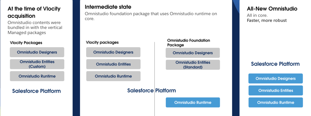
Omnistudio’s journey: Past, present, and future on Platform
To understand the change, we need to rewind a bit. In the past, Omnistudio was managed through packages. If you were using it with Communications, Media, and Energy & Utilities (CME) or insurance packages, everything was bundled together. The tools used to build ( designer), basic data components (entities), and the engine that ran scripts (the runtime) all resided within that specific industry package.
Following the acquisition of Vlocity, we introduced a new layer called the Foundation package. This new package housed Omnistudio designers and entities separately. This was a crucial phase because industries such as Agentforce Health, Agentforce Education, Agentforce Manufacturing, and Agentforce Financial Services (FS) could install the Omnistudio package directly without needing the older CMT or INS packages.
Today, Omnistudio is a native, deeply integrated part of the Salesforce Platform. With this transition, you no longer need to install separate packages. Once you enable your industry license (which includes Omnistudio licenses), the designers and runtime are available immediately. There’s no need to rely on packages, so you’re always using the fastest and latest version.
Who can access the new standard designers?
Now the question arises: Who can or can’t access the new designers? We’ve got you.
- New customers: If your org has a Salesforce Industries license and no existing package, enabling your bundled Omnistudio license gives you direct access to designers and runtime on the Platform. No separate Omnistudio package installation is needed.
- Existing customers already on the Platform: If you already have Omnistudio license enabled, and the org is on the Platform, you’re in luck. Once the package is updated to the latest version, you’ll get the standard designers by default.
- Existing customers still on the package runtime: If your org is on the package runtime, you won’t automatically get access to standard designers. You’ll need to take steps to migrate to the Platform runtime to gain access to it.
Benefits of standard designers
To be honest, the package designer’s list page for managing components was often difficult to navigate. Navigating the hierarchical view made it difficult to find what you were working on. Locating properties and elements while switching between tabs to build and configure a component was troublesome, and moving between versions required multiple steps.
With the standard designers, you’re automatically on the best and latest versions. You get immediate access to new features, better performance and user experience (UX), faster Omniscript activation, and security enhancements without waiting for complex package updates. These enhancements allow you to go live faster and enhance productivity. However, it doesn’t stop here. Let’s see some more benefits.
Enhanced developer experience with general UI improvements
The new Omnistudio standard designers bring a huge leap forward in the daily developer experience. They are more responsive and intuitive, and they are visually aligned with familiar Salesforce interfaces.
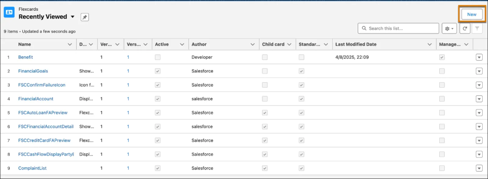
Salesforce standard list view page
The new designers use traditional Salesforce list views for all four major components.
- Familiar look and feel: The list page follows Salesforce standards, meaning it looks and acts like your familiar Account or Contact pages.
- Customization power: This is a significant benefit for developers working in teams. Since it is a standard Salesforce list view, you can create custom views and filters, choose which columns to display, and filter components to show only what you are actively working on.
- Focus on recent work: No more old hierarchical list view. The new list view defaults to showing the most recently modified records, ensuring your current components are front and center.
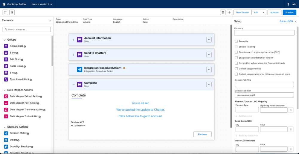
Organized designer canvas for Flexcard and Omniscript
The new designer canvas has been completely reconfigured to be more intuitive and aligned with experiences like the Lightning App Builder. The layout is much more logical and intuitive. For example, creating a Flexcard now takes just three steps: click New, enter details, and Save. To select a data source, click the Setup icon, scroll to Data Source, and choose from the dropdown. You will also find:
- Elements on the left: All available elements (such as steps, blocks, Data Mappers, and standard actions) appear neatly on the left side of the canvas. You can drag and drop them directly onto the canvas.
- Canvas in the center: The canvas where you build and visualize your components is centrally located.
- Properties on the right: The properties panel automatically loads on the right side of the screen when you drag, drop, or click a component. The necessary configuration options appear instantly when needed.
- Organized elements: To improve clarity, elements are now grouped logically. For example, Data Mapper actions are clubbed into one section to make them easily understandable.
- Setup panel access: Less frequently used configurations (such as the setup panel for knowledge articles, currency fields, or cache configurations) are accessible through a top menu or dedicated icon instead of cluttering the workspace.
Intuitive version management
Managing multiple versions of your components within the builder interface is now significantly easier, eliminating unnecessary navigation steps.
- Switching inside the designers: Users can easily switch versions via a drop-down menu located at the top of the designer interface (available for Omniscript, Flexcard, and Integration Procedures). This eliminates the need to return to the main list page to access an older version.
- Creating new versions: To create a new version, simply click the New Version button and confirm.
- Track older versions: Select Manage Versions from the dropdown on the right side of the record to view all versions and drill down as needed (available for Omniscript, Flexcard, Integration Procedure list pages).
The Design Assistant
In the managed package runtime, there were no guardrails or limits set on creativity. Developers could unknowingly create overly complex components that were so large or heavy, they broke the designer itself. This meant developers often didn’t realize they had exceeded system limits until discovering the issue during activation.
The Design Assistant reviews your Omniscript or Flexcard with soft guardrails, not hard warnings, during design. Instead of reaching the checkout line (activation) and realizing the cart is too heavy (breaking the component), you’re gently reminded mid-shopping (during design) to split items (heavy child cards) into smaller carts for smoother processing.
Design Assistant provides two types of feedback:
- Information messages: Displayed when designs approach system limits. For example, a data table component is approaching the 500-row limit. These act as early warnings.
- Warning messages: Displayed when the design exceeds recommended limits, signaling that the component may be too complex.
Component-specific design transformations
Through component-specific enhancements, the standard environment is now more responsive, intuitive, and developer-friendly. This shift allows you to spend less time managing the tools and more time delivering meaningful digital experiences.
Instant activation and creation speed
In the package designers, activating an Omniscript required activation, compilation, and deployment. It was a time-consuming bottleneck that disrupted workflow.
With the new designers:
- Activation for Omniscripts, Flexcards, and Integration Procedures is nearly instantaneous.
- Performance is up to nine times faster than the legacy package.
- Creation of Omniscripts and Flexcards is up to six times faster.
- Flexcard creation now requires just two clicks: New and Save.
Note: All data presented above is derived from internal testing.
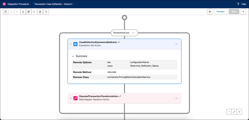
Integration Procedure Designer
The Integration Procedure Designer has undergone significant visual and functional upgrades. The older Angular-based package designer was simply not as intuitive. It dumped you directly onto a blank canvas without guidance on where to start. Even dragging elements was clunky and frustrating.
Now, when you click New, you are prompted to enter a Name, Type, Subtype, and Description. After saving, the designer opens in a new browser tab with a playground-type structure. Once you land on the designer’s canvas, you immediately see a Plus (+) icon indicating where to begin adding components. This structure is much more visual and clearly shows the flow of data.
The new Integration Procedure interface also introduces several key usability enhancements such as:
- Easy component setup: Add components using Plus (+) icons between cards. The properties panel appears instantly in the right tray for configuration, and you can view the Type and Subtype through the gear icon in settings.
- Visual connectors: After adding components, connectors automatically appear between components, clearly displaying execution flow. Since Integration Procedures are headless, these connectors make data flow transparent and easy to understand.
- Easy manipulation: Use drag-and-drop functionality to add components, shuffle them within the canvas, and rearrange them easily.
- Undo/Redo: To make development easier, we’ve introduced undo and redo options.
- Explicit saving: Changes (like dragging a component or adding an action) require clicking an explicit Save button to ensure they are intentional.
- Intuitive preview: Entering preview mode and executing your Integration Procedures now includes color indicators to show which action was successful and which component failed during execution, significantly improving troubleshooting.
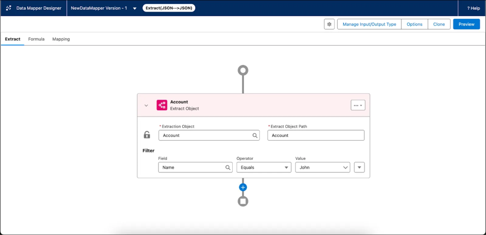
Data Mapper Designer
The Data Mapper, an essential backend tool for Omnistudio, handles data extraction, loading, and transformation.
The first thing you will notice is the visual upgrade. The new Data Mapper UI visually aligns with the new Integration Procedure Designer, ensuring a consistent experience across backend components.
Key improvements include:
- Select interface: Start by selecting an interface type (such as Extract or Load), then use the Plus (+) icon to add objects and formulas intuitively.
- Connectors: Link elements using connectors, with options to move rows up or down or insert rows within a clean table structure.
- The new table view: The table-based layout resembles JSON paths and outputs, making mappings easier to visualize and configure.
- Transformation setup: This visual alignment makes defining how data is extracted, transformed, and loaded more accurate, saving significant time during configuration.
Start exploring the standard designers today
The new Omnistudio standard designers mark a massive architectural shift, delivering instant activation with a simplified, intuitive canvas, and essential future-proofing for next-generation features. Now is the perfect time to ensure your organization is positioned to benefit from these improvements. Sign up today.
Resources
- Learn about Omnistudio Development Essentials on Trailhead
- Watch a video to learn how to Build Low-Code Digital Experiences with All-New Omnistudio
- Learn about Omnistudio Omniscript Fundamentals on Trailhead
About the author
Krishna Kruthiventi is a Senior Product Manager at Salesforce, specializing in Industries Cloud solutions. His primary focus is on the Omnistudio product suite, simplifying complex enterprise workflows and elevating Omnistudio to deliver best-in-class, consumer-grade digital experiences for both administrators and end users. Follow him on LinkedIn.
Payal Verma is a Content Marketing Analyst at Salesforce with over four years of professional experience in product, brand, and content marketing. She has worked across B2B and B2C markets, developing and executing content strategies for a wide range of formats, including blogs, social media, scripts, e-books, guides, etc. Follow her on LinkedIn.