Guest Post: Daniel Peter is a Lead Applications Engineer at Kenandy, Inc., building the next generation of ERP on the Salesforce Cloud. You can reach him on Twitter @danieljpeter or www.linkedin.com/in/danieljpeter.
 Now that we have the basics of the displaying reports and navigating around, there are a couple of styling tweaks we can do to improve the appearance.
Component bundles in the Salesforce1 Lightning framework contain their own CSS. The CSS in these bundles is enforced to be unique to that component:
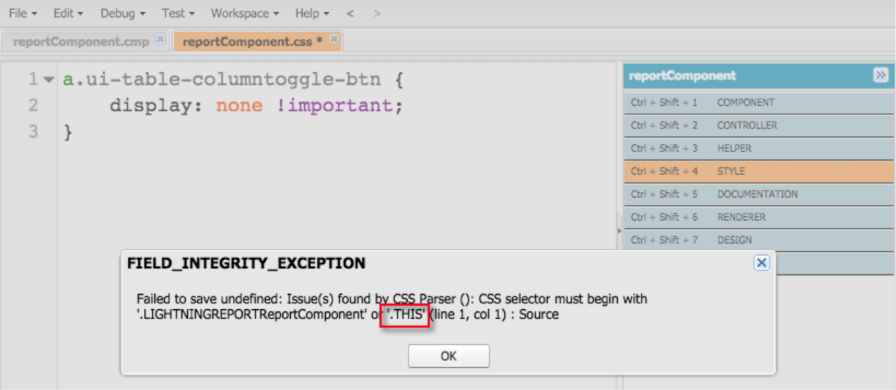
All of the CSS selectors need to include “.THIS”:
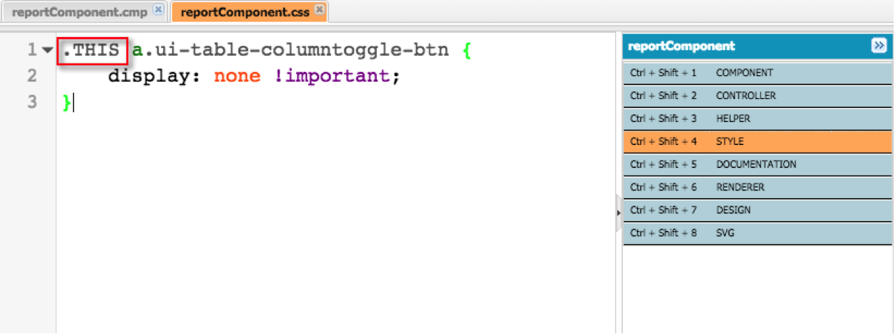
“.THIS” will get converted to the component name automatically by the framework. If you are already familiar with CSS, this is pretty much the only thing new to learn for styling lightning components.
Hiding the “Columns…” button
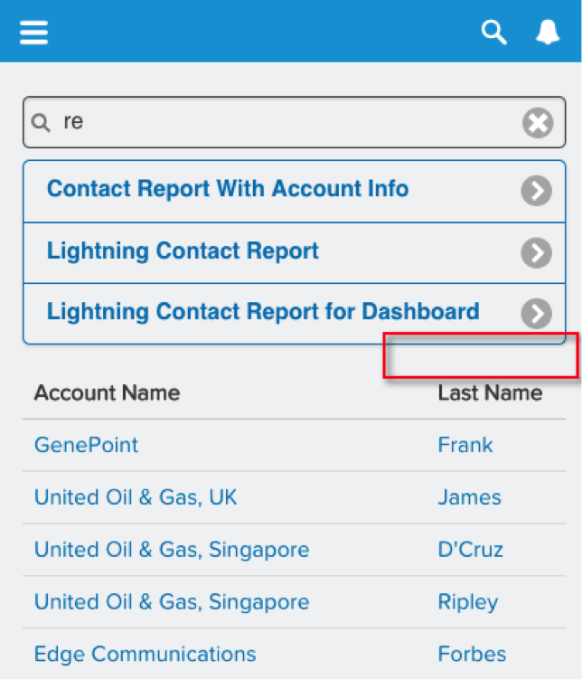
As I mentioned in part 4 of this series, the column toggle button relies on a hyperlink to a fragment identifier. You can get away with this if you are embedding VisualForce in Salesforce1, but it isn’t compatible with the lightning framework. There are some crazy workarounds for this that go against the grain of the way jQuery mobile was written. One workaround is using jQuery to edit the hyperlink to instead toggle the css and styles of DOM elements to achieve a similar effect to clicking on the original fragment hyperlink. You can contact me if you want more details on that route, but I’m hoping there will be a more native way to do this in the future with Lightning. So instead we will just hide the button for now.
The screenshots above show how we do this, it is pretty straightforward:
reportComponent.css
That frees up the real estate by cleaning up the button that used to live in the area inside the red box:
Making Summary Reports Easier to Read
Remember the summary report from a previous article?

|

|
The salesforce standard report uses a darker color to denote the grouping levels. Let’s add something similar to our lightning version of the summary report.
We will add the css class “group” to the grouping header cell in reportGroupComponent.cmp:
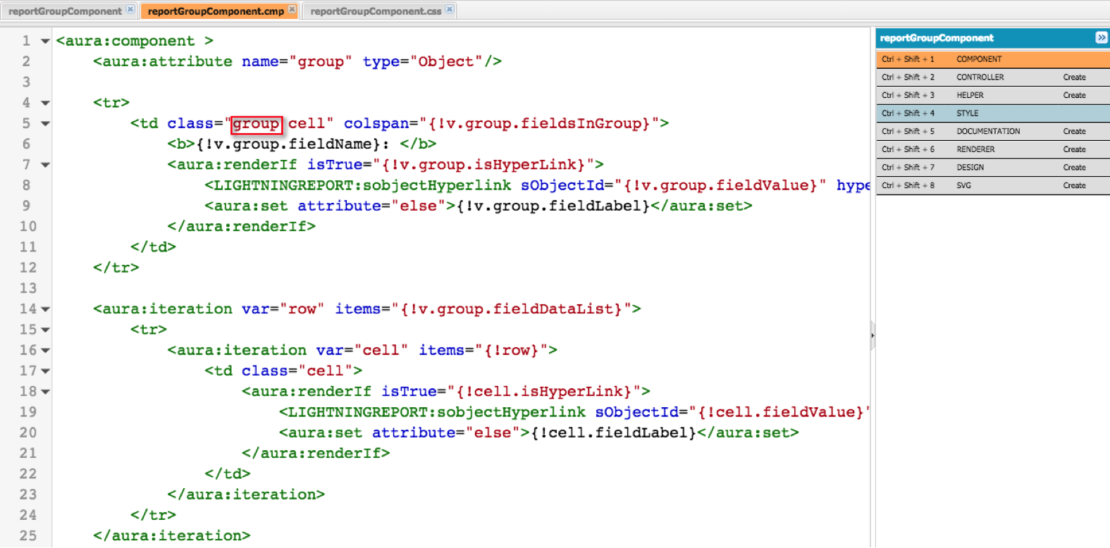
Then in the component bundle we add this entry to reportGroupComponent.css:
reportGroupComponent.css
Refreshing the report shows that now summary reports are now easier to read:
A little bit of CSS goes a long way!
Demo Video and Source Code
Check out a demo video of lightning reports in action:
https://www.youtube.com/watch?v=bsLTy35W8xo
The complete code for this series is available here: