Web applications we create must be both mobile and desktop friendly. Fortunately, with responsive web design frameworks such as the Salesforce Lightning Design System (SLDS), we can thoughtfully develop apps once, then deploy across all devices. In this article we discuss the backbone of responsive Lightning applications: SLDS grids and the related Lightning components of layout and layoutItem.
Before we dive deeper, a quick reminder of what responsive web design is:
Responsive web design (RWD) is an approach to web design aimed at allowing desktop webpages to be viewed in response to the size of the screen or web browser one is viewing with.

As illustrated in this image, content responds to its container. We want the same features across all screen sizes, but we never want to see these horizontal scrollbars again. 🙂
This sounds like a lot of effort, but you’ll learn that with SLDS grids and Lightning layout components it becomes simple.
What is the SLDS Grid?
You benefit from the power of the SLDS grid every time you use the Salesforce Lightning Experience.
In order to present the SLDS grid, let’s peek at its definition:
The Lightning Design System grid, based on Flexbox, provides a flexible, mobile-first, device-agnostic scaffolding system.
This is a complex description, but it’s complete and contains valuable information. Let’s have a closer look at these technical terms.
Based on Flexbox
Flexbox (short for flexible boxes) is a layout mode that is part of CSS3, a standard implemented by all modern browsers. It lets developers build responsive web pages without relying on custom JS code.
Flexible
The SLDS grid enables you to build responsive pages with concepts similar to Bootstrap. You can position components on columns and rows with specific settings for different screen resolutions.
Mobile-first
This means that mobile support is built-in (it’s not considered a plugin).
Device-agnostic
This means that SLDS is not bound to a particular device or browser, thanks to the use of HTML and CSS standards.
Scaffolding system
This indicates that the framework provides building blocks of various granularity upon which rich and complex UIs are built.
How does the SLDS grids work?
SLDS grids divide the screen width into 12 virtual columns. Developers can place components across these columns and create rows by applying specific SLDS CSS classes. For the sake of brevity, we don’t go into the details of syntax in this article but you can read more in our documentation.
With these SLDS grids, developers can specify the column span of components for each of these screen resolution categories:
- Small for phone (page width between 480px and 767px)
- Medium for a tablet (page width between 768px and 1023px)
- Large for a laptop or desktop (width above 1024px)
- Default as a fallback category when no other categories apply
As screen resolutions change across devices, content expands across columns or wraps and pushes itself onto new rows.
This animation demonstrates the behavior of a responsive grid with three components. Note that the column span of components varies depending on the resolution. That behavior is controlled by the developer.

Let’s examine a different and more detailed code example.
In this sample we create a top-level grid that contains six components. The sixth component contains an embedded grid that holds two subcomponents.
With the addition of a CSS rule that adds red borders on divs, this code renders as following across different resolutions:

Notice that the layout changes responsively as the resolution of the page enters a new category.
Notice as well that we didn’t explicitly define component sizes for a small resolution. We’re using the default sizes to handle that.
Responsive Lightning components
Starting from Winter ’17 the Lightning Component Frameworks introduced a new way to create responsive content with two components: lightning:layout and lightning:layoutItem.
These components assist developers in using SLDS grids without having to directly use CSS classes. layout represents a grid and layoutItem represents a component that’s part of a grid. With a couple of properties, these components generate the right CSS classes behind the scene.
The following code produces the exact same effect as the previous SLDS grid sample:
This version is a bit more verbose than SLDS classes, but attributes are more readable thanks to syntax coloring. These can also easily be controlled via dynamic Lightning expressions.
One of the things that I appreciate the most about these Lightning components is the fact that their column span is easier to assess at a glance compared to SLDS classes.
This is a minor difference but layoutItem‘s size attributes are all based on an integer value ranging from 1 to 12, whereas SLDS classes are based on fractions such as 1-of-2 or 2-of-3. In that particular case, we have more information to read and we also have different ways to express the same value (1-of-2 is equal to 2-of-4, 3-of-6, and so on). On the downside, SLDS classes do allow finer-grained column spans (such as 5-of-8) that are not available in layoutItem.
Next steps
Whether you choose to go for a combination of HTML and SLDS classes or Lightning components, make sure that you consider the user experience on different devices. The syntax differs between these two approaches, but the responsive capabilities remain the same. You can check it out for yourself in this sample Gist.
If you haven’t done so yet, I recommend that you complete the following Trailhead modules:
- Lightning Design System. This will teach you the basics of SLDS. It even has a unit dedicated to grids with Visualforce.
- UX Prototyping Basics. This guides you through prototyping best practices. It can help you save time when choosing application layouts.
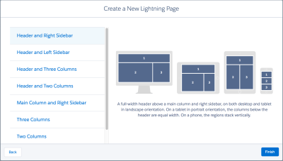
If you’re looking for some inspiration, here are some common layouts that our UX specialists recommend.
Finally, remember that you can also use the built-in layout templates provided by the Lightning App Builder. That can be a time-saver if you wish to build a simple high-level page layout without having to code it.