You know what they say — time flies when you’re having fun! And we’ve been having a lot of fun since Lightning Experience launched two short years ago. This blog post covers several enhancements in the Winter ’18 release which might affect your components and Visualforce pages.
In addition to a ton of new features, Lightning Experience also introduced us to a completely new look. This new look was based on the Salesforce Lightning Design System — a living design system containing a modern UI framework. For developers, the Salesforce Lightning Design System, or SLDS for short, provides the blueprint for building on the Salesforce platform. Using the HTML and CSS provided by SLDS we can ensure that our components and applications look and feel like the rest of Lightning Experience – even as the look of Lightning Experience evolves.
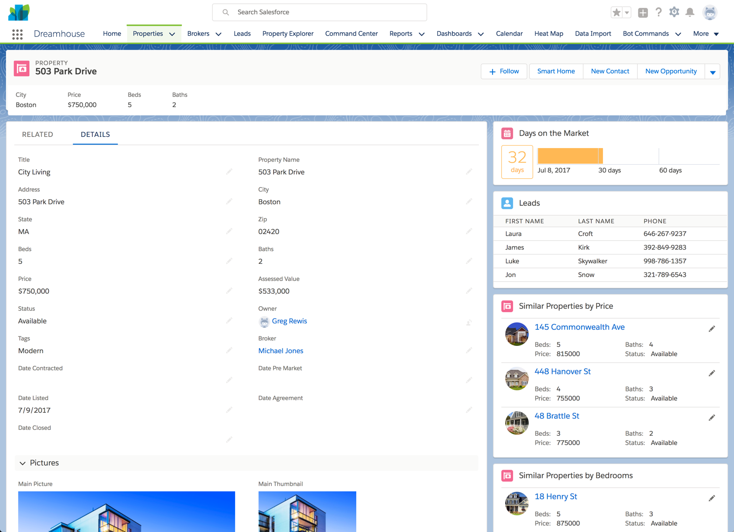
With Winter ’18, you’ll immediately notice an evolution in the look of Lightning Experience. This evolution is the result of research and feedback from across the Salesforce ecosystem. We have made global changes to improve the legibility of pages, increase content density, and improve the contrast between content cards and the background. The new background image and color helps eliminate the feeling of “snow blindness” that many users felt, making the content areas of a page more discernible.
Background changes
The addition of a background color and image means that Admins and Developers alike need to check your custom Lightning components and components you’ve downloaded from the AppExchange. Components which are being used on a Lightning page, now need to have a solid background in order to remain legible on the new background.
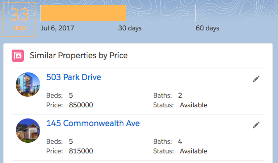
Thankfully, this is an easy fix using one of three methods. In the component’s Style file, you can simply add:
The alternative is to simply add a wrapping <div> around the content of the component and add the card class from SLDS: <div>.
Although a better approach would have been to use the <lightning:card> component in the initial design of the component. Simply wrapping the markup of the component in the <lightning:card> component provides the needed solid background. For example:
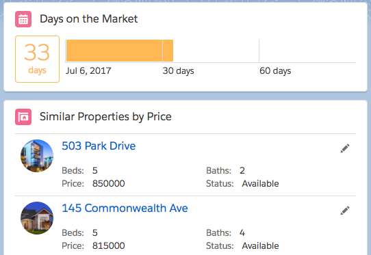
By using Base Lightning Components, you automatically get any changes to SLDS, such as the fact that cards in Winter ’18 have a white background instead of a gray background.
List Density
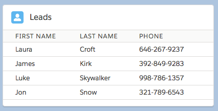
You’ll also notice that lists in Winter ’18 have increased density, allowing you to view more data in the same space.
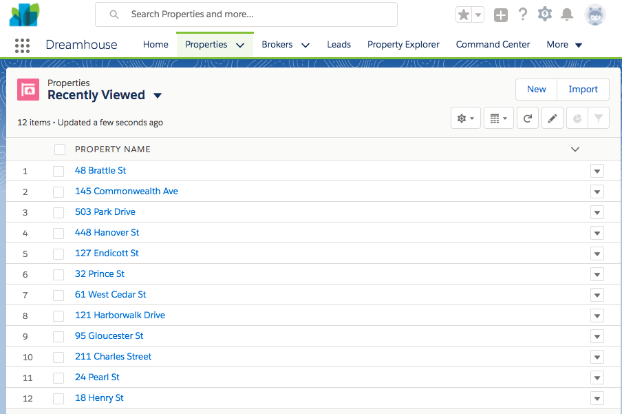
Once again, if you are using SLDS markup and CSS, in this case from a data table, you will automatically get the increased density in your components. However, if you’ve used a static height on your component (generally a bad idea), you might need to adjust it.
Page Legibility
In addition to the increased density of lists, you might also notice some subtle differences in typography. We’ve increased the size of the font used to display data to more easily allow users to scan through things like record detail layouts. If you have overridden the standard styling of fonts in your components or Visualforce pages, you’ll want to ensure that the larger font doesn’t negatively impact the layout of your component or page. This is also a great time to remind ourselves of the importance of using tokens instead of hard-coded values when building components. And on that subject, when selecting a token, it is important to use the proper semantic token, not just the one “that looks like it’s the right size”.
Static Resources
Lightning components and Visualforce pages that have been built with a static resource version of SLDS could potentially look out of place now, due to the fact that these static versions of SLDS will obviously not get the design updates to SLDS. If at all possible, these components and pages should be updated to use the current version of SLDS instead of a static resource. Additionally, it is a best practice to ensure that all of your own custom CSS is scoped to avoid conflicts with SLDS styles and overrides.
Finally, if you have been using SLDS in Visualforce via the <apex:slds /> tag, your Visualforce pages will also inherit the new styling in Winter ’18. However, you should still take a look to ensure that any custom styling does not conflict with these new changes.
Delaying Rollout of the New Look
We realize, of course, that some orgs might have a significant number of components that need to be updated, whether they have been created internally or downloaded from the AppExchange. Due to this, you might want to delay the rollout of the new look until all of your updates have been completed. As an Admin, you can disable this background image and color in Setup, reverting the background color of pages to the same white color used in Summer ’17 before these UI enhancements.

Next Steps
We’re excited about the enhancements to the Lightning Experience UI and hope you are too! For developers, you don’t need to wait to make any needed adjustments to your components, as covered above. You can make these changes now in Summer ’17 so you’re ready to go. If you want to learn more about building with Lightning Experience in general, check out this Develop for Lightning Experience module on Trailhead. We suggest you test affected components and pages once you gain access to Winter ’18 (e.g. in pre-release or sandbox). AppExchange Partners should test and push any required updates to their managed packages as soon as possible to ensure customers have the best experience when Winter ’18 goes live.