Salesforce Connect (Formerly Lightning Connect) is an exciting product that allows organizations to connect external data sources to their Salesforce instance. One way this connection is done uses the OData protocol, but you can now write your own connector in Apex as well. Instead of Standard or Custom Objects, this external data is represented as External Objects. Full Read/Write capability now exists for Salesforce Connect. However, the key is that the data is not persisted in Salesforce.
The standard Salesforce Reporting engine cannot be used on External Objects (due to this lack of persistence within Salesforce), so reporting can only be done using Apex SOQL queries surfaced in some form. This blog posts shows two solutions to getting some basic charts and reports for External Object data, using custom Visualforce pages and Apex Controllers. Note that certain DML functions cannot be performed on External Objects, so I had to accumulate External Object data to create totals using Maps and Wrapper Classes. This also addressed the challenge of outputting multiple sets of data (totals and orders) on the same page.
There were two Salesforce Connect reporting solutions created:
- An enhanced list view of an External Object.
- A simple report of External Object data that includes charts and a list that has totals of Sales Orders by customer.
Solution 1: An Enhanced List View
The first solution results in a Controller for the List view page. Note that it’s basically just a SOQL query:
The Visualforce page simply lists out each record for the External Object (based on the query) and does some basic formatting:
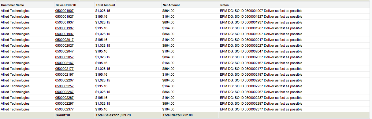
The following image shows sample output of the list view.

Solution 2: A Simple Report on a Visualforce Page
In this solution, the Controller for the Report page does a little bit more. It uses a SOQL query and some accumulation logic to be able to prepare the data to be displayed on the Visualforce page:
The Visualforce page for the Report first outputs two charts based on the accumulation data, and then outputs the records based on the SOQL query (with some formatting):
The following image shows sample output of the Visualforce page as a chart and report detail.
Chart:

Detail:
Here are the two Test Classes for the Controllers. Note: these Classes provide over 90% coverage:
Next Steps
Here are some things you might try next:
- Port the solution to other data sets as appropriate.
- Broaden the queries to more Accounts (parameterize the accounts used for the queries).
- Build Visualforce components and detail views.
Like everything at Salesforce, this was a team effort. Many thanks to David Scruggs for letting me scattershot him with questions during the process, and to Tim Long for listening as I explained what I was trying to do… and for giving me encouragement when I got stuck. Steve Cox with Enablepath was particularly helpful in helping me with the tests and refactoring the code.
Thanks for reading. Please let me know your thoughts in the comment section below.