Lightning Aura Components Developer Guide
 j
jBuild a Custom Navigation Model for Your Flow Screens
Example
This component (c:choiceNavigation) displays a script and a choice in the form of buttons.
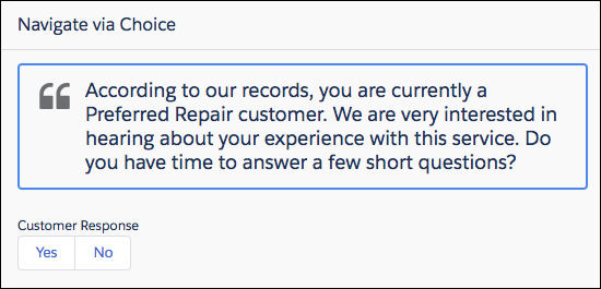
c:choiceNavigation Component
1<aura:component implements="lightning:availableForFlowScreens" access="global" >
2   <!-- Get the script text from the flow -->
3   <aura:attribute name="scriptText" type="String" required="true" />
4   <!-- Pass the value of the selected option back to the flow -->
5   <aura:attribute name="value" type="String" />
6
7   <!-- Display the script to guide the agent's call -->
8   <div class="script-container">
9      <div class="slds-card__header slds-grid slds-p-bottom_small slds-m-bottom_none">
10         <div class="slds-media slds-media_center slds-has-flexi-truncate" >
11            <div class="slds-media__figure slds-align-top">
12               <h2><lightning:icon iconName="utility:quotation_marks"
13                  title="Suggested script" /></h2>
14            </div>
15            <div class="slds-media__body">
16               <ui:outputRichText class="script" value="{!v.scriptText}"/>
17            </div>
18         </div>
19      </div>
20   </div>
21   <!-- Buttons for the agent to click, according to the customer’s response -->
22   <div class="slds-p-top_large slds-p-bottom_large">
23      <p><lightning:formattedText value="Customer Response"
24         class="slds-text-body_small" /></p>
25      <lightning:buttongroup >
26         <lightning:button label="Yes" aura:id="Participate_Yes"
27            variant="neutral" onclick="{!c.handleChange}"/>
28         <lightning:button label="No" aura:id="Participate_No"
29            variant="neutral" onclick="{!c.handleChange}"/>
30     </lightning:buttongroup>
31   </div>
32</aura:component>
c:choiceNavigation Design
The design resource includes the scriptText attribute, so you can set the script from the flow.
1<design:component>
2   <design:attribute name="scriptText" label="Script Text"
3      description="What the agent should say to the customer" />
4</design:component>
c:choiceNavigation Style
1.THIS.script-container {
2   border: t(borderWidthThick) solid t(colorBorderBrand);
3   border-radius: t(borderRadiusMedium);
4}
5
6.THIS .script {
7   font-size: 1.125rem; /*t(fontSizeTextLarge)*/
8   font-weight: t(fontWeightRegular);
9   line-height: t(lineHeightHeading);
10}
c:choiceNavigation Controller
When the user clicks either of the buttons, the JavaScript controller calls navigateFlow(“NEXT”), which is the equivalent of the user clicking Next.
1({
2   handleChange : function(component, event, helper) {
3      // When an option is selected, navigate to the next screen
4      var response = event.getSource().getLocalId();
5      component.set("v.value", response);
6      var navigate = component.get("v.navigateFlow");
7      navigate("NEXT");
8   }
9})
defaultTokens.tokens
The script in c:choiceNavigation uses tokens to stay in sync with the Salesforce Lightning Design System styles.
1<aura:tokens extends="force:base" >
2</aura:tokens>