Load a Custom UI for Your Activity
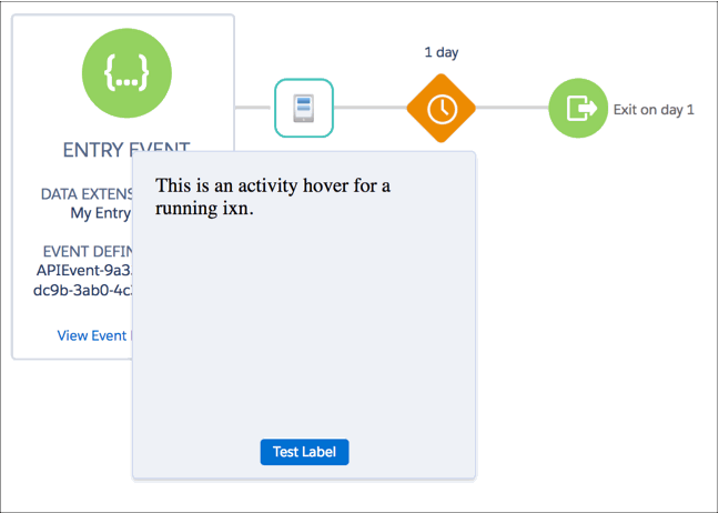
Custom hover UIs are used to display information. While a journey is in running mode, you can configure a custom hover UI to load for an activity. This hover UI is optional and appears only if there’s a userInterfaces.runningHover object in the config.json. The hover UI contains an iframe that loads the URL that the runningHover object specifies.
To define default outcomes, define runningHover and runningModal in the activity's config.json under the userInterfaces object.
The hover UI contains a button labeled More Details, which closes the hover and opens a larger modal element. This modal contains an iframe that loads the URL specified in the runningModal object. The iframe supports Postmonger's destroy event. Users click the X that is shown by default to exit. If you provide a button, such as a Cancel button, along with the modal's default close method, Postmonger's destroy event closes the iframe when the user clicks Cancel or X.
You can’t hide the More Details button, but you can customize the text by setting a runningHoverButtonLabel in the config.json's lang object.
Both the runningHover and runningModal URLs load inside an iframe, so any JavaScript you run within the iframe works. You can make dynamic decisions about what to show or hide either from the server hosting the URL, or by using JavaScript in the browser. While the URLs are static, you can make them dynamic by pointing them at a server resource that redirects the iframe.
Interacting with a hover UI and modal using Postmonger events works just as it does for activities, but with limited interactivity. For example, you can't use the updateActivity method or its equivalent.
Hover UIs and modals are initialized by calling their respective context-dependent initialization Postmonger events.
-
The running hover's iframe is 200 px x 243 px.
-
The running modal's iframe is 420 px x 560 px.
iframe dimensions can’t be resized.