Customizing the iOS Login Screen Programmatically
Mobile SDK for iOS provides extensive options for customizing the style and behavior of the login screen’s navigation bar. You can make simple declarative changes to control widget appearance and visibility, or you can reimagine the navigation bar by extending the login view controller class.
Here’s the standard Salesforce login screen.
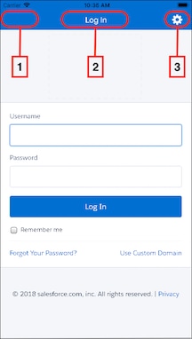
Navigation bar widgets you can customize include the back button (1), which is normally hidden, the title (2), and the Settings icon (3). You can also hide the entire navigation bar. By default, the login screen shows both the top navigation bar and its embedded Settings icon.
The Settings icon  is often referred to as the “gear” icon due to its sprocket-like shape. Customers can use the Settings icon to select a login server from a built-in list, or to specify a custom login URI. Some companies, however, don’t allow users to choose the login server. To disable login server selection, you can hide either the Settings icon itself or the entire navigation bar. You can also customize the navigation bar’s color and the color and font of its text. Use the following
 SFSDKLoginViewControllerConfig properties to control the visibility and appearance of these UI elements.
Controls the display of the Settings icon only. Does not affect the visibility of the navigation bar.
- Behavior
Value Meaning YES(default)Default value. The Settings icon is visible and accessible. NOThe Settings icon is hidden. Users cannot access the login host list and cannot add custom hosts.
Controls the display of the navigation bar, which in turn hides the Settings icon.
- Behavior
Value Meaning YES(default)Default value. The navigation bar is visible. The Settings icon display depends on the showSettingsIconproperty.NOThe navigation bar and the Settings icon are hidden. Users cannot access the login host list and cannot add custom hosts.
To hide the gear icon in hybrid apps, apply these steps in the native wrapper app.
You can set the following style properties:
navBarColornavBarTextColornavBarFont
The following example shows how to set the Settings icon visibility and navigation bar style. You import the header file and add the subsequent lines to the application:didFinishLaunchingWithOptions: method of your AppDelegate class.
To provide in-depth customization of the navigation bar, extend the SFLoginViewController class and implement the required methods. Doing so gives you the power to
- Enable the back button—Some developers enable the back button to enhance the customer experience if login fails. You’re responsible for providing a custom action if you enable the back button. If you don’t customize the action, Mobile SDK uses its default behavior for failed logins, which ignores the back button.
- Override the default title widget—You can provide your own title text and define custom actions.
- Override the default Settings icon—You can substitute a custom icon for the gear image.
Here’s a partially coded example.
-
Extend
SFLoginViewController. -
In the
application:didFinishLoadingWithOptions:method of yourAppDelegateclass, set up the following block.
See Also