Visualforce Developer Guide
 j
jPie Charts
The most common customizations to <apex:pieSeries> charts is to colors
and labels. Use the colorSet attribute and the <apex:chartLabel> component that were demonstrated in previous examples.
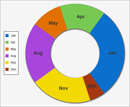
To create a ring chart instead of a pie chart, set the donut attribute. The donut attribute is an integer between
0 and 100 and represents the percentage of the radius of the hole.
Here’s a simple ring chart:
1<apex:chart data="{!pieData}" height="400" width="500" background="#F5F5F5">
2    <apex:legend position="left"/>
3    <apex:pieSeries labelField="name" dataField="data1" donut="50">
4        <apex:chartLabel display="middle" orientation="vertical"
5            font="bold 18px Helvetica"/>
6    </apex:pieSeries>
7</apex:chart>