Visualforce Developer Guide
 j
jUser Input and Interaction
Without a keyboard and mouse, standard HTML forms can be difficult for users to fill out and interact with on mobile devices, especially phones. For Visualforce pages that don’t use JavaScript remoting to make requests, choose Visualforce components for form input with an eye towards mobile users. No other change you can make to your Visualforce pages will have a larger usability impact than taking advantage of new HTML5 and mobile browser features to improve your forms and user interface controls.
Choose Efficient Input Elements
Use <apex:input> to get user input whenever possible. <apex:input> is an HTML5-ready, mobile-friendly, general-purpose input component that adapts to the data expected by a form field. It’s even more flexible than <apex:inputField> because it uses the type attribute to allow client browsers to display type-appropriate user input widgets, such as a date picker, or use a type-specific keyboard that makes entering input on a mobile device much easier.
You can also use <apex:inputField> to create an HTML input element for a value that corresponds to a field on a Salesforce object. <apex:inputField> adapts the HTML generated to correspond with the data type of the underlying sObject field. Usually this is what you want, but if it isn’t, use the type attribute to override the automatic data type detection. However, be aware that <apex:inputField> generates a lot of HTML, and requires additional resources to load, which means it’s not the most efficient component to use over a mobile wireless connection.
Use the type Attribute to Create Mobile-Friendly Input Elements
Set the type attribute on <apex:input> components—and <apex:inputField>, if you’re using it—to display data-type-specific keyboards and other input user interface widgets that are easier to use on touchscreens. The value is passed through to the generated HTML <input> element, for display in the Salesforce app.
As users step through form elements, the input method for that form element adapts for the type of data expected. Text fields show the standard keyboard, email fields show an email-specific keyboard with characters like the “@” sign and “.com” assigned to keys, date fields show a date picker, and so on.
1<apex:form >
2
3    <apex:outputLabel value="Phone" for="phone"/>
4    <apex:input id="phone" value="{!fPhone}" type="tel"/><br/>
5
6    <apex:outputLabel value="Email" for="email"/>
7    <apex:input id="email" value="{!fText}" type="email"/><br/>
8
9    <apex:outputLabel value="That Number" for="num"/>
10    <apex:input id="num" value="{!fNumber}" type="number"/><br/>
11
12    <apex:outputLabel value="The Big Day" for="date"/>
13    <apex:input id="date" value="{!fDate}" type="date"/><br/>
14
15</apex:form>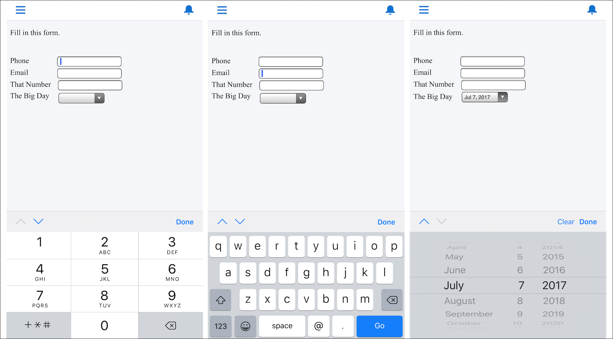
These type-specific keyboards make filling in forms much easier for people using their mobile devices.
- date
- datetime
- datetime-local
- month
- week
- time
- number
- range
- search
- tel
- text
- url
The HTML type attribute, including new HTML5 features, is a standard part of HTML. For additional details about the type attribute, what you can use it for, and how it relates to mobile development, see WHATWG’s list of input type attribute values and descriptions. Not all values are supported on Visualforce input components. If you want to use a value not supported by Visualforce, use static HTML instead of a Visualforce tag.
Use HTML5 Pass-Through Attributes for Client-Side Validation
Set pass-through attributes on your <apex:input> and other Visualforce components to enable other HTML5 features, such as client-side validation. By performing basic validation on the client side, you can avoid sending a request to the server and waiting for a response, when there are easily-corrected errors on a form.
1<apex:input id="email" value="{!fText}" type="email"
2    html-placeholder="you@example.com"
3    html-pattern="^[a-zA-Z0-9._-]+@example.com$"
4 title="Please enter an example.com email address"/>- placeholder (set using the html-placeholder attribute)—adds ghost text to the field to show sample input to the user.
- title (set using the title attribute on <apex:input>, and the html-title attribute on components without a title attribute)—adds an error message to use if the field fails client-side validation.
For inspiration for how you can use attributes to enhance the usability of HTML <input> elements, HTML5 Forms Introduction and New Attributes is a good survey of the new features in HTML5. For further details, especially for mobile users, and details of client-side forms validation, see Client-side form validation and Improving the user experience on mobile devices in WHATWG’s HTML: The Living Standard.