Page Designer
Developers create page types and component types. Merchants then use these types to create Page Designer pages in the visual editor in Business Manager.
Only existing customers can access some of the links on this page. Visit Salesforce Commerce Cloud GitHub Repositories and Access for information about how to get access to the repositories.
Developers play an important role in implementing Page Designer. Developers work with the ecommerce marketing director to determine the pages, components, layouts, and assets required for the storefront. The developer then creates and uploads custom cartridges. These cartridges contain reusable page types, component types, and visual editor artifacts that help merchants quickly create custom pages.
Page Designer is a B2C Commerce feature that supports standard development processes and tools for creating reusable page types and component types. Merchants use a visual editor in Business Manager to design, schedule, and publish custom storefront pages. They create pages by dragging page and component types on to the canvas. Merchants can use the same page and component types to create various pages independently, without going back to the developer for updates. This topic applies to B2C Commerce.
The typical Page Designer implementation process includes these steps.
- The ecommerce marketing director meets with the developer to discuss the pages, components, layouts, and assets required for the storefront.
- The developer creates the reusable page types and component types that support the ecommerce marketing director’s requirements.
- The developer uploads two custom cartridges to a site: one containing page and component types, and another containing supporting UI artifacts.
- The merchant uses the Page Designer visual editor in Business Manager to build storefront pages. They use the page and component types that the developer implemented.
We provide example page types and component types to help you quickly get started with Page Designer.
-
If you don’t have a GitHub account, see Salesforce Commerce Cloud GitHub Repositories and Access.
-
Search for the
storefront-reference-architectureorpage-designer-referencerepository.- Storefront Reference Architecture (SFRA) includes Page Designer page types and component types optimized for use with SFRA. The latest version of SFRA is in the SFRA repository.
- Page Designer reference cartridges for SiteGenesis are in the SiteGenesis repository.
-
Click Clone or download to copy the repository to your local system.
-
If you downloaded the repository, expand the .zip file.
On macOS, use the command-line unzip utility to expand the files.
For information about how to get started with the SiteGenesis page-designer-reference repository, see SiteGenesis README.
For details about the Page Designer example pages and components for the SiteGenesis page-designer-reference repository, see SiteGenesis Implementation Guide.
In addition to following standard B2C Commerce development guidelines, follow these Page Designer-specific recommendations.
-
Do as much planning and requirements gathering upfront as possible. Work with the merchant and ecommerce director before developing page types and component types.
-
Create self-contained components so any region can handle them as independent units. To support self-containment, give each component its own default styling, although at times you can adjust the styling by specifying custom render settings.
-
Be careful when changing meta definitions after merchants have created page and component instances. Don’t make incompatible changes. For example, changing the
typevalue for a component attribute creates an inconsistency between the meta definition and database data. In this case, create a component type and deprecate the old one. -
For sites that share libraries, assign the same data and the same set of cartridges with the same set of page and component types to each site. Sharing data and code makes sure that there aren’t inconsistencies between meta definitions and data. For example, you can have a page that was known in one site but not another, or two sites that use the same ID for different component types with different sets of attributes, which would result in validation errors. Keep in mind that data and code are shared with different mechanisms that can have multiple relationships to sites, as follows:
Entity Can Be Assigned To Cartridge 1…n sites Library 1…n sites Content Asset 1 library Page 1 library Component 1 library Catalog 1…n sites -
Implement anchor tags on your Page Designer pages.
For example, you can build a page with anchors to each section. You can also create a component at the top with images or links that anchor to sections below. Follow these steps:
-
In each component, use a string attribute that defines a tag.
<a name="string_attribute_value"/> -
When creating the links, reference the tag.
<a href="#string_attribute_value">Link to the string_attribute_value section</a>
-
-
Dynamically pull a profile attribute into a Page Designer component.
For example, to display
firstNameorcompanyNamein a component on the homepage after a customer logs in, such as “Welcome back, {firstName}”, use:Request.getSession().getCustomer().Be sure it isn’t cached.
-
Duplicate a Page Designer page to a new library.
Using the Shared Library Page Designer, pages are automatically duplicated within the shared library. They’re also created offline allowing the merchandiser to determine if the page is available within the other locations.
-
Caching for Page Designer pages is similar to other pages. For more information, see Page Caching.
-
Check the Page Designer page cache time to live.
There’s no Page Designer-owned cache time to live, only what the customer developers set in their scripts. Use the “cache information” tool in SFTK to check how long a given page is cached. Select the top or page level cache icon, and look for a remote include of the pipeline “Internal - Page Designer”.
The following tips have been found to quickly discover and help solve many common errors.
-
Refer to the browser developer console to determine if there are errors shown.
- Check for general javascript errors, induced by either the storefront itself or Page Designer.
- Check the network tab in the browser console and monitor the XHR requests (for example, see any API request going back and forth).
-
Refer to the server logs to determine if there are errors shown.
- In Business Manager, click App Launcher
 and then select Administration > Site Development > Development Setup.
 - Browse the log files checking especially the error logs for any related entries, such as script exceptions.
- In Business Manager, click App Launcher
-
Work within Page Designer Optimal Performance.
Page Designer Pages within Business Manager aren’t cached allowing Content Editors and Merchandisers to see their updates immediately. For optimal performance, we recommend you make sure the nesting within components is kept to 5 or under.
-
If you’re experiencing a ‘Service Unavailable Error - 500’, this is not a Page Designer specific issue. Check the error logs to determine the issue.
Page caching is skipped in Page Designer editing or previewing mode. This makes changes immediately visible to the user. In the plain storefront, customer page cache instrumentations apply as coded. Slow rendering typically results from the page not being cached yet or a low-performing page implementation.
For slow performing pages, we recommend you check to see if the implementation has to be revised:
- In the storefront, use the Storefront Toolkit.
- Enable the Cache Info tool.
- Look for the cache symbol for pipeline “Internal - Page Designer”, and check its caching status.
For uncached occurrences that must be revisited for an implementation change, we recommend you:
- Use page caching unless it’s ultimately necessary to not cache the given page. See Page Caching for more information.
- Refactor the business logic of the page avoiding costly operations, or mass amounts of operations, during one request.
To implement page types and component types, you must include a meta definition file and a script file for each page type and component type in a custom cartridge.
Each page type and component type requires a JSON meta definition file. For page types, the file describes regions where merchants can place components. For component types, the file describes merchant-configurable attributes and can also define regions.
Put the meta definition file in one of the following directories of the custom cartridge, or any arbitrary subdirectory within these directories:
- Page types:
{your_cartridge}/cartridge/experience/pages - Component types:
{your_cartridge}/cartridge/experience/components
The meta definition file name can include only alphanumeric or underscore characters. If you use a subdirectory within /experience/pages or /experience/components, subdirectory names must also use only alphanumeric or underscore characters.
To view schema files that describe the JSON formatting for the meta definition file, see Page Designer JSON Schemas.
For PWA Kit implementations, you can create headless pages and components that render using React instead of ISML. This requires two additional fields in your meta definition files:
Headless Page Designer only works for pages deployed to Managed Runtime (MRT) with the corresponding Business Manager configuration. You must configure your MRT URL in Business Manager under Administration > Sites > Manage Sites > Your Site > MRT Configuration.
arch_type field:
- Set to
"headless"for PWA Kit React-only rendering (no ISML required) - Set to
"controller"or omit for traditional ISML rendering - Enables hybrid storefronts with both ISML and headless pages, supporting incremental migration
- When set to
"headless", custom JavaScript in Page Designer metadata is NOT executed—all logic must be in your React components
route field (pages only):
- Specifies the URL path where the page is accessible (e.g.,
"/"for homepage,"/about"for about page) - Page Designer uses this route to load your PWA Kit storefront in edit mode
- Supports dynamic routes with parameters (e.g.,
"/product/:productId","/category/:categoryId") - Route parameters must match the attribute IDs defined in the page’s aspect type
Example headless page:
Example headless component:
For more information about implementing headless Page Designer with PWA Kit, see Page Designer for PWA Kit.
This example promotion page type meta definition file, named promopage.json, defines three regions for the promotions page: header, main, and footer. The header and footer regions can display only one component at a time, as specified by max_components = 1. The region_definition for the main region doesn’t include a max_components value, indicating that the main region can display any number of components. The main region uses component_type_exclusion to specify that components of type banner aren’t allowed in the main region.
The max_components value restricts the number of components rendered for a region at a time, but the region can contain any number of components. Therefore, display different components for different customers or on different schedules. For example, you could have a banner region that displays one component in winter and a different component in summer.
This example banner component meta definition file (banner.json) defines four merchant-configurable attributes: image file, alt text, size, and Magic Unicorns. The Magic Unicorns attribute uses a custom UI control (com.sfcc.magical) to let merchants select a unicorn. In the visual editor, attributes appear in groups. These four attributes appear in a group labeled Banner Image Configuration.
The default_value setting for an attribute is used only for rendering the page in the storefront or previewing in the visual editor. The default_value isn’t shown as preselected in the visual editor that the merchant uses to configure the component. Rendering behavior based on settings for required and default_value is as follows:
Requiredis true and adefault_valueis configured: Thedefault_valueis assigned to the attribute for rendering the page, but isn’t shown as preselected in the visual editor. If the merchant doesn’t configure a value for the attribute and saves the component, no error message is presented.Requiredis false and adefault_valueis configured: Thedefault_valueis assigned to the attribute for rendering the page, but isn’t shown as preselected in the visual editor. If the merchant doesn’t configure a value for the attribute and saves the component, no error message is presented.Requiredis true and nodefault_valueis configured: If the merchant doesn’t configure a value for the attribute and saves the component, an error message is presented.Requiredis false and nodefault_valueis configured: If the merchant doesn’t configure a value for the attribute and saves the component, no error message is presented.
The 3column.json meta definition file is for a component type that represents a layout of three columns. Each column is a region in the meta definition file.
Define custom page-level attributes for a page type. For example, define custom attributes for title, Image, and Description. Merchants can use those attributes to specify the image and text that appears in the search results for a page.
Define the page-level attributes in the meta definition file for the page type. This example shows three attributes defined for a Search Results Title, Search Results Image, and Search Results Description.
Prepopulating a region with default components is a best practice that guides a merchant in creating a page. To specify that a region contains specific components by default, use the default_component_constructors property in the meta definition file for a page type. Use this property in the meta definition file for a component type that includes a region. When the merchant creates a page in the Visual Editor using the page type or component type, the default components are already populated in the region. The merchant can delete the components if necessary.
The following example specifies that the main region of the page is prepopulated with a default component. The component has id commerce_layouts.productDetailand name Product Detail Layout.
Each page type or component type requires a corresponding script file. The script file must have the same name as the meta definition file but with a .js extension. For example, promopage.json requires a script file named promopage.js.
The script file name can include only alphanumeric or underscore characters. Put the script file at the same location as its meta definition file. For a component type named headlinebanner, the files would be at:
mycartridge/cartridge/experience/components/assets/headlinebanner.json
mycartridge/cartridge/experience/components/assets/headlinebanner.js
The script file must include a render function that returns the markup for the page. Assemble the markup using any process you want, as long as the result is a string. In many cases, the render function calls an ISML template to which it passes information about the page or component type and its content. If you use an ISML template, you must use the dw.util.Template API to render the markup from the template. Don’t use dw.template.ISML because it doesn’t return a string, and it writes the markup to the response stream right away.
In this promotion page script file, named promopage.js, the context object that is passed to the render function is of type dw.experience.PageScriptContext. It provides access to:
context.page—Currently rendered pagecontext.renderParameters—Parameters passed to PageMgr.renderPage(pageID, parameters)context.content—Attributes set in the custom logic (not defined by the merchant)
In this banner script file, named banner.js, the context object that is passed to the render function is of type dw.experience.ComponentScriptContext. It provides access to:
context.component—The currently rendered component.context.componentRenderSettings—Render settings provided by the hosting region. Optionally override these render settings that are passed in from the region with settings specific to the component.context.content—Attributes as defined in the meta definition file for the component and then configured by the merchant in the Page Designer visual editor, or as defined in the custom logic.
Each attribute in the meta definition file has an assigned type. The type determines how merchants set the value in the visual editor. For example, a file type displays a file selection modal for browsing library files. An enum type displays a single select box for choosing from allowed values.
This table describes the type options for component attributes and how those options are displayed in the Page Designer visual editor.
| Component Attribute Type | Attribute Semantics | Visual Editor UI Control |
|---|---|---|
| boolean | Boolean | Check box |
| category | String representing a catalog category ID | Category picker |
| cms_record | Record from the Salesforce CMS (Content Management System) | User is presented with a modal window to select the CMS record. After the user selects the CMS record, the edit panel displays the UI controls necessary to configure the attributes of the slected CMS record. |
| custom | String enclosed in curly brackets {} that represents a JSON object | Text area or custom UI control |
| enum | Enumeration of either string or integer values. | Select box (single select) |
| file | String representing a file path within a library | File picker |
| image | String representing a configurable image JSON | Image picker that lets users select an image and specify a focal point on that image. The image dimensions are also stored and can be accessed, along with the image name and focal point, using the Image API. |
| integer | Integer | Input field |
| markup | String representing HTML markup | A rich text editor that allows semantic formatting options to produce HTML markup |
| page | String representing a page ID | Page picker |
| product | String representing a product SKU | Product picker |
| string | String | Input field |
| text | String | Text area |
| url | String representing a URL | URL picker |
| image | String representing a configurable image JSON | Image picker that lets users select an image and specify a focal point on that image. The image dimensions are also stored and can be accessed, along with the image name and focal point, using the Image API |
The content attributes from the context object (the content dictionary) are defined in a map. Attribute IDs are keys, and resolved values are values. A resolved value has been converted to B2C Commerce API objects when needed. For example, a product attribute (product SKU) becomes a dw.catalog.Product instance. Strings don’t need conversion. The following table lists content attribute types and their B2C Commerce API objects.
| Content Attribute Type | B2C Commerce API Value |
|---|---|
| category | dw.catalog.Category |
| cms_record | dw.experience.CMSRecord |
| custom | dw.util.Map |
| file | dw.content.MediaFile |
| image | dw.experience.image.Image |
| page | dw.experience.Page |
| product | dw.catalog.Product |
The render function of a page type creates the page’s HTML markup. Typically, the page type’s render function calls an ISML template that uses PageMgr.renderRegion() to render each region of the page.
In this example, a page calls an ISML template. This ISML template renders three regions: header, main, and footer.
Each PageMgr.renderRegion() function in the page ISML finds all assigned and visible components in each region and calls each component’s render function, which in turn calls its own ISML template, as in the following example:
As each region and component is rendered, Page Designer creates an HTML element to wrap the content. Specify which HTML element to use as the wrapper and which attributes to assign to the wrapper using the dw.experience.RegionRenderSettings and dw.experience.ComponentRenderSettings APIs. For more information, see:
By default, the HTML wrapper for regions and components is div. The default CSS class for regions is experience-region experience-<{region_definition_id}>. The default CSS class for components is experience-component experience-<{componenttype_id}>.
Component type ID values include dots, for example, assets.productile. When used in the CSS class name, the dot is replaced with a hyphen, for example, experience-component experience-assets-productile.
For example, for a region with id my_region and three components, two of type my_component_type_1 and one of type my_component_type_2, the default HTML wrapper is:
Sometimes you want a component styled differently based on its containing region. For example, you have a product tile component with default render settings. You also have a carousel component that scrolls through other components. When the product tile appears in the carousel, you want it to use carousel-specific styling.
You could use a custom CSS class item for the first and second components. Then use item active for the third component to mark it as active. Here’s the HTML wrapper for the carousel.
Here’s the code to set the custom render settings for the carousel. You could include this code in the render function of the script file for the component.
The Page Designer reference implementation available in GitHub includes helper functionality to streamline this code.
A page type, component type, or custom attribute editor ID combines the subdirectory path and file name without extension. Separate directory levels and the file name with periods. For example, a page type named homepage directly under cartridge/experience/pages has ID homepage. If the files are in storefront/campaigns subdirectory, the ID is storefront.campaigns.homepage.
When component types and page types are persisted in the database, their IDs are prepended with the prefixes page. or component.. Those prefixes, plus the IDs of the page types and component types, can’t exceed 256 characters, or else errors occur. Adjust the file names or move the meta definition file and script file to a higher level in the directory structure to shorten the ID.
| Location of Page Type, Component Type, or Custom Control | ID |
|---|---|
mycartridge/cartridge/experience/components/assets/headlinebanner.json | assets.headlinebanner |
mycartridge/cartridge/experience/components/assets/banners/headlinebanner.json | assets.banners.headlinebanner |
mycartridge/cartridge/experience/pages/promopage.json | promopage |
mycartridge/cartridge/experience/pages/promotions/promopage.json | promotions.promopage |
mycartridge/cartridge/experience/editors/com/sfcc/magical.json | com.sfcc.magical |
Implement various strategies for using decorators with Page Designer pages. For example, write the script file for a page type so that you can pass in a custom decorator as a parameter when the page is rendered, or fall back to a default decorator defined in the script. Optionally, write the controller that renders the page so that a different decorator is used based on the value of a certain condition.
In this snippet, the constant DEFAULT_DECORATOR defines the default decorator location. If a different decorator is passed as a parameter, it’s used instead. The following line uses the passed decorator parameter if it exists, otherwise it uses DEFAULT_DECORATOR.
model.decorator = renderParameters.decorator || DEFAULT_DECORATOR;
When pages are displayed in the visual editor, the default decorator from the script file is used. To optimize page creation, define DEFAULT_DECORATOR to point to a lightweight decorator that loads quickly. When the controller renders the page in the storefront, pass in the full decorator location.
Choose which decorator to use based on the state of a condition. For example, in the following snippet from a storefront controller, the decorator at decoration/ajax is used if the format of the page is based on AJAX (Asynchronous Javascript and XML), but the decorator at decoration/full is used if the page isn’t based on AJAX.
A dynamic page uses dynamic attributes passed at runtime to determine storefront content. Typically, the developer creates an aspect type for a business use (like Product List or Product Details). The developer assigns the aspect type to a page type defining the layout. The merchant creates a template page and assigns it to categories. When the storefront needs a page for an assigned category, the template displays. Content is populated based on the category dynamic attribute.
For an example of how a merchant implements a Product List or Product Details template, see Create a Product List or Product Detail Page Template for Page Designer.
To implement a dynamic page, create an aspect type meta definition file. This file defines required attributes for a business use. It also defines the business object type that merchants can bind to pages. In the page type’s meta definition file, specify which aspect types are supported.
To view the schema file that describes the JSON formatting for the aspect type meta definition file, see Page Designer JSON Schemas.
Put the aspect type meta definition file in the following directory of the custom cartridge, or any arbitrary subdirectory within this directory:
{your_cartridge}/cartridge/experience/aspects
Valid values for supported_object_types are ‘category’ or ‘product’.
Using ‘category’ lets merchants assign pages to categories in the Page Designer UI. Developers can retrieve them using PageMgr.getPageByCategory.
Using ‘product’ lets merchants assign pages to products in the UI. Developers can retrieve them using PageMgr.getPageByProduct.
Create an aspect type with no supported_object_type declared. For example, you could implement a Product List page that depends on the results of a query, not the assignment of a category, to determine which products to display on the page.
The ‘attribute_definitions’ of the aspect type define which attributes should be passed in when rendering the page using PageMgr.renderPage.
The following examples show aspect meta definition files for Product List and Product Detail pages. The Product List page aspect type has one category attribute and supports the category object type. The Product Detail page aspect type has product and category attributes. Both support the category object type, which merchants assign during page creation. All products in assigned categories use the Product Detail page.
Specify supported aspect types in the page definition file. This example page type supports the plp aspect type and requires its category attribute. The controller or script uses this category attribute to render the page.
Create a page type that supports more than one aspect type. During page creation, the merchant selects which aspect type to use for the page by selecting a Page Purpose in the page creation wizard.
A component attribute can include a dynamic_lookup property. The dynamic_lookup property specifies an attribute of the aspect. The component attribute gets its value from the aspect attribute specified.
In the following example, the component attribute named Category includes adynamic_lookup property. The dynamic_lookup property specifies the aspect attribute category. At runtime, component attribute Category gets its value from aspect attribute category.
In the Visual Editor, merchants can override the page’s category and assign a different one to the component. In the SFRA reference implementation, the dynamic banner uses the page’s category by default. It displays the banner image and text assigned to that category in Business Manager.
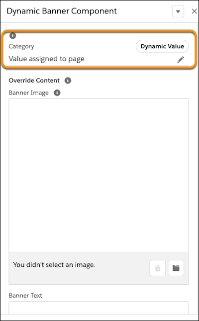
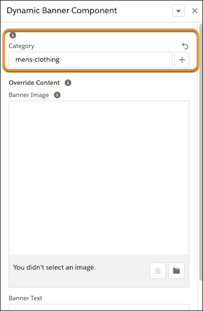
The merchant can edit the category value and assign it to something other than the value the page is using. For example, the merchant can specify that the banner component uses the category mens-clothing regardless of the category assigned to the page.
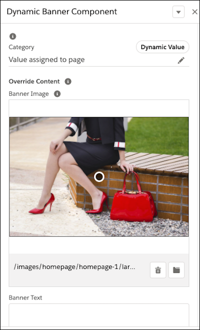
Merchants can also override component attributes separately from the dynamic category. For example, the banner can always display an image for women’s shoes and handbags regardless of category.
Aspect attributes are passed to the page through the Page.renderPage() method that takesaspectAttributes.
The following code snippet passes aspect attributes to the page during rendering:
The following code snippet checks to see if a page is assigned to the given category for a given aspect type and returns that page. If there’s no page assigned, the code walks up the category hierarchy until it either finds a category with the page assigned or it reaches root. If no page is found even for root, it returns null.
Follow best practices when developing a dynamic page.
- Use the
default_component_constructorsproperty in the page meta definition file to populate a region on the page with a component. For example, specify that the main region of a Product List page contains a Product List grid component. When the merchant creates a Product List page in the Visual Editor, the main region is already populated with the Product List grid component. This approach helps the merchant to quickly create pages that use the appropriate components. - Be specific when naming a component, clearly indicating what kind of page the component is intended for. For example, name a component intended for a Product Detail page,
Product Detail Grid. If the merchant uses a component that has attributes not specified by the aspect type assigned to the page, the component doesn’t render correctly. By naming the components carefully, help merchants create pages with the appropriate components. - Be careful when creating a page type that supports more than one aspect type. Merchants must complete the extra and potentially confusing step of selecting a page type purpose during creation. Also, a page type generic enough to accommodate more than one aspect type can make only limited use of prepopulated components, providing the merchant less guidance during page design.
To localize page and component types or display thumbnail images, create a custom cartridge. Include resource bundles for localization and thumbnail image files. Upload the cartridge to the Business Manager site.
A resource bundle contains the localized names and descriptions for each page type, component type, and component type group that you want to localize. Including a resource bundle is optional. If you don’t provide them, the visual editor uses information in the meta definition files.
Each page type, component type group, and component type requires a separate resource bundle.
Name the resource bundle files using this pattern:
{componenttype/pagetype/componenttypegroup}__{locale}_.properties
Put the resource bundles for page types and component types in this location in the cartridge:
{your_cartridge}/cartridge/templates/resources/experience/pages
{your_cartridge}/cartridge/templates/resources/experience/components
Put resource bundles for component type groups within a componentgroup subdirectory: {your_cartridge}/cartridge/templates/resources/experience/componentgroups
If type files are in a subdirectory of ../experience/pages or ../experience/components, resource bundles must be in a corresponding resources subdirectory.
| Page Type, Component Type, Component Group | Resource Bundle in Cartridge |
|---|---|
mycartridge/cartridge/experience/components/banners/headlinebanner.json | myBMcartridge/cartridge/templates/resources/experience/components/banners/headlinebanner_de_DE.properties |
mycartridge/cartridge/experience/pages/promopage.json | myBMcartridge/cartridge/templates/resources/experience/pages/promopage_fr.properties |
mycartridge/cartridge/experience/pages/promotions/promopage.json | myBMcartridge/cartridge/templates/resources/experience/pages/promotions/promopage_en.properties |
content | myBMcartrige/cartridge/templates/resources/experience/componentgroups/content_en.properties |
The resource bundle for a component type group contains only the name value of the group.
In the Page Designer visual editor, thumbnail images assist the merchant in determining which page or component to select. If you don’t provide thumbnail images, generic images are displayed.
The file name for a thumbnail images (without the extension) must match the name of the respective page type or component type, for example, promopage.png or promopage.svg. Page Designer doesn’t support a different thumbnail image for different locales.
Put thumbnail images for page types in this location.
{your_cartridge}/cartridge/static/default/images/experience/pages/{subdirectory}/{id}
The optional {subdirectory} must match the subdirectory where the pages are in the ../experience/pages directory.
For example if the page type is located in mycartridge/cartridge/experience/pages/promotions/promopage.json, the image file must be located here:
myBMcartridge/cartridge/static/default/images/experience/pages/promotions/promopage.png
Put thumbnail images for component types at this location in your cartridge:
{your_cartridge}/cartridge/static/default/experience/components/{sudirectory}/{id}
The optional {subdirectory} must match the subdirectory where the component types are in the ../experience/components directory.
For example if the component type is located in mycartridge/cartridge/experience/components/banners/headlinebanner.json, the image file must be located here:
mycartridge/cartridge/static/default/experience/components/banners/headlinebanner.png
Use Salesforce CMS to manage all your content in a single repository. Merchants can use the CMS content on a Page Designer page. For example, you develop a component type that displays a headline banner. Create and manage different options for the content of the headline banner in Salesforce CMS. When merchants add the component type to a page, they select which content to use for the headline banner from Salesforce CMS.
To use CMS content with Page Designer components, make sure your Salesforce org includes Salesforce CMS.
Contact your Salesforce Account Executive or Success Manager for information about pricing and packaging. For information about Salesforce CMS, see Salesforce Content Management System (CMS).
Connect your B2C Commerce instance to a CMS channel and assign the channel to your site library.
-
Open a support ticket and request a trust relationship between your Salesforce org and your B2C Commerce instance.
-
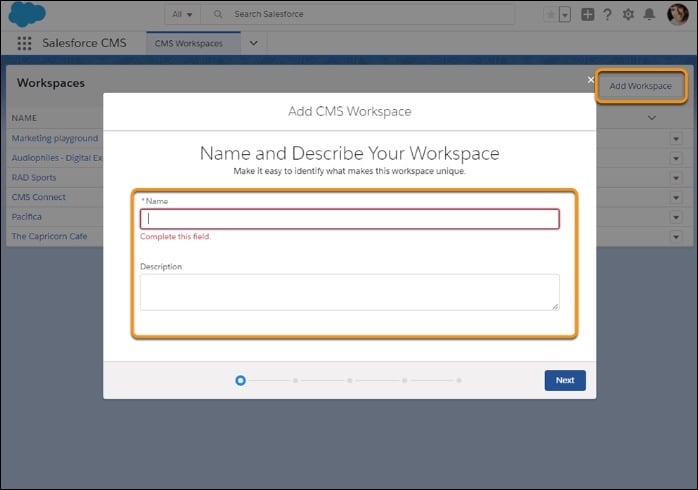
In Salesforce CMS, add a CMS workspace to host the Page Designer content or use an existing CMS workspace.
For information about creating CMS workspaces, see Create a CMS Workspace in Salesforce CMS.
-
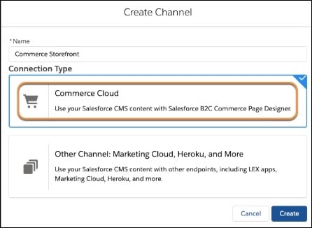
In Salesforce CMS, create a B2C Commerce channel.
For information about creating a CMS channel, see Create a CMS Channel.
-
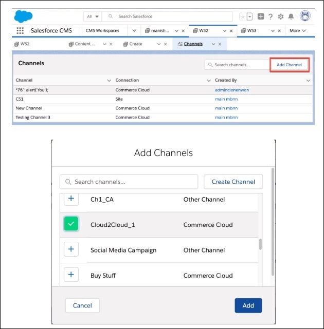
In the CMS workspace, add the B2C Commerce channel.
For information about adding CMS channels, see Add a Channel to a CMS Workspace.
-
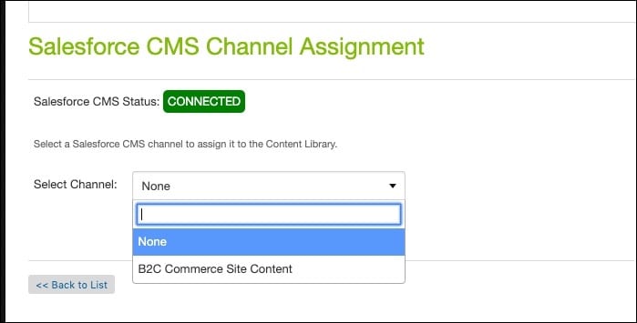
In B2C Commerce Business Manager, go to Administration > Sites > Content Libraries > site > General. Scroll to the bottom and assign the CMS channel to your site library.
Define a component type with an attribute assigned to Salesforce CMS content.
-
Determine the content required to configure the component type attribute.
For example, you want merchants to be able to include a headline banner on their Page Designer page by selecting a CMS record. Use the news content type, which already exists in Salesforce CMS, to create and manage the content for the headline banner.
If the content type you want to use in the Page Designer page doesn’t already exist in the CMS, create it. See Custom Content Types.
-
Create a component type that includes attributes assigned to type
cms_record, with thecontent_typespecified in theeditor_definitionelement.For example, the following meta definition file and script files for component type CMS Headline Banner use a Headline Content attribute of type
cms_record, withcontent_typenews.
Configure the component attribute by selecting the Salesforce CMS content and then configuring the attributes for that content.
When you select CMS content for a component attribute, it’s copied into the page. CMS updates don’t automatically appear in the component. To get updated content, reconfigure the attribute and select the content again.
The default locale for the Page Designer page isn’t necessarily the same as the default locale for the CMS content.
-
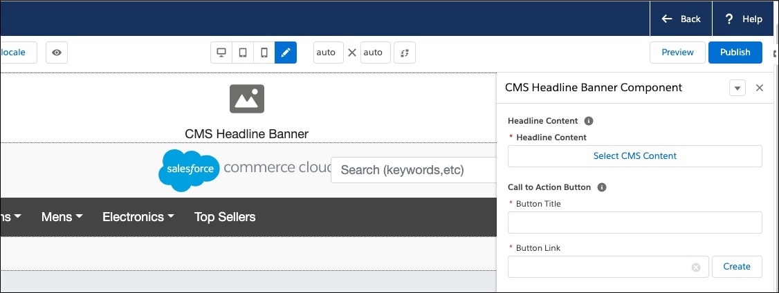
Add the component that uses Salesforce CMS content to the page.
In this example, the CMS Headline Banner component type uses CMS content to configure the Headline Content attribute.
-
In the attribute editor window, click Select CMS Content.
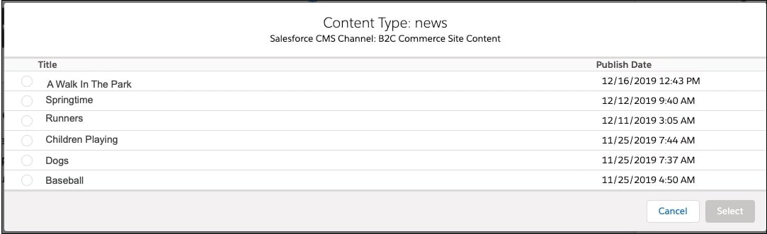
A list of the CMS content available to configure the attribute is displayed.
-
Choose the CMS content you want to use and click Select.
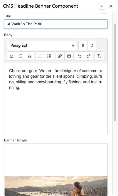
The CMS content is copied to the page. Any attributes for the CMS content that require configuration are presented in the editing pane. The CMS content for the Headline Banner in the example requires that you enter a Title, Body, and Banner Image.
-
Configure at least the required attributes for the component click Save or Save & Close.
Create a custom attribute editor for configuring component attributes. Merchants use the custom attribute editor when setting a value for the component attribute in the Business Manager visual editor.
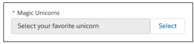
When you create a component type, you specify merchant-configurable attributes. For example, a headline banner component might have an Image attribute. Merchants must configure this attribute to select the displayed image. The type value in the meta definition file determines the UI control (check box, file picker, etc.).
Page Designer provides preconfigured type options. The file type presents a file picker. The boolean type presents a checkbox. The enum type presents a selection list.
If none of the preconfigured Page Designer UI controls are appropriate for your situation, create your own custom attribute editor. For example, you might want a custom attribute editor to let merchants select store locations on a map or choose a color for the text or background. Or, you want to let merchants place a Favorite icon on a product tile or select which Shop Now button to use.
A custom attribute editor doesn’t conflict with the platform code for Page Designer, and you can create more than one custom attribute editor for a single component type.
A custom attribute editor uses a meta definition file, script, and JavaScript/CSS resources. It operates in a self-contained client-side environment. Merchants use it in the Page Designer visual editor to configure attribute values.
In the meta definition file for the component type, define the attribute’s type as custom. If information is passed to the custom attribute editor, include that information in an editor_definition element for the attribute. In the meta definition file for the custom attribute editor, list the CSS and JavaScript resources that the custom attribute editor requires. Optionally add server-side logic or resources to initialize the custom attribute editor in the script file for the custom attribute editor. You include the meta definition file and script file for the custom attribute editor, along with the JavaScript and CSS resources, in a custom cartridge assigned to the Business Manager site.
On the client side, each custom attribute editor is wrapped in a host component containing an <iframe>. The iframe encapsulates the editor’s code and style. This sandbox environment prevents different editors on the same page from interfering.
The host and editor communicate on a dedicated channel. Page Designer adds management code to the iframe with subscribe and emit methods. These send predefined events with serializable payloads between host and editor.
For information about the messaging channel implemented for Page Designer custom attribute editors, see Channel Messaging.
In the component meta definition file, set the attribute type to custom and include an editor_definition element. The editor_definition includes the custom editor ID and optional configuration information.
This example banner meta definition includes three standard attributes: image (file), alt (string), and size (enum). It also includes a Magic Unicorns custom attribute using editor ID com.sfcc.magical. Unicorn options (Auris, Chant, etc.) are passed via the configuration element.
To view schema files that describe the JSON formatting for the meta definition file, see Page Designer JSON Schemas.
The meta definition file for a custom attribute editor references the JavaScript and CSS resources that the custom attribute editor requires.
Put the meta definition file in this directory of the cartridge or any subdirectory under this directory:
{your_bm_ cartridge}/cartridge/experience/editors
The cartridge that contains the custom attribute editor meta definition file, script file, and client-side code must be added to the cartridge path for the Business Manager site.
Use only alphanumeric or underscore characters for the file name. If you put the meta definition file in a subdirectory of /experience/editors, the subdirectory name must also use only alphanumeric or underscore characters.
To view the schema file that describes the JSON formatting for the meta definition file, see Page Designer JSON Schemas.
This example meta definition file describes a custom attribute editor that lets the user select a unicorn. Use fully qualified URLs or relative URLs in the meta definition file. Page Designer resolves relative URLs to point to the /static/default directory of the cartridge. For example, this meta definition file uses relative URLs to reference the JavaScript file magical_editor.js and the CSS file magical.css, which are in the /static/default/experience/editors/com/sfcc directory of the cartridge.
Each custom attribute editor requires a script file. The script file has the same name as the corresponding meta definition file but with a .js extension. For example, if the meta definition file for the control is magical.json, name the script magical.js.
Use only alphanumeric or underscore characters for the file name. Put the script file with its meta definition file. For a custom attribute editor named magical:
my_bm_cartridge/cartridge/experience/editors/com/sfcc/magical.json
my_bm_cartridge/cartridge/experience/editors/com/sfcc/magical.js
The cartridge that contains the custom attribute editor meta definition file, script file, and client-side code must be added to the cartridge path for the Business Manager site.
In the script file, optionally implement the init function to initialize the custom attribute editor with server-side logic or resources.
Every custom attribute editor requires a script file. If you don’t use the script file to implement the init function, you must include an empty script file in the cartridge.
This example script adds options not in the component’s editor_definition. It also includes localization and CSS resources for lists over 10 items. The editor object passed to init is type dw.experience.CustomEditor. It provides access to:
configuration—Map that contains entries passed to the client-side scripts, populated with the values provided by theeditor_definitionof the attribute in the component’s meta definition file. To extend the map, use only serializable entries, primitive types (number string, boolean),dw.util.HashMap, or JavaScript arrays. Native JavaScript objects (in curly braces) aren’t supported nor are other complex B2C Commerce script objects, such asdw.catalog.Product.dw.experience.CustomEditorResources—Collection of JavaScript and CSS URLs that the client-side iframe uses to display the custom attribute editor.
Put client-side JavaScript and CSS files in the cartridge’s static/default directory. The location should correspond to the meta definition and script file location.
For example, let’s say the meta definition file and script file for the custom attribute editor are in the following location:
my_bm_cartridge/cartridge/experience/editors/com/sfcc/magical.json
my_bm_cartridge/cartridge/experience/editors/com/sfcc/magical.js
Put the JavaScript and CSS files here:
my_bm_cartridge/cartridge/static/default/experience/editors/com/sfcc
The cartridge that contains the custom attribute editor meta definition file, script file, and client-side code must be added to the cartridge path for the Business Manager site.
This client-side JavaScript example uses a <select> element for user interaction. It displays unicorn types in two <optgroup> elements from two different sources:
group1—Unicorn types entered into theconfigurationelement of theeditor_definitionfor the attribute in the component’s meta definition file.group2—Unicorn types passed to the custom attribute editor from theinitfunction of the editor’s script file.
In this example, the editor subscribes to sfcc:ready. When the host emits this event, the editor initializes its DOM using configuration from the server-side init function. It assigns unicorns to their <optgroup>. When users change the <select> value, the editor sends sfcc:value to the host.
Each custom attribute editor is wrapped in a host component that contains an HTML iframe element. The iframe encapsulates the code and styling of the editor and represents a self-contained sandbox environment in which the editor runs so that different custom attribute editors on the same page don’t interfere with each other. The host and the custom attribute editor in the iframe communicate by passing events back and forth on a special messaging channel.
For information about the messaging channel implemented for Page Designer custom attribute editors, see Channel Messaging. For information about the messaging API used to send and receive the events, see Messaging API. Page Designer adds some management code to the iframe that includes a subscribe method and an emit method that send predefined events with serializable payloads back and forth between the host and the editor.
Subscribes to events sent from the host to the editor. Subscribe for a certain event type. When that event is sent from the host, a callback is invoked that uses a payload and optional context.
Sends events from the editor to the host.
| Event | Meaning | Payload |
|---|---|---|
sfcc:ready
|
The custom attribute editor is initialized. All the scripts and styles have been loaded into the editor's environment. When the host emits this event, it doesn't necessarily mean that all asynchronously loaded assets and code have finished loading. For some components, you might need to manually listen to browser events, such as load or DOMContentLoaded, to get more information. The
sfcc:ready
event includes information required to display the editor, such as initial value, configuration data, data locale, display locale, and initial validity.
|
|
sfcc:value
|
The value of the attribute. Not sent on the initial load. Sent only when the value changes because of external modifications. |
{ OBJECT_OF_ARBITRARY_STRUCTURE }
|
sfcc:required
|
Indicates whether this attribute is required. Not sent on the initial load. Sent only when the required status changes after the initialization ready phase. The custom attribute editor might use this information to display certain styling or indicators in the editor. |
boolean
|
sfcc:disabled
|
Indicates whether this attribute is disabled. Not sent on the initial load. Sent only when the disabled status changes after the initialization ready phase. The custom attribute editor might use this information to render elements differently or display certain styling or indicators in the editor. |
boolean
|
sfcc:valid
|
Indicates whether the value of the attribute is valid. Not sent on the initial load. Sent only when the validity status changes after the initialization ready phase. |
boolean
|
| Event | Meaning | Payload |
|---|---|---|
sfcc:value | The value of the attribute. Sent when the value changes inside the editor. Page Designer requires that the value be a plain JavaScript object. | (OBJECT_OF_ARBITRARY_STRUCTURE) |
sfcc:valid | Indicates whether the value of the attribute is valid. Can include an error message. | { valid: boolean, message: string } |
sfcc:interacted | Indicates that the user has interacted with the custom attribute editor. The editor is implicitly marked as interacted when it’s blurred, for example, when the editor’s contentWindow loses focus. Page Designer supports an interacted (or touched) state for form elements. This state marks a field that a user already interacted with, for example, by tabbing through it. Being able to mark a field as touched allows for error messages in forms to be hidden initially and only display for fields with which a user has interacted. | void |
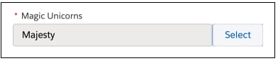
Create a custom attribute editor sized to fit your content with the breakout custom attribute feature.
The right pane of the Page Designer visual editor provides only limited space for merchants to configure component attributes. To provide more space, create a trigger editor to display a breakout editor inside a separate modal window.
For example, you want the merchant to select which unicorn image to use on the storefront, but the right pane doesn’t have enough space to display all the available unicorn images. So you create a trigger editor that appears in the right pane and includes a Select button.
When the merchant clicks Select, the breakout editor opens in a modal window where the merchant can see all the available images.
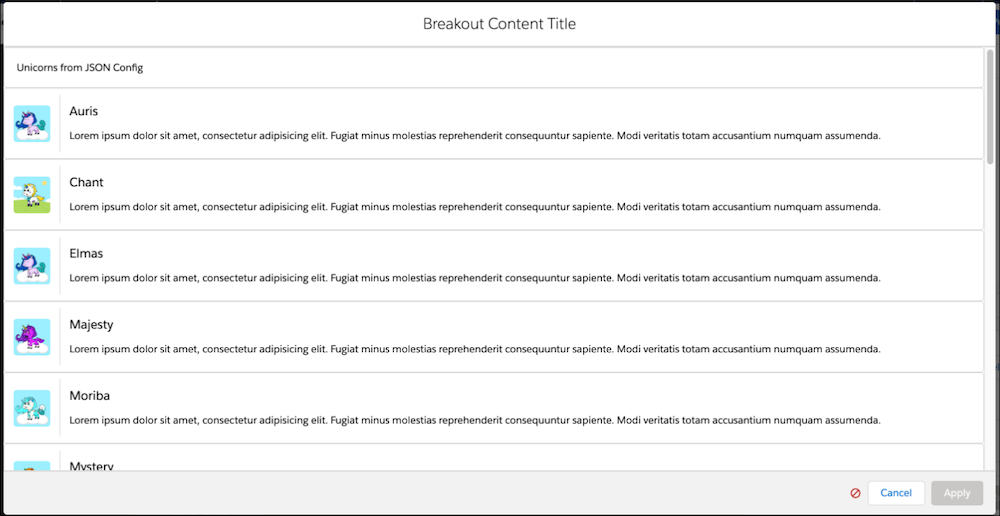
The merchant selects an image, and clicks Apply.
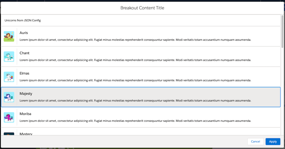
The modal closes, and the selected image appears in the right pane next to the Select button.
Implementing a breakout editor involves these high-level steps:
- Create server-side meta definition and script files for the trigger editor and the breakout editor.
- In the script file for the trigger editor, define the breakout editor as a dependency.
- Develop client-side UI code that implements the trigger and breakout editors, opens and closes the breakout modal window, and passes a value from the breakout editor to the trigger editor to Page Designer when the merchant clicks Apply.
To create a trigger custom attribute editor, define the attribute as type custom in the component meta definition file. Then create a meta definition JSON file and a script file for the trigger editor. In the script file, instantiate the breakout editor using the PageMgr.getCustomEditor method. This method takes the ID of the breakout editor and an optional configuration object. Then add the breakout editor as a dependency.
This trigger editor script file example specifies a breakout editor with ID com.sfcc.magicalBreakout. The script creates a breakoutEditorConfig configuration object that contains the localization information defined for the trigger editor. It also includes the options defined in the attribute_definitions section of the component meta definition file for the trigger editor, obtained from editor.configuration.options.config.
The localization information and options in the breakoutEditorConfig object are passed from the trigger editor to the breakout editor using the PageMgr.getCustomEditor method, which instantiates the breakout editor with the given ID. The script then adds the breakout editor as a dependency using editor.dependencies.put. The ID included in editor.dependencies, in this case magical_breakout, is used in the client-side code for the trigger and breakout editors to access the breakout editor.
The breakout custom attribute editor requires its own JSON meta definition file and script file.
The meta definition file references the JavaScript and CSS resources that the editor requires, as in this example.
The script file implements the init function to initialize the custom attribute editor with server-side logic or resources. This example adds options for the breakout editor not included in the editor_definition of the component’s meta definition file. It also includes a reference to CSS resources that are required if the list of unicorns includes more than 20 items.
To open the modal window for the breakout editor, we recommend using a callback on event emission approach, which manages the asynchronous breakout editor process. If you have multiple breakout editors, the callback on event emission approach makes it easier to keep track of open breakout editors because a callback is related to only one breakout process.
This example opens the breakout editor from the trigger editor, waits for the user to close the breakout editor, and then gets the selected value.
Another way to open and close the breakout modal is to use only events. However, this approach is more difficult because it requires that you correctly implement a cascade of subscribers and emitters based on the messaging API. This example illustrates a trigger editor that manages multiple parallel breakout editors.
If you leave the ID portion of an event payload blank, Page Designer closes the first open breakout editor related to the requesting trigger editor. `
Emit an sfcc:valid event from the breakout editor to indicate whether the value that the user selected in the breakout editor is valid. If the value is valid, Page Designer enables the Apply button in the breakout modal window footer. If the value is invalid, Page Designer disables the Apply button and optionally displays an error message.
In this example, if the value is valid, an sfcc:valid event with payload true is emitted, and the Apply button is enabled. If the value is invalid, an sfcc:valid event is issued with a polymorphic payload that includes a valid key set to false and a message set to This value is invalid. The Apply button is disabled, and an error icon is displayed showing the error message This value is invalid in a tooltip.
The trigger editor and the breakout editor require client-side script files. Incorporate any of the custom attribute editor events in the script files. The trigger editor file opens and closes the breakout editor and emits the sfcc:value event to Page Designer. The breakout editor file includes the code to implement the editor, and emits sfcc:valid and sfcc:value events to the trigger editor.
This example of a client-side script for a trigger editor, magical_trigger.js, uses callbacks and event emissions to open and close the breakout editor. When the merchant clicks Apply in the breakout editor, the handleBreakoutApply(value) function passes the value selected in the breakout editor to Page Designer using an sfcc:value event.
The client-side script example for the corresponding breakout editor, magical_breakout.js, includes the logic that displays the unicorns. The list of unicorns to display is retrieved from two different sources. The first source is the attribute_definitions in the component’s meta definition file (options.config). Refer to Custom Attribute Editor Meta Definition File for an example of the component’s meta definition file where these unicorn options are configured. The second source is the init method in the server-side script file (options.init).
The example uses function updateValidity(value) to check whether the currently selected value. When the merchant selects a valid value, function updateSelectedValue(value) emits an sfcc:value event to the dedicated host component for the breakout editor.
The code in these examples conforms to the ECMAScript 2015 specification. It isn’t appropriate if you’re targeting legacy browsers such as Internet Explorer 11.
Create custom attribute editors faster and more efficiently with prebuilt attribute editors. Use the prebuilt editors as building blocks when you create custom attribute editors.
This table lists the prebuilt editors that are available. We provide multiple IDs for each prebuilt editor to use the style you prefer. All the prebuilt editors open in a separate breakout modal window.
| Prebuilt Editor | Purpose | ID | Return Value Type | Return Value Example |
|---|---|---|---|---|
| Category Picker | Allows merchant to select a category | sfcc:categoryPicker or sfcc\:category-picker | Category ID <string> |
{
type: "sfcc:categoryPicker",
value: "1234567890"
}
|
| Link Builder | Builds a link to the element selected by the merchant | sfcc:linkBuilder or sfcc:link-builder | Absolute URL or URL portions <string | string[]> Depending on the link type the user created using the Link Builder, the return value is either a single string or an array of strings. A single string indicates that the value is an absolute URL that can be used as-is. An array of strings indicates that the URL must be assembled using the |
{
type: "sfcc:linkBuilder",
value: "https://salesforce.com"
}
or {
type: "sfcc:linkBuilder",
value: ["Page-Show", "cid", "1234567890"]
} |
| Page Picker | Allows merchant to select a page | sfcc:pagePicker or sfcc:page-picker | Page ID <string> |
{
type: "sfcc:pagePicker",
value: "1234567890"
}
|
| Product Picker | Allows merchant to select a product | sfcc:productPicker or sfcc:product-picker | Product ID <string> |
{
type: "sfcc:productPicker",
value: "1234567890"
}
|
The following examples show a custom attribute editor that uses the prebuilt editor for Category Picker. In the meta definition file for the component type, designate the attribute for the Category Picker as type custom.
On the server side, create a meta definition JSON file and a .js file for the custom attribute editor just as you would for any custom attribute editor.
On the client side, create a JavaScript file that runs the prebuilt editor, as in this example. Set the payload ID in the sfcc:breakout event to the ID of the prebuilt editor, in this case sfcc:categoryPicker.
Configure searching for Page Designer pages and attribute content.
Page Designer pages and components are content assets that can optionally be assigned to folders. In order to also make pages that aren’t assigned to folders searchable, you must extend the ContentSearchModel to remove the folder filter. The same applies to content suggestions, so you want to apply the same adjustment to the SuggestModel as well.
For example, in the Storefront Reference Architecture (SFRA) searchHelpers.js file, we could add the following line to the setupContentSearch function so that searching can find content assets that aren’t in folders:
apiContentSearchModel.setFilteredByFolder(false);
The modified setupContentSearch function is as follows:
In the Storefront Reference Architecture (SFRA) SearchServices.js file, we could set the setFilteredByFolder attribute of the SuggestModel to false so that content assets that aren’t in folders can be found using content suggestions:
suggestions.setFilteredByFolder(false);
The modified code is as follows:
Specify that component or page attributes are indexed and searchable. When attributes are searchable, users can find pages by searching for the attribute value. For example, users can search for the text configured for a rich text attribute.
Add searching to the definition of the attribute in the page or component meta definition file, as in the following example for a page attribute:
Designate the following types as searchable. If the searchable value isn’t specified, the default is false.
- string
- text
- markup
- product
- category
- cms_record
- custom
- enum-of-string
The refinable value indicates whether a user can further refine search results based on the content of this attribute. Designate all searchable attribute types as refinable except cms_record and custom.
The boost_factor value influences the placement of the page in the search results. Specify any value from 0.01 to 100.00 for the boost factor. A boost factor of 1.00 is the default and doesn’t change the order of search results. Specify a boost factor less than 1.00 to indicate that text in the attribute is less relevant than other terms in the index. Specify a boost factor greater than 1.00 to increase the relevance of attribute text. For example, including a boost factor of 2.00 makes the field twice as relevant in relation to other fields in the index. We recommend that you use boost factors less than or equal to 5.00.
For page attributes, include the sorting property set to true to indicate that search results can be sorted using this attribute.
The sorting property is applicable only for page-level attributes. Don’t use the sorting property for component attributes.
You can’t use the sorting property with attributes of type markup.
For attributes of type custom, all elements of the attribute are considered text for purposes of indexing. For attributes of type cms_record, only attributes of the cms_record that are supported as searchable are added to the index. For example, if the cms_record includes an attribute of type image, the image isn’t indexed.
When you render dynamic Product Detail or Product List pages, use Page Meta Tag Rules that merchants configured to create meta tags in the HTML markup. Include a decorator that creates the HTML <head> section of the page. When rendering the page, get the data from the Page Meta Tag Rules, and pass it to the decorator.
For example, if you’re working with SFRA pages and components, include the following code in the implementation of your page, after all regions and all components are rendered, but before the decorator.
The template htmlHead.isml, which is included indirectly in the SFRA decorator templates, uses pdict.CurrentPageMetaData to create the appropriate HTML meta tags.
Pages and components are persisted in the database as content assets, but they aren’t displayed in the content asset list in Business Manager and you can’t edit them directly from Business Manager. Generally, processes like replication and indexing work the same for pages and components as they do for content assets. But pages and components are different from content assets in some ways.
Page Designer doesn’t support using the OCAPI SHOP and DATA resources to access pages and components as content assets.
Pages and components share the same attributes as content assets. But in some cases, the content asset attributes have special meaning or behavior when they’re applied to pages and components.
| Content Asset Attribute | Pages | Components | Localizable? | Site Specific? |
|---|---|---|---|---|
| id | id | id | ||
| type | type | type | ||
| online | online | online | X | |
| config | visibility definition | visibility definition | ||
| data | content attributes | X | ||
| content links | components per region | components per region | ||
| name | name | name | X (For components, the name is technically localizable, but the localized name isn’t displayed in the visual editor.) | |
| description | description | X | ||
| page title | seo title | X | ||
| page description | seo description | X | ||
| page keywords | seo keywords | X | ||
| page url | seo url prefix | X | ||
| searchable | searchable | X | ||
| searchwords | searchwords | X | ||
| sitemap included | sitemap included | X | ||
| sitemap change frequency | sitemap change frequency | X | ||
| sitemap priority | sitemap priority | X |
Import pages and components as content assets using the standard library import and export functionality. The type attribute distinguishes pages and components in the library from other content assets.
Pages use the following format for the type attribute:
page.{page_type_id}
For example, this snippet from a library import file includes a page named fixedlayout identified as type page.fixedlayout.
Components use the following format for the type attribute:
component.{component_type_id}
For example, this snippet from a library import file includes a component named producttile identified as type component.assets.producttile.
Both pages and components need a config attribute describing visibility rules. Components also need a data attribute with merchant-set attributes. Define config and data as JSON snippets. See the JSON schemas for details:
In the following situations, the import is allowed to proceed, but might issue multiple warning messages:
- You haven’t yet uploaded the cartridge that contains the page and component types.
- The imported data is in conflict with the meta definitions for existing page and component types, for example, if an imported component has attributes that aren’t defined in the corresponding meta definition file.
It’s important to understand how page caching works with Page Designer pages and the cache times for pages, components, and custom attribute editors.
Caching for Page Designer pages is similar to other pages, with some nuances.
Rendering or serialization starts with a top-level request from the web adapter invoking a custom controller like Page-Show. The SFRA Page.js controller uses this snippet to check page visibility. Only pages without visibility rules are pagecached.
Deciding if you want to apply pagecaching in your controller, and how to do so, is effectively a case by case decision. Don’t create pagecache conditions in your code that are subject to the request context, thus not pagecacheable in a global manner.
Parallel to the first pagecache lifecycle constructed around the controller, there’s a second pagecache lifecycle constructed around the actual contents of the page that is initiated by two nested remote includes.
When PageMgr.renderPage() renders or PageMgr.serializePage() serializes a page:
-
The first-level remote include is the system controller
__SYSTEM__Page-Include. This remote include determines a visibility fingerprint of the page and its components, which are visible for the current request context (based on schedules, customer groups, or other visibility settings). Remote includes can only be pagecached if the page and its components don’t have a visibility rule defined. This is due to the context evaluation. The duration of such pagecaching is configurable via Business Manager.- In Business Manager, click App Launcher and then select Administration > Merchant Tools > Manage Sites.
- Select a site.
- Select the Cache tab.
- Locate the Time to Live (TTL) of Page Designer Fingerprint. The option is configured in seconds. The default is 24 hours (84000 seconds).
The presence of a visibility rule leaves this first-level remote include uncached. After this calculation, the fingerprint is attached to a second-level remote include. Then the second-level remote include is invoked.
- In Business Manager, click App Launcher
-
The second-level remote include is the system controller
__SYSTEM__Page-Render(rendering) or__SYSTEM__Page-Serialize(serialization), which is pagecachable based on the attached visibility fingerprint. This remote include invokes the custom scripts of the render function to render the page, or the serialize function to serialize the page. The response created is configured with pagecache settings through the previously mentioned scripts that are invoked for the page and all its processed visible components. If none of these provide pagecache instrumentation, this second-level remote include remains uncached.
Each variation of the page showing a different set of visible components results in a separate pagecache entry because the visibility fingerprint calculation yields a different result.
The more a page varies (in terms of different components shown for different request contexts) the more pagecache fragmentation for this page occurs.
For __SYSTEM__Page-Include, pages with visibility rules appear uncached. The second-level include (__SYSTEM__Page-Render or __SYSTEM__Page-Serialize) maintains caching statistics for all Page Designer pages combined. You can’t track caching separately for individual pages.
Caching for Page Designer pages through SCAPI clients is similar to the DWScript-based approach. However, there are some small differences. The shopper experience SCAPI exposes two endpoints. Use them to fetch Page Designer pages by ID, or category or product. For more information, see the SCAPI documentation.
The client starts serialization by calling a shopper experience endpoint. The request goes to the web adapter, which calls a system controller. The controller gets pages by ID, category, or product.
-
get page by id:
__SYSTEM__ShopperExperience-GetPagesIdV1 -
get pages by category or product:
__SYSTEM__ShopperExperience-GetPagesV1
The system controller calculates a fingerprint. Then it delegates to the serialization of the pages.
A pagecache lifecycle is built around the page content. This includes fingerprint calculation and a nested remote include. The include performs the serialization.
-
The top-level request covers the two endpoint system controllers used in the SCAPI-based page serialization. These retrieve a single page by ID or multiple pages by category or product. Then, they create a visibility fingerprint from the page and its components. These are visible for the current request context. This is based on schedules, customer groups, or other visibility settings. For multiple pages by category or/ product the final fingerprint is the concatenation of the fingerprints of each page. The top-level request can only be page cached if the page and its components don’t have a visibility rule defined. This is due to the context evaluation. The duration of such pagecaching is configurable via Business Manager.
-
In Business Manager, click App Launcher
and then select Administration > Merchant Tools > Manage Sites. -
Select a site.
-
Select the Cache tab.
-
Locate the Time to Live (TTL) of Page Designer Fingerprint.
The option is configured in seconds. The default is 24 hours (84000 seconds).
The presence of a visibility rule leaves this top-level request uncached. After this calculation, the fingerprint is attached to a second-level remote include. Then the second-level remote include is invoked.
-
-
The second-level request is a remote include to the system controller
__SYSTEM__ShopperExperience-SerializePageV1, which is pagecachable based on the attached visibility fingerprint. This remote include invokes the custom scripts of the serialize function to serialize the page. The response created is configured with pagecache settings through the previously mentioned scripts that are invoked for the page(s) and all its processed visible components. If none of these provide pagecache instrumentation, this remote include remains uncached.
Each variation of the page showing a different set of visible components results in a separate pagecache entry. This is because the visibility fingerprint calculation yields a different result.
When a page varies, pagecache fragmentation increases. This happens when different components are shown for different request contexts.
TThe pagecache lifecycle of the page contents beyond the fingerprint calculation is induced through a separate request. If you configure pagecaching for the page itself, or any component within that page, the setting is applied for:
-
the response of the
__SYSTEM__Page-Renderand__SYSTEM__Page-Serializerequest in case of DWScript based rendering. -
the response of the
__SYSTEM__ShopperExperience-SerializePageV1request in case of SCAPI based rendering
Thus this setting affects the pagecaching for the whole page, and anything within it, but doesn’t affect anything outside of it like the controller that initiated the rendering. The concept of page and component pagecaching applies for both DWScript and SCAPI based rendering and serialization.
If different pagecache settings are supplied for different components of the page, the response takes on the shortest of the pagecache settings. For example, if you have a page where:
- Component A has a 1-minute relative pagecaching.
- Component B has a 1-hour relative pagecaching.
- Component C has a 1-day relative pagecaching.
The final calculated relative pagecaching is the minimum of these three values (1 minute).
Let’s look at an excerpt of the component type implementation that corresponds to component B to see how it instruments the response for a 1-hour pagecaching. Assuming this component presents personalized information (for example, based on a combination of pricebook, promotion, sorting rule, and A/B test segments), then you must account for that by instrumenting the response with the corresponding vary-by. For more information, refer to the B2C Commerce Script documentation.
If using dw.util.Template.render() like SFRA, don’t use <iscache> in your template. Use response.setExpires() instead. The dw.util.Template class is for markup generation, not response modification.
If you don’t supply any pagecache setting for your page and none of its components (for example, neither the page type implementation itself nor component A, B, or C related component type implementations configure a pagecache setting) then the page isn’t going to be pagecached at all. As soon as at least one of these building blocks within a page supplies a pagecache setting, pagecaching happens.
Because the visibility fingerprint is also factored in to the pagecache key of a page rendering or serialization (in shape of a query parameter vf of the cacheable __SYSTEM__Page-Render, __SYSTEM__Page-Serialize, and __SYSTEM__ShopperExperience-SerializePageV1), there’s no need for the page or component type implementation to care about page or component visibility rules, that take for example customer groups into consideration, as this is already automatically handled for you.
If your page or component requires a minimum pagecache setting, supply it in your page or component type implementation. Component types require extra care as this pagecache setting is affecting the pagecache of the entire page and not just the component alone.
If your page or component doesn’t strictly need any specific pagecache setting - don’t supply it in your page or component type implementation because it relies on the pagecache instrumentation supplied by the other components that reside on the page.
This is subject to change as your merchant adjusts which components are plugged into a page over time.
For a page type that doesn’t supply a pagecache setting, carefully think about this decision as this means that a page’s components determine if the page is pagecached or not.
If the content of a component can’t be affected by the pagecache settings of the page, other components, or must not be pagecached at all, you must move such content into a remote include to separate it from the rest of the page. The remotely included controller (and its respective template) can then use a pagecache setting as it fits its business purpose. For example, a product tile component that renders the product’s inventory would likely want to include this inventory state in a remote include manner so that the current inventory can always be shown while the remainder of this component can still be pagecached.
Keep in mind that the level which calculates the fingerprint remains uncached unless the page and all its components don’t have any visibility rule. To improve caching, separate cacheable pieces into their own includes. Keeping the page and its components free of visibility rules allows for more efficient caching. This especially holds true if the structure of the page isn’t tied to visibility rules, but only the actual content shown by the components. Consider these two facets separately. They have different implications at design and runtime.
How long page types, component types, and custom attribute editors are cached in memory depends on whether the environment is sandbox, development, staging, or production.
To refresh the page types, component types, and custom attribute editors on a production environment, or to refresh them immediately on other environments, a code version switch must occur. When you develop new page types, component types, or custom attribute editors, or modify existing ones, and then replicate them to a production environment, a best practice is to issue an event for a code version switch so that the page types, component types, and custom attribute editors are immediately refreshed.
| Environment | Cache Refresh Interval |
|---|---|
| Sandbox | 5 seconds or on code version switch |
| Development | 5 seconds or on code version switch |
| Staging | 5 seconds or on code version switch |
| Production | On code version switch |
Page Designer pages are rendered from a controller and incorporated into the storefront.
Use the dw.experience.PageMgr API to render pages.
For more information, see PageMgr API
Pages are rendered together with their components. You can’t render components separately.
This is the basic code for the page rendering process:
Put the call to PageMgr.renderPage() in its own controller or add it to an existing controller. To take advantage of SEO URL features, a best practice is to add it to the Page-Show controller.
Page rendering occurs within a nested remote include. If you want to use external parameters in the rendering process, for example, parameters accessible by the controller that calls PageMgr.renderPage(), pass the parameters to the rendering process using a parameters string. For example:
The remote include that does the rendering doesn’t allow passing response headers or cookies set during rendering to the request that called PageMgr.renderPage(). If you need to adjust the response, do so outside of the page rendering process.
Use a storefront controller to create a URL to Page Designer pages. Use the URL, for example, to link to a page from a marketing email. Use the URL to add a link to the page from the global header or footer or main navigation of the storefront.
Create the storefront controller using the dw.experience API. The following example controller, PDPage.js, exports a Show function that passes in the ID of the Page Designer page. The controller checks whether to make the page visible based on schedule and customer group. If the page is visible, the controller renders it. Otherwise, the user is redirected to the home page.
For clarity, this example shows a separate controller dedicated to rendering Page Manager pages. A best practice is to include the call to PageMgr.renderPage in the Page-Show controller to take advantage of SEO URL features.
When this controller is uploaded to the site, any Page Designer page can be accessed by passing in its page ID in a URL as follows:
{\<urlToTheStorefront>}/PDPage-Show?cid={\<pageID>}
For example, if you have a page with ID loyalty-rewards, the following URL accesses that page:
{\<urlToTheStorefront>}/PDPage-Show?cid=loyalty-rewards
To add a link to your page from the storefront’s global header or footer, add the URL to the ISML file for the header or footer. For example:
<a href=$url('PDPage-Show','cid','loyalty-rewards')"title="Loyalty Program">Loyalty Program</a>
You could also add a link to the page from the storefront main navigation using the Business Manager to set up a new category. Configure the alternative URL for the category as follows:
$url('PDPage-Show','cid','loyalty-rewards')$
When a merchant drags a component onto a Page Designer page in edit mode, a mock component placeholder displays until the merchant configures the component attributes. Mock component placeholders are also used when a merchant creates a localized page based on another page or when a page doesn’t render because it’s missing attributes.
The mock component placeholder signals to the merchant that the component isn’t yet fully configured or has an error condition. The merchant can move the mock component and edit it like a regular component. The mock component displays only in edit mode.
A mock component uses the following values:
- The
nameof the component type as configured in its meta definition file. - The thumbnail image for the component type provided in a custom cartridge for Page Designer UI artifacts or, if no custom thumbnail image is provided, the generic Page Designer component thumbnail image.
This example shows what a page looks like with four mock components, one for a headline banner and three for product tiles.

The HTML wrapper is always div. Mock components use the following two classes:
sfdc-component-mocksfdc-component-{typeID}-mock, where{typeID}is the ID of the component type. Component type ID values include dots, for example,assets.banner. When used in the class name, the dot is replaced with a hyphen, for example,assets-banner. For example, for a component type with IDassets.banner, the class issfdc-component-assets-banner-mock.
To customize how a mock component placeholder displays, apply custom CSS to the mock component class. For example, this CSS file, named banner-mock.css, specifies that mock components using the class sfdc-component-assets-banner-mock have a background-color of lightblue.
Expose the data assembled by a page and its components in JSON format. This process can be useful if you want to expose the page to external services to implement native mobile apps or custom heads.
Use the serializePage method of the dw.experience.PageMgr API to render the page in JSON. For more information about PageMgr, see PageMgr API.
The method to expose JSON has the following signatures:
For example, the following code uses the serializePage method to render a page in JSON.
In this example, the page has three regions:
- Header: banner
- Main: category tile and a 2x2 layout grid that holds product and category tiles
- Footer: banner
The resulting JSON includes content structured as follows:
- id: String: The ID of the page or component.
- data: Map<String, Object>: Content attributes.
- custom: Map <String, Object>: Additional data that custom code assembles.
- regions: Region: The region model representing the component hierarchy:
- id: String: The ID of the region.
- components: List<StructuredContent>: All visible components assigned to the region in order.
If your page type or component types have custom code that you want to include in the exposed JSON, use the serialize(context) function in addition to the render(context) function in the JavaScript for the page or component, as in the following example.
The JSON returned includes the output of the custom code as a custom property of the page or component as in this example.