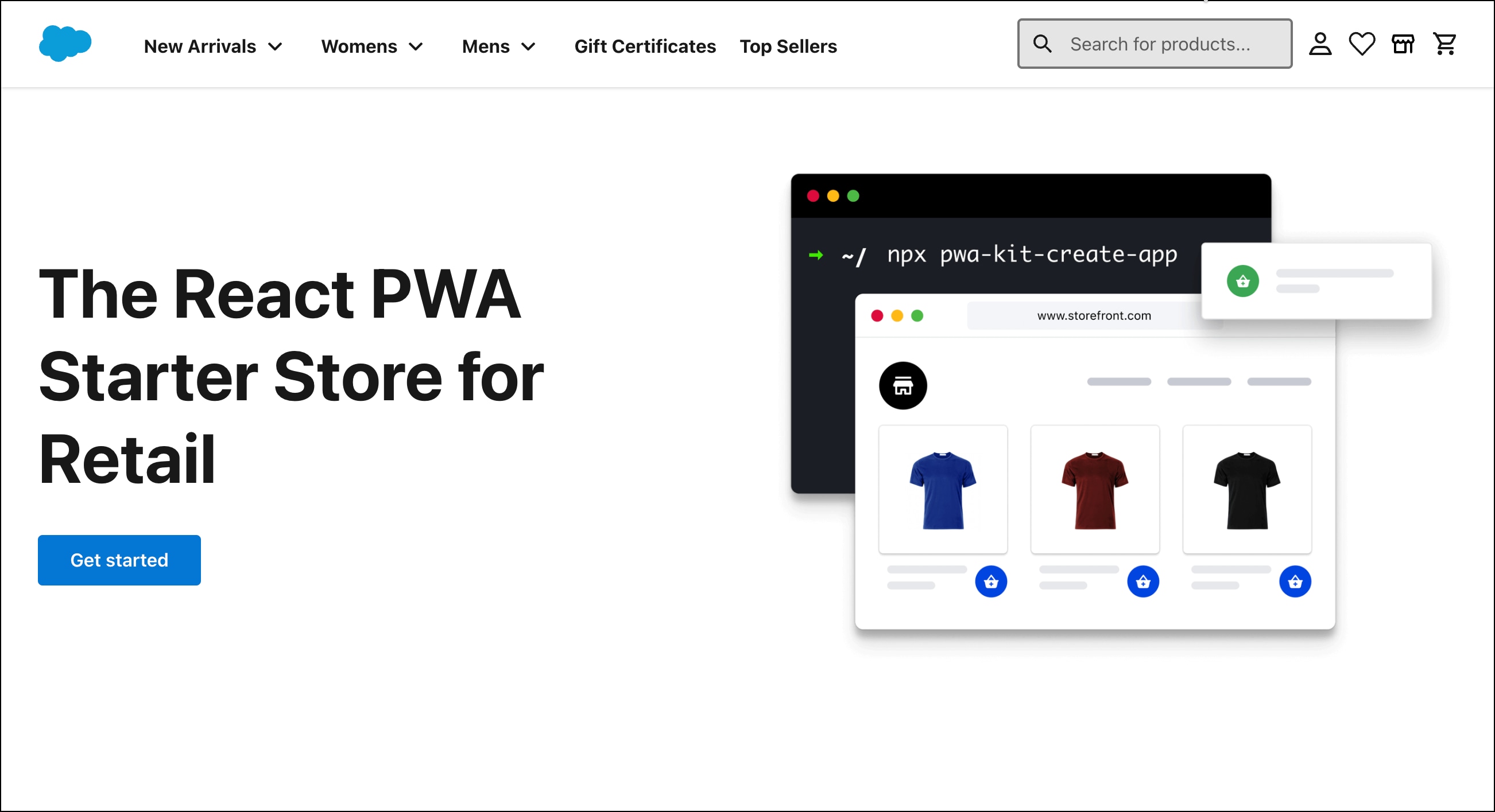
Retail React App in PWA Kit v3.x
The Retail React App is a set of sample code and tooling designed to give you a head start on building your storefront on top of APIs and hosting it on Managed Runtime.
When you use the Retail React App with Progressive Web App (PWA) Kit version 3.x, you have access to features, such as Template Extensibility, Personalize with Shopper Context, SLAS private client, Store Locator, and support for different Product types.
This guide for the Retail React App in PWA Kit version 3.x:
- Describes its structure and contents
- Highlights its flexible, open-source foundation
To use the Retail React App with PWA Kit version 3.x or later, if you haven’t already done so, upgrade your PWA Kit project from version 2.x to version 3. See Upgrade to v3.
All PWA Kit projects start with the same set of files. At the start of a project, these files are generated by a script. To generate a PWA Kit project, see Get Started.
To get an overview of how the Retail React App works, start by exploring its file structure. Here’s a description of some of the folders and files in the PWA Kit project.
| Directory | Description |
|---|---|
| .cursor | Contains autogenerated Cursor rules for storefront development |
| config | Configuration files |
| config\default.js | Default configuration file |
| config\sites.js | Identifies sites configured in Business Manager. Includes localization details. |
| config\utils.js | Utilities imported throughout the app |
| node_modules | Package dependencies |
| overrides | Contains overrides for template extensibility |
| overrides\app | Application code lives here |
| translations | Translations for react-intl |
| worker | Service worker |
| .eslintignore | Exclusion rules for ESLint |
| .eslintrc.js | Code style rules for ESLint |
| .prettierrc.yaml | Code formatting rules for Prettier |
| README.MD | Basic documentation |
| babel.config.js | Transpilation rules for Babel |
| jest.config.js | Unit testing configuration for Jest |
| package-lock.json | Package configuration lock file |
| package.json | Package configuration |
Here’s a listing of all the files and directories of a freshly generated project.
To automate routine development tasks, the Retail React App includes several scripts. Use the command npm run <SCRIPT_NAME> to run them from the terminal.
Here’s a complete list of all the included scripts with a description of each one.
| Name | Description |
|---|---|
analyze-build | Builds the project in production mode and creates two webpack-bundle-analyzer reports. Use the reports to monitor the size of your code bundle. |
compile-messages | Compile all localized messages into AST format. |
extract-default-messages | Automatically extract the default locale’s messages from your React components. |
format | Format the code using Prettier. |
lint | Find inconsistent code styling using ESlint. |
lint:fix | Automatically fix ESlint errors. |
prod:build | Build the project in production mode. |
push | Push the code bundle (production build artifacts) to Managed Runtime. |
save-credentials | Save Runtime Admin credentials locally (for push command). |
start | Start the SSR server. |
start:inspect | Start the SSR server using the Node.js inspector. |
start:pseudolocale | Start the SSR server with a pseudo locale. |
test | Run unit tests using Jest. |
test:lighthouse | Run Lighthouse tests. |
test:max-file-size | Run a bundlesize test. |
Your project comes with two example test suites for quality assurance: unit tests created with Jest and React Testing Library.
The unit tests are included alongside each of the page components in their respective directories.
To start the unit tests, run the following command in your terminal:
To learn more about testing your storefront, review the source code for the example test suites and explore the documentation for Jest and React Testing Library.
From the start, the Retail React App gets excellent performance scores, as measured by Google’s Lighthouse test suite. We make it easy to monitor your Lighthouse scores throughout development using the following script:
The script runs Lighthouse three times on your storefront and uploads the median scores for each category to Google. Google then uses those scores to generate a report. A link to the report is output by the script before it exits.
To use Salesforce APIs to access shopper data, an administrator must complete the tasks described in Set Up API Access.
In PWA Kit version 3.x, shopper data in the Retail React App is accessed through the @salesforce/commerce-sdk-react library, which replaces the previous CommerceAPI class. This library provides hooks for interacting with Salesforce Commerce Cloud’s backend services, streamlining API requests, and enhancing state management through TanStack Query.
The getProps method used in previous versions has been replaced by the withReactQuery data fetching strategy. This new approach uses the react-query library, allowing for isomorphic data fetching using React hooks. To access the API wrapper from a page component, you can use the React hooks provided by @salesforce/commerce-sdk-react as shown in this example:
The @salesforce/commerce-sdk-react library currently uses the B2C Commerce API for products, promotions, gift certificates, and search. Each feature is provided with its own set of endpoints, which are documented separately in the B2C Commerce API reference.
To authorize API requests on behalf of registered shoppers and guests, the @salesforce/commerce-sdk-react library relies on a Salesforce Commerce API called the Shopper Login and API Access Service (SLAS). For baskets and orders, the library class also uses the Open Commerce API (OCAPI).
Instructions for setting up the B2C Salesforce Commerce API (including SLAS) and OCAPI are covered in Set Up API Access.
The Chakra UI component library is a new, yet production-ready technology that we’re excited to use in the Retail React App. It includes 50+ user interface components, all with excellent accessibility and usability. Components can be customized with style props or using JavaScript objects for more advanced styling (CSS-in-JS). All Chakra components come with well-designed base styles that can be overridden with a theming system.
The Chakra Theming system is based on the Styled System Theme Specification. You can customize the look and feel of your components to suit your brand by updating the values in the app/theme directory.
Theming is available for most of the reusable components in app/components but isn’t available for the pages like the Product Details Page or Product Listing Page. To change the styling for these pages, edit the inline styles in the source code for their respective page components in app/pages.
To include custom SVG icons in the project, add them to the app/assets/svg directory, import them in app/components/icons/index.js, and export the React icon component like this: export const MyCustomIcon = icon('my-custom-icon').
The imported SVG icons are packaged into an SVG sprite at build time, and the sprite is included in the server-side rendered HTML.
The PWA Kit React SDK is a library that supports the isomorphic rendering pipeline for PWA Kit storefronts. It contains many key classes, functions, and components that power the Retail React App. For example, the render() function in app/ssr.js that kicks off the entire rendering and routing process is imported from the SDK.
The SDK abstracts away some of the implementation details for server-side rendering, caching, and proxying while giving you plenty of opportunities to customize their operation. It also provides general-purpose utilities and tools for maintaining a single set of code that can be rendered both on the client side and the server side.
Salesforce maintains the SDK as a separate npm package from the Retail React App so that improvements can be made more easily.
The PWA Kit React SDK and the entire Retail React App are open-source projects and available on GitHub. We welcome contributions from the B2C Commerce community!
The open-source technologies listed in this section are the ones that are used most frequently by the Retail React App. They’re also the hardest to replace with alternatives, so we selected them not only for their performance characteristics, but also for their reputation. Each one is actively maintained, highly customizable, well documented, and widely used.
Here’s a brief overview of each of these core technologies, many of which are probably familiar to you already:
Babel compiles your JavaScript code to make it compatible with a wide range of browsers and Node.js environments. It transforms advanced language syntax and polyfills any features that are missing from the environment.
Express is a popular open-source web server framework, written in JavaScript, and run within the Node.js runtime environment. It handles HTTP requests for the routes you define as the entry points for your storefront.
Express allows you to configure common web server settings, such as the connection port and the location of templates for returning the response. It also allows you to add additional request processing middleware at any point within the request handling pipeline.
All of the server-side code for a PWA Kit application is run on top of Node.js, an open-source runtime environment for JavaScript. The runtime environment omits browser-specific JavaScript APIs and includes its own APIs to access features of the host operating system (such as the file system) in a cross-platform way.
Node.js uses a non-blocking or asynchronous architecture, which is ideal for building highly scalable and data-intensive storefronts.
React is a framework developed by Facebook to create single-page apps that deliver fast, fluid, and immersive user interfaces.
In a React app, the user interface is built with discrete components that are typically arranged in complex hierarchies. In a well-designed React app, each component is only responsible for one job—and often that job is just to contain other components.
The component hierarchy in the Retail React App is designed for extensibility. You can build on top of the included components or swap them out for new components.
Packages related to React:
| Name | Description |
|---|---|
| Loadable Components | Speeds up performance through code-splitting of larger bundles. |
| ReactDOM | Provides DOM-specific methods that can be used at the top level of your application. |
| ReactDOMServer | Provides the method renderToString() that pre-renders HTML on the server side. |
| React Helmet | Helps you manage changes to the document’s head tag |
| React Router | Maps URL paths to React components. Paths can be expressed as patterns that are matched from most specific to least specific. |
Webpack consolidates your code into one or more bundles. These bundles are deployed to Managed Runtime and eventually loaded in the browser as part of the hydration process.
The Retail React App imports ready-made Webpack configurations for the client side and server side from the PWA Kit React SDK. In most cases, you don’t need to change these configurations, but if you do, you can extend the Webpack configuration in webpack.config.js.
Our demo site is built using the Retail React App. The site looks similar to what’s shown in this example.
- Use template extensibility to customize your site. This approach helps to reduce your code footprint, development toil, cost of ownership, and future upgrade headaches.
- Keep track of new features in the Retail React App by checking the release notes or the releases page on GitHub.
- Check out the Performance Guide for Composable Storefronts on performance best practices and tips to monitor and improve your storefront’s performance.
This section provides suggested solutions for a few common errors that you can encounter while using the Retail React App.
Potential Cause: API access wasn’t set up.
Suggested Solution: Ensure that an administrator has completed the tasks described in Set Up API Access. Also, add code to the relevant page components to access the API wrapper as described in Salesforce APIs.
Potential Cause: Large bundles, images, or caching aren‘t optimized.
Suggested Solutions:
- Check out the Performance Guide for Composable Storefronts on performance best practices and tips to monitor and improve your storefront’s performance.
- Use the Loadable Components package for code-splitting to improve performance.
- Use the
npm run analyze-buildscript to check for large bundle sizes. You may need to perform code splitting to reduce your bundle sizes. - Optimize images to reduce their size. Consider using image compression tools to reduce page load times.
- Implement caching strategies. See Maximize Your Cache Hit Ratio.
For more performance improvement suggestions, see the Pre-Build and Go-Live Best Practices checklist.
- Now that you’re familiar with the structure and contents of the Retail React App, it’s time to dig deeper! Start by exploring the source code, especially the ecommerce components in
app/pages. - See GitHub Repository for information about the latest files in the Retail React App and other packages.
- Check out our demo site that’s built using the Retail React App.
- Build your own demo site based on the Retail React App. See the Quick Start.
- Learn about features available with the Retail React App on PWA Kit version 3.x such as:
For other features, check out the Build Your Site section.