Create a Sample Lightning Web Component
Create a sample custom component to deploy from SFDX to an authorized org. You can then reuse content from this Lightning web component file structure.
To display your LWR component in Experience Builder, you must specify target and capability configuration values in the .js-meta.xml file. You can also make component properties editable in Experience Builder.
-
In the Visual Studio Code editor, open the Command Palette by pressing Ctrl+Shift+P (Windows) or Cmd+Shift+P (macOS).
-
Enter
SFDX. -
Select SFDX: Create Lightning Web Component.
Don’t select SFDX: Create Lightning Component, which creates an Aura component.
-
Name the component, for example
helloWorld. -
To accept the default
force-app/main/default/lwclocation, press Enter. -
To view the new files in Visual Studio Code Explorer, press Enter.
-
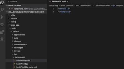
Open the HTML file (for example,
helloWorld.html), and write or copy and paste the HTML code for your project. -
Save the file.
-
Open the JavaScript file (for example,
helloWorld.js), and write or copy and paste the JavaScript code for your project. -
Save the file.
-
Open the XML file (for example,
helloWorld.js-meta.xml), and write or copy and paste the XML code for your project. -
In the XML file, define the component design configuration values for Experience Builder. See XML Configuration File Elements.
Option Description lightningCommunity__PageFor a custom drag-and-drop component on an LWR page in Experience Builder (appears in the Components panel). lightningCommunity__Page_LayoutFor a custom page layout component in an LWR site in Experience Builder (appears in the Page Layout Window). lightningCommunity__Theme_LayoutFor a custom theme layout in an LWR site in Experience Builder (appears in Settings in the Theme area). lightningCommunity__DefaultEnables editable component properties when the component is selected in Experience Builder. Supported property attribute types include integer, string, boolean, picklist, and color. -
To make your component usable in Experience Builder, set
isExposedtotrue, and define{lightningCommunity__Page},{lightningCommunity__Page_Layout}, or{lightningCommunity__Theme_Layout}intargets. -
To include properties that are editable when the component is selected in Experience Builder, define
{lightningCommunity__Default}in targets and define the properties intargetConfigs. -
Lightning Locker and Lightning Web Security (LWS) are disabled in B2B and D2C store LWR templates. To configure the component to run without Lightning Locker or LWS, define
{lightningCommunity__RelaxedCSP}incapabilities.
-
The snippet specifies a custom component for an LWR page in Experience Builder, enables component property editing, and enables the component to run without Lightning Locker or LWS.
See Also