Branding and Theming
The Agentforce Android SDK provides comprehensive theming capabilities for customizing the visual appearance of all UI components.
The Agentforce Android SDK includes a sophisticated theming system built on top of Salesforce's design system. The theming system provides:
- Color Theming: Complete color palette customization with semantic tokens
- Light/Dark Mode Support: Automatic switching and explicit mode setting
- System Integration: Adapts to Android system theme preferences
- Reactive Updates: Composable state management for real-time theme changes
- AgentforceThemeManager: Central theme management interface
- AgentforceColors: Class for color palettes with semantic color tokens
- AgentforceDarkColors: Dark mode color variants
- AgentforceThemeCreator: Factory for creating theme objects
- DefaultAgentforceTheme: Default theme object with Agentforce colors
The theming system provides comprehensive color tokens organized by purpose.
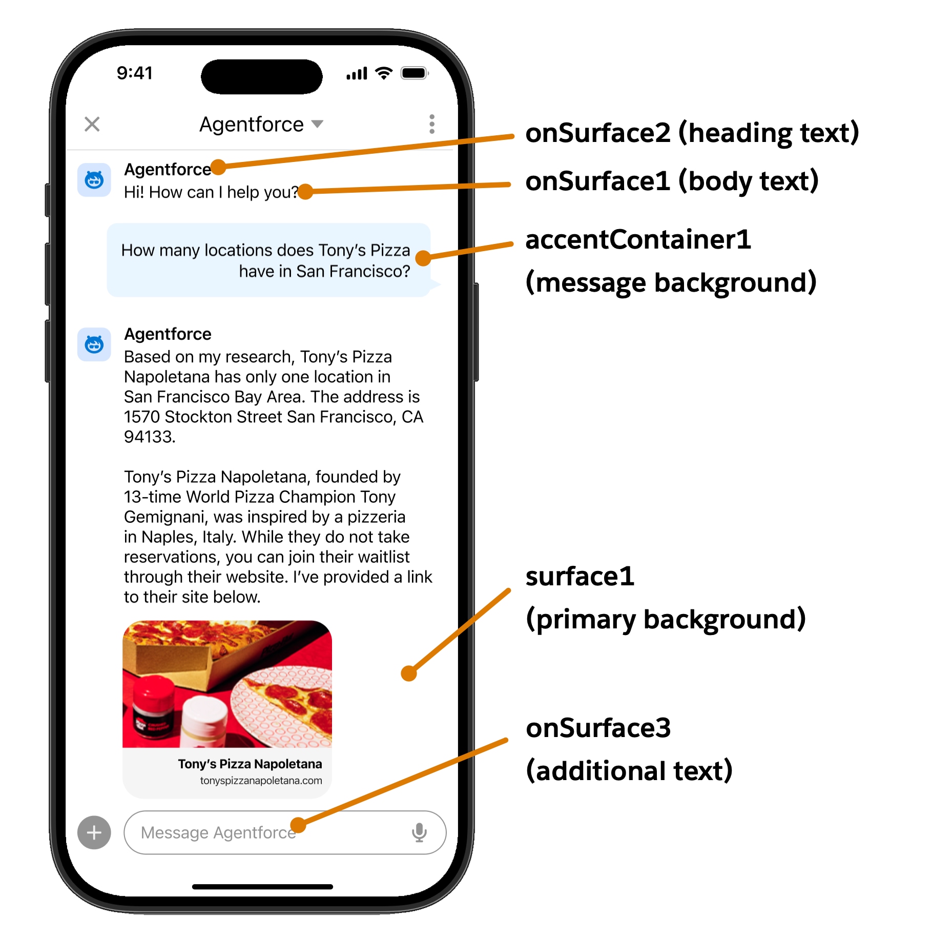
surface1: Primary view backgroundsurface2: Secondary view backgroundsurfaceContainer1: Default container background (cards, modals)surfaceContainer2: Darker container backgroundsurfaceContainer3: Darkest container background
onSurface1: Lightest text/icon fill (body text, labels)onSurface2: Darker text/icon fill (headings, input fields)onSurface3: Additional text/icon variant
accent1: Button icons and interactive elementsaccent2: Links, hover states, primary actionsaccent3: Selected statesaccentContainer1: Branded button backgroundsonAccent1: Text/icons on accent containers
error1: Error text and iconserrorContainer1: Error alert backgroundsonError1: Text on error containersborderError1: Error button borderssuccessContainer1: Success alert backgroundsonSuccess1: Success text and iconsborderSuccess1: Success button borders
disabledContainer1: Disabled white component backgroundsdisabledContainer2: Disabled dark component backgroundsonDisabled1: Text on light disabled containersonDisabled2: Text on dark disabled containers
brandBase50: Primary brand colorerrorBase50: Error brand colorfeedbackWarning1: Warning text colorfeedbackWarningContainer1: Warning container backgroundinfo1: Information text colorinfoContainer1: Information container background
The following sections show how to implement theming in your Android application.
Important: Currently, only color theming is supported. Fonts, dimensions, and shapes are not yet implemented in the theming system.
The following best practices ensure effective theming implementation.
- Use Semantic Colors: Always use semantic color tokens rather than hardcoded colors
- Test Both Modes: Ensure your custom colors work well in both light and dark modes
- System Integration: Use
AgentforceThemeMode.SYSTEMto respect user preferences - Copy Function: Use the
copy()function to modify existing colors rather than creating from scratch - Accessibility: Ensure sufficient color contrast for accessibility compliance
- Feature Flags: Use feature flags to gradually roll out custom theming
- UI Components: See Android UI Components for component theming
- Configuration: See AgentforceConfiguration for setup