Illustration (Beta)
lightning-illustration
Displays a Salesforce Lightning Design System illustration.
For Use In
Lightning Experience, Experience Builder Sites
lightning-illustration is a pilot or beta service that is subject to the Beta Services Terms at Agreements - Salesforce.com or a written Unified Pilot Agreement if executed by Customer, and applicable terms in the Product Terms Directory. Use of this pilot or beta service is at the Customer’s sole discretion.
The lightning-illustration component displays Salesforce Lightning Design System (SLDS) scalable vector design (SVG) illustrations to communicate errors, success, and other statuses. This component provides access to a set of standardized SVG illustrations for use in the Salesforce platform.
The lightning-illustration component simplifies development and maintenance while ensuring a high-quality visual experience for your custom Lightning pages that’s consistent with the Salesforce platform.
| Feature | Developer Benefit |
|---|---|
| Automatic Design System Compliance | Ensures uniform illustrations, eliminating manual checks for adherence to design guidelines. |
| Simplified Updates | Reduces the effort of updating illustrations by enabling centralized management with the component. A change to the illustration propagates everywhere you use the component. |
| Dynamic Theme Support | Illustrations dynamically adapt to themes, supporting light and dark mode and themes based on SLDS 1 and SLDS 2. |
lightning-illustration implements the Illustration blueprint in the Salesforce Lightning Design System (SLDS). The icons adapt to SLDS 1 or SLDS 2 styling based on the org’s theme or the container app that you use. Consult the SLDS site for images of the available illustrations.
| SLDS 1 | SLDS 2 | |
|---|---|---|
| Design | Illustration | Illustration |
| For Use In | Lightning Experience, Experience Builder sites | Lightning Experience |
Both the lightning-illustration and lightning-empty-state components currently support only Salesforce SVG illustrations for depicting empty state conditions. The lightning-illustration component doesn’t currently support other standard illustrations or custom illustrations. The lightning-illustration component currently supports the same illustrations as lightning-empty-state.
To display an illustration that clarifies why a page or panel has no content, and provides text and call-to-action content, use the lightning-empty-state component.
Use lightning-illustration for similar use cases as lightning-empty-state where you don’t require the supporting text or call-to-action content.
The component is useful for displaying an illustration only, without any visible text. It supports only two attributes: illustration-name and alternative-text. The illustration-name is required.
Here’s a basic example.
The lightning-illustration component detects the SLDS version of the theme that’s enabled in Salesforce and presents different illustrations for SLDS 2 and SLDS 1 themes. In SLDS 2 themes, the illustrations also adapt automatically for dark mode and the theme and branding that’s in effect in the org.
illustration-name accepts a name in the pattern set:symbol (which you can think of as category:name) to retrieve an illustration from SLDS. For example, valid names include cart:noitems and error:connectionissue.
The lightning-illustration component displays a unique SVG image for each illustration that you specify with the illustration-name attribute.
For SLDS 2 themes, lightning-illustration presents new Salesforce Cosmos illustrations. For SLDS 1 themes, the component uses a smaller set of existing SLDS 1 illustrations from Lightning Experience.
Each of the SLDS 1 illustrations maps to one of the same category:name illustration names. The mapping enables lightning-illustration to work in SLDS 1 themes. However, some SLDS 1 illustrations map to multiple illustration names. This reuse of illustrations means that SLDS 1 themes don’t have a unique SVG image for each illustration name.
For example, if your component encounters an error that isn’t fixable at the moment, specify illustration-name="error:unrecoverable".
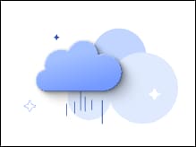
In an SLDS 2 theme, the component displays an illustration of a rain cloud for illustration-name="error:unrecoverable".
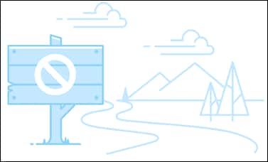
In an SLDS 1 theme, the same illustration-name="error:unrecoverable" attribute causes the component to display an illustration of a closed walking trail.
The component automatically presents the illustration that’s appropriate for the theme.
If you pass an invalid illustration name, the component falls back to the “gone fishing” illustration in SLDS 1 themes. In SLDS 2 themes, there’s a console error.
These illustration names in category:name format are available. Visit the Illustration component design to see the current images. This table describes the images that map to the illustration names to aid you in recalling the images. You can avoid looking them up in the design each time.
| Illustration Name | SLDS 2 | SLDS 1 |
|---|---|---|
access:deleted | A cocoon or chrysalis | An open empty treasure chest |
access:limit | An extinguished candle | A closed treasure chest |
access:request | A locked padlock | A closed treasure chest |
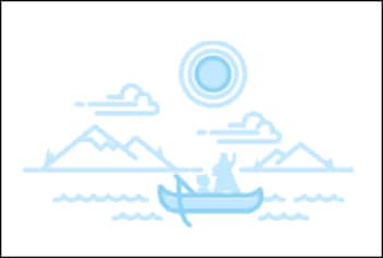
cart:noitems | An empty shopping bag | Gone fishing - Astro and Codey in a canoe |
error:appconnection | A stylized balloon | Floating hot air balloons |
error:connectionissue | An unplugged electrical plug | Floating hot air balloons |
error:recoverable | A wilting plant | A rainy campsite |
error:unrecoverable | A rain cloud | A walking path that’s closed |
maintenance:planned | A healthy plant | A hand under a landscape |
maintenance:unplanned | A boomerang | A hand under a landscape |
noresults:filter | Three plants, the tallest bending to the sun | Binoculars with a cracked lens |
noresults:search | A telescope pointing away from the sky | Binoculars with a cracked lens |
noresults:unknown | Mountains and clouds | Binoculars with a cracked lens |
success:assigned | Umbrella planted on a beach | Gone fishing - Astro and Codey in a canoe |
success:new | A zen sand garden | Gone fishing - Astro and Codey in a canoe |
success:selfassigned | A flag planted on a hill | Gone fishing - Astro and Codey in a canoe |
lightning-illustration automatically sizes to the full width of the container that it’s in. You can’t set the size directly in the component. To control the size, specify the container size. For example, wrap the component in a div and add a style to set the maximum width.
The lightning-illustration component is supported only on the Salesforce platform. It requires access to the SVG illustrations in a Salesforce org.
The component works in Experience Builder Sites, but can only display SLDS 1 illustrations. SLDS 2 isn’t supported in Experience Cloud.
Illustrations can clarify states like no data, success, access issues, or maintenance. Use lightning-illustration for more general status messaging, not for displaying in containers if there’s no data to display. Use lightning-empty-state for containers without data.
Render the illustration conditionally. For example, render an error illustration only in an error state.
This component uses new Salesforce Cosmos illustrations to fit the SLDS 2 themes. Develop with the SLDS 2 version of the illustration in mind first, and then test the component with SLDS 1 themes.
Choose an illustration that’s closest in meaning for your use case and provide messages in adjacent text components.
Rely on the component to detect the theme and handle switching between illustrations for SLDS 2 and SLDS 1. You can avoid branching your code.
Avoid changing illustration colors or shapes with custom CSS. Use layout and spacing utility classes.
Don’t embed text in the SVG.
lightning-illustration has an alternative-text attribute for specifying text for assistive technologies. Use alternative-text if the illustration conveys meaningful information such as why no results appear. Use concise, purposeful text such as “No search results.” Omit alternative-text if the illustration is purely decorative and the surrounding UI communicates the message.
The illustrations support SLDS standards for high color contrast across all themes.