Capricorn’s content managers have created some great content and curated that content for the main Capricorn Coffee website. In this blog post, we’ll see how Capricorn’s site designers display this content in rich, engaging ways using Salesforce CMS components and layouts.
Layouts in Salesforce CMS
Layouts in Salesforce CMS help the Capricorn team present content to their audience. Salesforce CMS comes with a number of layout options, providing great presentation flexibility and enabling you to create a wide range of digital experiences – no programming or design skills required. Simply use CMS Single Item and CMS Collection components to start integrating your curated content.

CMS Single Item component
Capricorn’s site designers want to create a beautiful banner advertising their new coffee brewing masterclass, as shown below.

Here are the steps they followed in the Lightning Builder:
Step 1: Drag and drop two CMS Single Item components into the builder canvas (Note: With Winter’20 building highly customized pages without code is made possible using Flexible Layouts.)
Step 2: Select the Content Source, which here is the content titled “Learn About Coffee Brewing Techniques” with Banner type for the first component and Blog type for the second component.
Note: The example shown below is a representation of the final stage after we have mapped the respective fields. Initially, it would be a blank canvas.

Step 3: Choose a Layout. With Salesforce CMS, content and presentation are decoupled. This means the content can be authored once but presented differently in different pages. Choose from several layouts options, including banner, tile, or card. For this page, banner layout is used in the two components.

Step 4: Map content to the layout display fields. Use “Field Mappings” to map the content fields to the desired placeholders in the layout. Capricorn’s site designers mapped video URL in the content type to video field in the layout for the first component. For the second component, details about the masterclass – headline, subheading, eyebrow, and metadata #1 fields in the layout – were mapped to appropriate fields from the blog content type.
Note: When you map a video URL (CMS currently supports YouTube, Vidyard, and Vimeo) to a text type content field, video overrides any existing image mapping present.
Also, video would fall back to image when there is no video URL in the content (the node that was mapped to was empty).

Step 5: Style your component. You can choose to align your content in nine ways: left, right, center, top-right, top-left, top-center, bottom-left, bottom-right, bottom-center. Here, Capricorn used center and left alignment.

Step 6 (optional): Further style your component. Here are some more ways you can customize your layout.
- Featured media: Control the alignment and width of the image/video inside your layouts. The example below shows left and right alignment. We can align it nine different ways as seen in step 5 above.

- Headline: As the name suggests, this is the title of your content. You can customize the size and variation of the font from the property panel.

-
- Also, you can highlight the text with a contrasting color as shown below.

- Subheading: It fits below the headline. Use it to give a brief description of your content.

- Eyebrow and metadata:
- The eyebrow is the topmost section of your layout. Use it to classify your content into a particular category. In this example, we use it to highlight the upcoming “masterclass.” We have configured the text color and made the text all caps.
- Metadata can be used in a variety of cases, such as contact us, event date, or author name. In this example, we have used the “Read More” link.

Step 7: Configure clickable content. What if you don’t want to take the user to a detail page? (See how to configure a detail page.) Use this section to override clicks. Based on the layout, you can override different things – eyebrow, title, and metadata in the case of Card/Tile layout and button text, title, eyebrow, and metadata in the case of Banner layout.
- Headline, eyebrow, and metadata fields can be configured to link to external sites using a URL.
- Select the desired field from the dropdown, then click Customize to map the selected field to a URL node. Click Save.
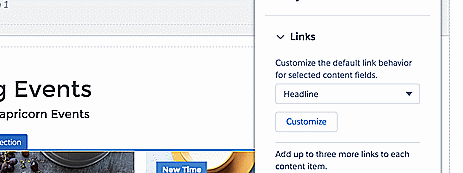
- You can also add up to three additional links. These links appear before metadata fields, and their labels and URLs can be mapped to content nodes.
Note: If the content mapped to the Link is not a valid URL, then the additional link won’t show up.
Valid URLs are absolute URLs which start with “http://” or “https://” or “mailto:” or “tel:”, or root relative urls, which start with “/”. The same valid URL rules apply to link overrides as well.
Step 8: Choose your button style with Banner layout. The button text and styling can be customized from the property panel.

Note: This customization is unavailable in Tile and Card Layouts as there is no button on these two layouts.
Step 9: Configure the hover effect for your component level. You can choose from Zoom In (component zoom in), Image Zoom In, and Overlay Fade Out.
CMS content detail page
With Salesforce CMS, you can create your own content types. Let’s follow Capricorn as its team creates a content detail page for a specific content type. A content detail page is the blueprint for how the content type will be displayed to the end user. Capricorn’s site designers want to create a content detail page for their custom content type Blogs.
Step 1: Create a content detail page for the content type. This is the page where your user will land when they click the button on the banner layout or headline in the card or tile layout.
- In Community Builder, open the Pages menu on the top toolbar and click New Page at the bottom of the Pages menu.

Step 2: Select CMS Content Page in the pop-up window.

Step 3: Select the content type. Click Next.

Step 4: Select a page payout. Click Create.

Step 5: Once you have the layout ready, drag and drop CMS Single Item (Detail) component and create a detail page for your content.

Step 6: Select the layout you’d like to use. Here we are using Detail Layout with Sections.

Step 7: Provide the field mappings as per your choice.

Step 8: Configure the other aspects of your layout. Based on your content, your detail page will vary to show the appropriate details.
CMS collection component
Next, Capricorn’s site designers want to showcase the events collection curated by their content managers. They can use the CMS Collection component to do this. Here’s how:
Step 1: Drag and drop the CMS Collection component into the workspace.
Step 2: Select the Collection. The collection titled “Events Near you” is used.
Step 3: Expand the Collection Layout. Choose from the available layouts – Grid, Carousel, Strip, or Slideshow. For this page, Capricorn used the Grid layout. Before we move on, let’s take a look at how each of these layouts appear.
Grid

Carousel

Strip

Slideshow

Step 4: Configure your layout.
- Choose the number of items to display and also control the spacing between them in the case of the Grid and Strip.
- In all carousel layouts, you can choose the maximum number of slides and transition speed. Additionally, in Strip you can set the number of slides displayed.
Here is how Capricorn’s Grid layout was configured:

Note: For thumbnails in slideshow, you need to map the content to “Thumbnail URLs” in the collection layout.
Step 5: Highlight your product using flags. Flags can be used to highlight your bestseller or newly launched products or even promote your latest offers. We will be using flags for highlighting our next component and go over it in detail.
- You can select the placement and the angle of rotation for the flag in the component.

- Also in Card and Tile layouts, you can place the flag relative to content or featured image. This will control whether the flag is placed inside the image or inside the content.
Note: This is by default set relative to image.
The next couple of steps are explained previously from Step 3 onwards in the “CMS Single Item component“ section. Capricorn also wants to showcase their store locations with the help of collections and using the power of layouts.
Step 6: Drag and drop the CMS Collection component. Select the collection “Locations-2.”
Step 7: Select Grid and Tile layouts respectively.
Step 8: Map fields and style content.
Step 9: In the Featured Media section, customize the borders to give a circular cutout to the images as shown below (bottom right). You can play around and choose one that you like.

Step 10: Choose the Zoom In effect for our collection, as shown below.

You see how simple it is for Capricorn to create rich, engaging experiences for customers. Use layouts to unleash the power of CMS. Go forth and customize!
Blog posts in this series
- Deliver Beautiful and Contextualized Digital Experiences with Salesforce CMS
- Use the CMS App to Create Content
- Content Curation in Salesforce CMS
- Content Delivery API to Extend or Integrate Content
About the author
Nishitha Reddy
Nishitha is an engineer on the Community Cloud team at Salesforce. She is one of the founding members of the Salesforce CMS team based out of Hyderabad, India. You can connect with her on LinkedIn to get the latest updates on the product.