
Since 2015, the Salesforce Lightning Design System (SLDS) has been helping developers on the Salesforce platform maximize clarity, efficiency, consistency, and beauty in their front-end code, as well as their rendered components. For more information about the history and structure of SLDS, check out: Building an Enterprise CSS Framework
As the system has grown though, it’s gotten harder and harder for developers to keep up with all of the best practices. Where should you use underscores and dashes in your class names? How do you choose the right class name for your button? Well, there’s a tool to help you figure all of this out, and more!
Enter the SLDS Validator, an extension for Microsoft Visual Studio Code. The validator will help you adhere to design system best practices by evaluating your HTML, CSS, and JavaScript code inline as you write it in VS Code, and giving you suggested changes to make. It can also run on your already-written code to validate for issues.
Here’s a video that gives you a feel for how the validator proposes changes to your code.
The SLDS Validator finds a variety of problems, but there are some issues that tend to need fixing more than others… so much so that we gave a talk about them at Dreamforce! Sure, you don’t have to fix them; your code probably works (right now, anyway) without our fixes. But the issues the validator catches will help your code be more maintainable, more adaptable, and less likely to break with design system updates. Those all sound like good things to us! Now, we present the top ten code issues revealed by the SLDS Validator.
General CSS issues
For our first few issues, let’s look at a few common CSS issues. CSS issues are particularly important to address because they are widespread and can affect any part of the design system.
Overwriting SLDS classes
Here is the CSS from the SLDS stylesheet that sets the color (using a design token) for all of the error text in an app:
1.slds-text-color_error {
2  color: $color-text-error;
3}
Say you wanted your error text to be a different color than $color-text-error, so you overwrote that SLDS class. Here is the custom CSS you wrote for your component to make the error text purple:
1.THIS .slds-text-color_error {
2  color: purple;
3}
No big deal, right?
Actually, overwriting SLDS classes can have many unintended consequences! This change will affect everywhere this class appears. Not only that, it can affect anything in the cascade of the class you’re modifying. After all, that’s the whole point of cascading style sheets.
What do we recommend instead? To make the customizations you wish to see, create a custom class. Note, though: the custom class you create should not prepend slds- or it will appear to be an SLDS class. Unexpected things could then occur. Give it a name that makes sense for what you’re trying to do. Then, use your new class in your HTML instead of the overwritten SLDS class.
1.THIS .my-custom-text-color_error {
2  color: purple;
3}
4
5<p></p>
Or… maybe don’t make your text purple at all. The design system is meant to create a consistent look and feel, and is meant to cover most use cases. Before you modify it, just think twice about whether or not the change is really necessary. The customizations you make to the design system create code that needs to be maintained for as long as that app is in use. Why not let us do the maintenance work for you?
Proper class, wrong HTML element
Using the right element for a given purpose is known as semantic HTML. It makes it easier for both people and machines to read and understand it. Semantics matter when it comes to SLDS as well, and the validator can help catch issues. Let’s spin up a quick button:
1<div></div>Here we’ve used a blueprint called slds-button and applied it to a div. According to the rules of the design system, though, an slds-button should actually be defined on a button HTML element, like this:
1<button></button>That’s better. But why does this matter?
As mentioned earlier, semantic HTML gives purpose. Using the wrong HTML element for a blueprint can impact accessibility. For example, using a
buttonelement allows screen reader users to know what’s going to happen next. Will they navigate somewhere or will something happen on the page? So, it’s important to choose the right HTML element for the job, and the Validator can help you choose the right one!
Double dash instead of underscore
If you’ve spent any time using SLDS, you’ve probably seen a LOT of dashes and underscores. SLDS CSS uses a standard class naming convention called “BEM,” which stands for Block Element Modifier. A block represents a component name, an element represents part of a component, and a modifier is a variation of a component or element. An example of a BEM-named design token is: slds-text-heading--large
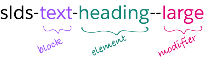
We found, however, that double dashes were problematic in XML environments because they are not allowed within comments. We made the decision to modify our BEM style to use underscores instead of double dashes between the element and modifier. That same design token now looks like this: slds-text-heading_large
Below is how this change is suggested within the SLDS Validator interface:
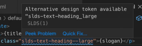
Thankfully, the SLDS Validator can fix a minor issue like this in just a click, helping your code be on track with SLDS standards and naming conventions.
Using CSS when an SLDS utility class will do
So, just what is a utility? A utility is a special CSS class used to set general properties, such as for grid, spacing, and typography, and isn’t associated with a specific blueprint.
What does it look like in practice to use CSS when a utility is available? Here we can see a bit of CSS and HTML code pulled from an actual Salesforce demo:
1.symbol {
2  text-align: center;
3}
4
5<p>
6  {stock.tickerSymbol}
7</p>
This class, symbol, has a text-align value of center. This is a pretty common bit of formatting. Think of how many times you might want to center, left, or right-align something in your app. You don’t have to put that formatting into your CSS class again and again.
Instead, we can take a utility class for center aligned text — slds-text-align_center in this case — and add that to our HTML element.
1<p>
2  {stock.tickerSymbol}
3</p>
Now that this class is on the HTML element, we’ve also provided a bit of clarity to the code. Without having to go into the CSS file, we can see that this p element is center aligned. You might notice that we’ve also removed symbol from the p element. It can be removed entirely from the CSS file as well. Symbol had no other formatting besides that center alignment, so it isn’t even needed anymore! Great, one less custom class for us to maintain! We’ve only made some subtle changes here, but we’re on the path to a more scalable app.
Blueprint related issues
For the next few issues, let’s look at issues related to component blueprints. As a reminder, a blueprint is a static, framework-agnostic, accessible UI element written in HTML and CSS. It requires additional JavaScript to become a functional component. Keeping blueprints looking consistent is a large part of keeping an overall app looking consistent, which is why it’s important to address SLDS issues the validator brings to light.
Incorrect blueprint hierarchy
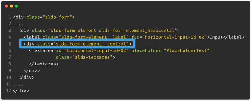
Hierarchy helps to maintain structure and consistency in a blueprint. If classes are missing within a blueprint hierarchy, the appearance will look off. Let’s look at this form we’re trying to lay out with labels to the left and fields to the right:
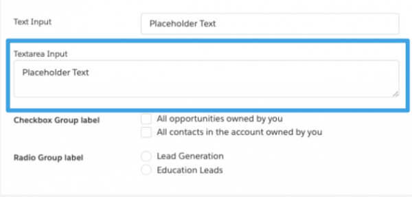
The textarea, highlighted in a blue box, extends far to the left instead of being aligned to the right like all of the other input fields. Let’s look at the code to see what happened:
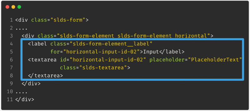
There is a label and a textarea input field, which seems fine. However, the SLDS validator (not shown) indicated there is a form-control div missing. Adding that, the code now looks like this:
Let’s see how this has changed the way our form looks:
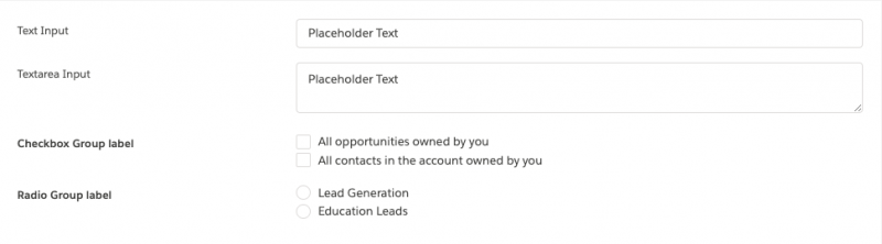
This definitely looks like what we were going for originally. Now all of the labels are aligned to the left, while the input fields are aligned to the right.
As mentioned before, hierarchy is important because it helps to maintain the structure and look and feel of the blueprint you want to use. It also helps in defining visual grids, spacing, and sections so your page looks consistent.
Blueprint consuming another blueprint’s class
Here we have two good-looking blueprints.

The arrows both point to h3 tags within the blueprints. They look pretty different – different sizes, one is bold. Which one do you like better? Don’t answer this! It’s a trick question!
A blueprint should not consume another blueprint’s class. Because a child’s style often relies on having the correct parent class in the code, it could render unpredictably. You also lose clarity, one of the main goals of SLDS. Your code won’t make sense to you or other people who come along behind you to maintain it. Additionally, if you mix blueprint classes, things may look good and work right now, but may break in the future. You’re assured that dynamic menu parts will always look good in a dynamic menu, but there are no assurances that dynamic menu parts will always look right in, say, an accordion.
So what does this look like in code? Here you see the beginnings of an accordion. As you can see, all of these nested HTML elements have classes that begin with slds-accordion. When you get to the h3 header, perhaps another h3 has the styling you prefer. Resist the urge to use that h3 and instead use the one for the blueprint you’re in – in this case, for the accordion.
1<ul>
2  <li>
3    <section>
4      <div>
5
6        /* NO */
7        <h3>
8
9        /* YES */
10        <h3>
11
12        /* BONUS NO */
13        <h3>
And as a bonus “no”, also resist the urge to not use a class at all when one is called for. Omitting a class will cause the design to look inconsistent and if the element has children, can have cascading design effects. The SLDS website not only provides documentation but also example blueprint code, so be sure to reference it.
Design token issues
In our last section, let’s talk about common issues we see with tokens!
Using CSS when a design token will do
As you can see in this first bit of code, this paragraph has a hard-coded padding size of 0.75rem.
1p {
2  padding: 0.75rem;  // hard-coded value
3}
We’ll see below that there is a design token that can replace this, but why would we want to do this?
Design tokens are named entities that store visual design attributes. They are used in place of hard-coded values. If you’re familiar with CSS variables, the execution and benefits are similar. If you have multiple custom components with links and font-sizes of 1rem, variables allow you to store the value in one place but reference it in multiple places. Later on, if you want to change the size, you only have to change it in one place. These principles allow design tokens to help maintain scalability and consistency in UI development.
Using the validator on the code above, it suggested a substitution of the design token spacingSmall for the hard-coded 0.75rem.
1p {
2  padding:  t(spacingSmall);  // design token!
3}
Remember, not all design tokens are used for all things. While some tokens are generic and intended to be used anywhere, others have specific uses. For example, tokens that begin with colorBackground should not be used for border colors or text colors, and a token with Text in the name should not be used for border colors or background colors.
Another note – you might be able to remove more code (and add clarity) by instead finding a utility class to use here. Remember issue 7? Aim for using utilities whenever possible so that you have less custom CSS to write and maintain.
Standard tokens that aren’t the standard
Here’s a subtle item related to standard tokens that aren’t the standard. Some standard tokens now have variable token alternatives. Here you can see a standard token as defined in the SLDS stylesheet:
1.slds-p-around_small,
2.slds-p-around--small {
3  padding:  0.75rem;
4}
and its variable alternative:
1.slds-var-p-around_small { // note the addition of var
2  padding:  0.75rem
3}
You should choose the version that is appropriate for your use case (more about that later). Here’s also a bonus reason to switch from the double dashes to the proper single underscore syntax (issue 8). We do still support, though highly discourage the use of, the double dashes in the standard token. Double dashes are not supported at all in the variable token. So if you’re changing from standard to variable, it will make it easier if you’re using an underscore.
As previously mentioned, not all design tokens have these variable token alternatives. These variable tokens are mainly related to spacing, form element alignment on record details, and title font size. As of the Winter ‘19 release, you have access to variable spacing tokens to help leverage densification in your own components. Individual users can adjust their UI “density setting” in Lightning, choosing between Comfy mode and Compact mode. If you want your design to be able to adapt, be sure to choose the variable token. If you don’t want your design to adapt, you want to stick with the standard token. Your layout can shift if you’re using a variable token in a standard world.
Here you can see how the SLDS Validator suggests this change:
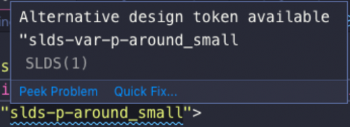
The yellow text is the original code. The text above that is the SLDS Validator alerting that an alternative design token, the variable version, is available. You would find the yellow light bulb and click on that to swap out the class. That’s all there is to it!
Applying scoped tokens globally
There’s a set of tokens that are global and can be used anywhere, but tokens scoped to a blueprint should not be used outside of that blueprint. Let’s see what this issue looks like.
Below is a custom button class that we’ve created. We wanted this button to have background color of white, so went through the SLDS documentation and found a design token that looked like it worked.
1.THIS .my-custom-button-class {
2  background-color: $card-background-white;
3}
However, there’s a problem here. That token seems to be scoped to the card blueprint, as indicated by the word ‘card’ prefixed at the beginning of the design token. This can potentially cause issues. For example, scoped tokens are subject to change, so if the design system were to update this to be a different color, the button color would change unexpectedly.
But, there is a solution for this: global tokens! Global tokens are tokens that can be used in any part of the design system.
1.THIS .my-custom-button-class {
2  background-color: $color-background;
3}
The SLDS Validator found that $color-background was a global token that could be substituted here.
In addition to the SLDS Validator, you can use the SLDS documentation to find which tokens are global by looking for tokens that are listed as ‘Global Access.’ One other benefit of using a global token is that it allows your application to look consistent throughout the app and maintain the Salesforce look and feel.
Semantically incorrect tokens
We talked about semantics previously while looking at HTML, but the same rules apply when looking at CSS as well. A quick reminder: semantic CSS allows people to understand your code more easily. Let’s look at a quick example:
1p.one {
2  border-style: solid;
3  border-color: $color-background;
4}
This CSS code adds a border style and border color. But as previously mentioned, what if the design system updates or changes the appearance of a $color-background? Suddenly the border-color could look a lot different than expected.
So, how can we figure out what to choose instead? The SLDS Validator can again find a token that semantically makes sense for this code.
1p.one {
2  border-style: solid;
3  border-color: $color-border;
4}
Since we’re assigning a border color, it found a design token called $color-border.
Using semantically correct tokens not only makes code easy to read, but certain design token values were selected for a particular reason. For example, choosing $color-border means accessibility is baked in. So, it’s a win for everyone!
Wrapping up
So, here they all are! We began with General CSS related issues:
- Overwriting SLDS Classes
- Proper Class, Wrong HTML Element
- Double Dash Instead of Underscore
- Using CSS When an SLDS Utility Class Will Do
then moved on to issues specific to blueprints:
- Incorrect Blueprint Hierarchy
- Blueprint Consuming Another Blueprint’s Class
and wrapped up with things you should watch our for when dealing with design tokens:
- Using CSS When a Design Token Will Do
- Standard Tokens That Aren’t the Standard
- Applying Scoped Tokens Globally
- Semantically Incorrect Tokens
Now that we’ve gone through the issues, let’s circle back to SLDS.
Perhaps we should address the elephant in the room right now. SLDS can sound like a lot of rules to follow. And there are a lot of rules! We think you’ll find that using SLDS as intended is worth it, though. Our goals are to help you achieve clarity, efficiency, consistency, and beauty in the user interfaces you’re creating. The SLDS Validator guides you through all of those rules so you can have someone, or something, double-checking your code so that you can get the most out of SLDS.
So, what now? Here are some next steps:
You can download the SLDS Validator, an extension for Microsoft Visual Studio Code that is now shipped as part of the Salesforce Extension Pack, and see for yourself how quick and easy it to fix common issues yourself in your code.
And to learn more about Lightning Design System, take this Trailhead module we created called Lightning Design System for Developers. We think that the SLDS Validator will quickly become a useful tool in your toolbox for developing using SLDS.
About the Author
Donia Robinson is a Lead Software Engineer at Salesforce on the Design System Enablement team. She’s been a full stack developer since before it was cool, and is working to help level the playing field in tech.