
Follow and complete a Learn MOAR Summer ’22 trailmix for admins or developers by July 31, 2022, 11:59 pm PT to earn a special community badge and enter for a chance to win one of five $200 USD Salesforce Certification vouchers. Restrictions apply. Learn how to participate and review the Official Rules by visiting the Trailhead Quests page.
Lightning Components continue to evolve with many great new features that will be Generally Available in the Summer ‘22 release. These updates enhance performance, enable you to expose your components to third-party libraries, and help you extend your components with new modules. In this blog post, we’ll discuss new features, such as light DOM and notification modules, that can help you enhance your Lightning Component development.
Introducing light DOM
Before we can really get into what light DOM is or how it can help you, we first need to recap shadow DOM. If you have spent time building Lightning Web Components, you are more than familiar with shadow DOM as it is used to protect your components from being manipulated. It does lots of great things for your components, such as protecting them from having CSS leak into them from their parent or the page, hiding them from the DOM inside of the shadow tree, and much more.
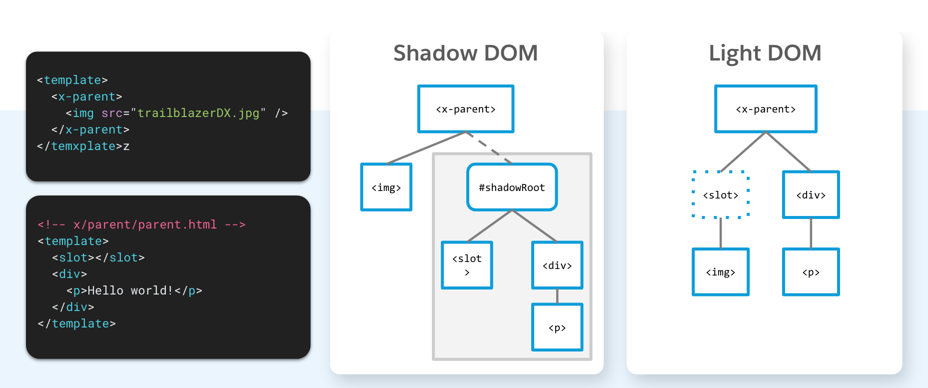
All of the benefits of shadow DOM are great, however , sometimes you may actually want to be exposing your components to the page. That’s why we have implemented a light DOM, which allows you to open up your components to the page and avoid the shadow DOM limitations. This makes it much easier to inherit global styles from your page and integrate with third-party libraries.
Considerations and limitations
There are a few differences between light DOM and shadow DOM that are worth noting. First of all, when you are rendering in light DOM, there is no shadow tree or shadow roots. This means that the way you access the contents will be different. With shadow DOM, you have to first call the template using this.template.querySelector() to reach inside of the component. Now with light DOM, you can use this.querySelector() directly as there is no template and no shadow tree.
You also have to keep in mind that styles aren’t scoped — all of the styles that have been set at the top level of the page will leak into your component. Events are no longer retargeted, and your events will be accessible at the page level. Lastly, slots elements are core to the shadow tree and will not render when in light DOM.
Get started with light DOM
It is very easy to get started with light DOM. The first thing that you need to do is to understand which components you need to expose outside of the shadow. Once you have completed a risk analysis, it’s as easy as updating the HTML and JS files of the Lightning Web Components that you would like to enable. There is no global switch for light DOM, it must be enabled on a component by component basis.
In the components HTML file, you will just need to set a static class property called render-mode and set it to “light.”
1<template lwc:render-mode='light'>
2    <my-header>
3        <p>Hello World</p>
4    </my-header>
5</template>
Then in the JS file, you will need to create a renderMode property and set it to light (the default is shadow).
1import { LightningElement } from 'lwc';
2
3export default class LightDomApp extends LightningElement {
4    static renderMode = 'light'; // the default is 'shadow'
5}
New base components
In late 2021, notable browser vendors released breaking changes that would no longer allow developers to use the .alert(), .confirm(), and .prompt() methods. Here at Salesforce, we have acted very quickly to create three new base components to help you continue to use these features.

The modules can be accessed right inside your existing Lightning Web Components. For example, to use the alert component, you will just need to import LightningAlert from lightning/alert.
To open the alert, you can then just call LightningAlert.open().
1LightningAlert.open({
2    message: 'this is the alert message',
3    //label defaults to "Alert"
4    variant: 'headerless',
5}).then((result) => {
6    console.log('alert result', result);
7});
Mixed shadow mode
Currently in Developer Preview — you can build components in mixed shadow mode. Now that all major browsers support shadow DOM, you gain the speed and efficiency of using the native shadow as much as possible in your app. In cases where native shadow DOM is not supported, Mixed Shadow mode will use the current synthetic shadow polyfill.
For example, if we set a components shadowSupportMode to any, it will pick the correct shadow implementation for the browser.
1import { LightningElement } from 'lwc';
2
3export default class extends LightningElement {
4    static shadowSupportMode = 'any';
5}
This component will render with native shadow DOM on Chrome, Edge, Firefox , and Safari, and it will use the synthetic shadow on legacy Edge and IE11.
Learn MOAR this week
Now you know about all of the great new Lightning Web Component updates. If you have questions, head to the Trailblazer Community and ask us on the Salesforce Developer Trailblazers group.
Product Managers and the Developer Relations team are back to share the latest features and functionality in Summer ‘22. To help you develop faster, new content from Developer Relations will cover their favorite new features. Also, be sure to check out Release Readiness Live on Friday, May 20, 2022 at 9:00 a.m. PST. Lastly, keep an eye on the Salesforce Developers blog every day this week for more posts on Summer ’22!
To learn even more, check out the Summer ’22 trailmix.
About the author
Stephan Chandler-Garcia is a Senior Developer Evangelist at Salesforce. He focuses on application development, security, and Experience Cloud. You can follow him on Twitter @stephanwcg.