Light DOM
Lightning Web Components currently enforces shadow DOM on every component, encapsulating a component’s internal markup and making it inaccessible to programmatic code. When you use light DOM, your component lives outside the shadow DOM and avoids shadow DOM limitations. This approach eases third-party integrations and global styling.
Let’s look at how the different DOM structures render in the DOM before we dive into details about light DOM. First, consider some markup for a shadow tree. Native shadow DOM renders components within the #shadow-root tag. However, Lightning Experience and Experience Cloud use synthetic shadow instead, which mimics native shadow behavior.
With light DOM, the component content is attached to the host element instead of its shadow tree. It can then be accessed like any other content in the document host, providing similar behavior to content that’s not bound by shadow DOM.
For a comprehensive overview, see Google Web Fundamentals: Shadow DOM v1.
Light DOM provides several advantages over shadow DOM.
- CSS theming and branding: Light DOM supports global styling, making it easy to apply custom branding to your components and child components.
- Third-party tooling and testing: With light DOM, third-party tools can traverse the DOM, enabling standard browser query APIs like
querySelectorandquerySelectorAll, without traversing the shadow root. For example, light DOM enables standard components in LWR sites to track events. - Accessibility: Light DOM doesn’t scope IDs and enables two separate components to reference an ID on the other. For example,
<label for="my-input">can reference<input type="text" id="my-input">even if the elements are in separate components.
The lwc-recipes repo has light DOM examples. Look for components that start with lightDom, such as lightDomQuery.
Using light DOM exposes your components to DOM scraping, so if you’re working with sensitive data, we recommend using shadow DOM instead. In other words, light DOM doesn’t provide the benefits that come with shadow DOM encapsulation, which prevents unauthorized access into the shadow tree. Since the DOM is open for traversal by other components and third-party tools, you are responsible for securing your light DOM components.
Consider these best practices when using both light DOM and shadow DOM in your app.
- You can nest a light DOM child component in a parent shadow DOM component and vice versa.
- We recommend encapsulating deeply nested light DOM components in a single shadow DOM component at the top level. Then, you can share styles between all the components under the shadow root.
- Be careful when querying elements or injecting styles at the document level. A shadow tree can sit between the document and your component.
- You can override shadow DOM styles via CSS custom properties and ::part. However, the component owner is in charge of exposing the extension points, which prevents downstream consumers from styling arbitrary elements.
- Restricting light DOM to specific namespaces isn’t supported.
- Distributing components rendered in light DOM isn’t supported. Component references in a managed package use the
cnamespace and would result in a namespace conflict. - Base components are always rendered in shadow DOM.
- Aura components can’t use light DOM. However, an Aura component can contain an LWC component that uses light DOM.
- Lifecycle hooks on slots are never invoked since the
slotelement does not render in the DOM. - Using slots inside a
for:eachiterator is not supported. For example:
Top-level light DOM components aren’t protected by Lightning Locker or Lightning Web Security (LWS). Always nest light DOM components somewhere within a shadow DOM component. If you expose a light DOM component at the top-level of your component hierarchy, code from other namespaces can read the content of the component, for example.
Disabling Locker, such as in Experience Builder sites, means that you won’t receive the security benefits from Locker. Make sure that you understand the ramifications of a more relaxed CSP environment on your Experience Builder site. See CSP and Lightning Locker Design Considerations.
In Aura-based Experience Builder sites, DOM access using this.querySelector() and other Web APIs are blocked by Lightning Locker. If you’re using light DOM in Aura-based Experience Cloud sites, ensure that there’s at least one LWC shadow DOM component as an ancestor to the light DOM component. Using a shadow DOM component means you encapsulate the component’s internal markup and are subject to shadow DOM limitations.
Beginning in Winter ’23, if Lightning Web Security (LWS) is enabled in the org, any Lightning web components contained in Aura sites are protected by LWS instead of Lightning Locker. If you disable Lightning Locker for the site, you also disable Lightning Web Security.
Due to its strong encapsulation, shadow DOM is the recommended way to author components. It hides your component’s internals so consumers can only use its public API.
Shadow DOM isn’t suitable in the following cases.
- Building a highly customizable UI, where you want complete control over a web app’s appearance.
- Using third-party libraries. Many popular libraries aren’t compatible with shadow DOM.
Light DOM is a better fit in those cases, but note that consumers can access your component’s internals as they can with your public API. Allowing such access makes it challenging to implement changes without impacting your consumer’s code.
Here are pros and cons in using one over the other.
| Shadow DOM | Light DOM | |
|---|---|---|
| Security | Strong component encapsulation protects components from unauthorized access | Weak encapsulation makes components open to unauthorized access |
| Portability | Highly portable with access controlled through public APIs | Susceptible to breaking changes caused by component authors or consumers |
| Styling | Requires CSS custom properties to override styles | Easy to override styles |
| Third-party library and tool integration | Limited compatibility with third-party libraries or tools requiring DOM traversal or event retargeting | Simple integration with third-party libraries and tools |
When working with third-party libraries, such as Google Analytics or another instrumentation library, you don’t have to use light DOM if your shadow DOM component exposes the right APIs. Let’s say you want to instrument click interactions on a button:
With light DOM, you can attach a click event listener on the button element. If you render the component in shadow DOM, the button element isn’t accessible from outside the component. With shadow DOM, <button> becomes an internal implementation detail of the my-button component. In this case, the correct approach to instrument this component is to add a click handler on my-button itself to instrument it.
Expose only the bare minimum you want to instrument since exposing your internal events can weaken your component’s encapsulation. While the preceding example isn’t always possible, we recommend you explore your options before selecting the best fit for your use case.
To enable light DOM, you start by setting the renderMode static property in your component class:
Then use the lwc:render-mode root template directive, which is required for components using light DOM.
Changing the value of the renderMode static property after instantiation doesn’t impact whether components render in light DOM or shadow DOM.
Migrating a component from shadow DOM to light DOM requires some code changes. The shadow tree affects how you work with CSS, events, and the DOM. Consider the differences described in the following sections when you work with light DOM.
Your app can contain components that use either shadow or light DOM. In this example template, my-app uses shadow DOM and contains several components: my-header uses light DOM and my-footer uses shadow DOM.
A light DOM component can contain a shadow DOM component. Similarly, a shadow DOM component can contain a light DOM component.
If you have deeply nested components, consider a single shadow DOM component at the top level with nested light DOM components. This structure allows you to freely share styles between all child components within the one shadow root.
Unlike synthetic or native shadow, light DOM doesn’t scope IDs to an individual component. Instead, it enables a component to reference an ID on a separate component. This advantage enables you to link two elements using IDs and ARIA attributes by placing them in the same shadow root.
Consider this example with two sibling components.
The c-label component contains a <label> element with an id attribute.
The c-input component contains an <input> element that references the <label> element from the c-label component.
With shadow DOM, CSS styles defined in a parent component don’t apply to a child component. Contrastingly, light DOM enables styling from the root document to target a DOM node and style it.
The styles on the following native shadow component cascades into the child component’s light DOM. In this case, the light DOM component is inside the native shadow component and is mounted at the closest native shadow root level. This light DOM component is scoped locally within that entire shadow root and affects any light DOM components inside that root.
Similarly, the styles on a child component rendered in light DOM are applied to its parent components until a shadow boundary is encountered when using native shadow DOM.
For synthetic shadow DOM, the shadow DOM styles don’t cascade into the light DOM child components.
In synthetic shadow DOM, styles are implemented at the global document level, but using attributes to scope the styles. This is a current limitation for synthetic shadow DOM.
LWC doesn’t scope styles automatically for you. To prevent styles from cascading out of a component, we recommend using scoped styles with *.scoped.css files. See the Use Scoped Styles in Light DOM section.
To override inherited styles in Lightning web components, use SLDS styling hooks in the component stylesheet. Your styling hooks act as placeholders for your custom styles. See the Blueprint Overview for a list of component blueprints that support component styling hooks.
The order in which light DOM components are rendered impacts the order in which stylesheets are injected into the root node and directly influences CSS rule specificity.
In shadow DOM, you can only access elements the component owns.
In contrast, you can retrieve a node from a light DOM component, which is helpful for third-party integrations and testing. For example, you can query the paragraph in your app using document.querySelector('p').
With shadow DOM, LightningElement.prototype.template returns the component-associated shadow root. The template element isn’t available to components that use light DOM, so with light DOM, LightningElement.prototype.template returns null.
When migrating a shadow DOM component to light DOM, replace this.template.querySelector with this.querySelector. The following example uses a list of common DOM APIs to work with a light DOM component.
With light DOM components, this.querySelectorAll() can return elements rendered by other light DOM components. To access the parent element in light DOM, use this.hostElement.
The id attribute on an element is preserved at runtime and isn’t manipulated as in synthetic shadow DOM. So you can use an id selector in CSS or JavaScript because it matches the element’s id at runtime.
Alternatively, use this.refs when you’re working with components in light DOM and shadow DOM. this.refs accesses the element that’s defined in the component and behaves similarly in both light DOM and shadow DOM, unlike this.querySelector or this.querySelectorAll.
With shadow DOM, if an event bubbles up and crosses the shadow boundary, some property values change to match the scope of the listener. With light DOM, events aren’t retargeted. If you click a button that’s nested within multiple layers of light DOM components, the click event can be accessed at the document level. Also, event.target returns the button that triggered the event, instead of the containing component.
For example, you have a component c-light-child using light DOM nested in a container component c-light-container that’s also using light DOM. The top-level c-app component uses shadow DOM.
When you dispatch the custom buttonclick event in c-light-child, the handlers return these elements.
c-light-child host handler
event.currentTarget:c-light-childevent.target:c-light-child
c-light-container host handler
event.currentTarget:c-light-containerevent.target:c-light-child
In contrast, if c-light-container uses shadow DOM, the event doesn’t escape the shadow root.
Events bubble through components even if composed is false in light DOM, since there’s no shadow root.
Light DOM emulates slots because browsers don’t support them outside shadow DOM. Slots in light DOM behave similarly to synthetic shadow slots. LWC determines at run-time if a slot is running light DOM.
The <slot> element is a placeholder in a component for where slotted content gets attached. <slot> isn’t rendered in light DOM, so if other parts of your code depend on attributes or event listeners of a <slot> element, LWC throws a compiler error. For example, the slotchange event and ::slotted CSS pseudo-selector aren’t supported since the slot element doesn’t render in the DOM.
A <slot> element without the name property is a default (or unnamed) slot. To pass content from only a specific element into a <slot>, create a named slot.
To create a named slot, set a <slot> element’s name property to a string value. To insert slotted content in that named slot, set the slot property of the element with content to the same string value.
In the sample code below, the component my-component has a named and an unnamed slot. The named slot contains fallback content that only renders if you don’t provide slotted content.
Pass slotted content into my-component like this.
At run-time, the slotted content or fallback content is flattened to the parent element. Content is directly appended to the host element in the DOM. The <slot> elements in my-component aren’t rendered to the DOM.
Light DOM only renders slotted elements that are assigned to slots. If an element with slotted content isn’t linked to a slot, the element’s lifecycle hooks are never invoked.
Consider these composition models using slots. A component in light DOM can slot in content and other components. The slots support both light DOM and shadow DOM components.
Here’s how your content is rendered in the slots.
Consider this light DOM component c-light-slot-consumer that contains a shadow DOM component c-shadow-slot-container and light DOM component c-light-slot-container.
If you include styles in c-app, all elements within the slots (in both the shadow DOM and light DOM components) get the styles. However, the shadow DOM component without slots doesn’t receive the styles.
When a component is rendered to the DOM at runtime, light DOM slots don’t rely on the native browser <slot> elements or slot attributes.
In LWC API v61.0 and later:
LWC removes the slot attribute from an element when it’s being slotted into a light DOM slot.
For example, this <template> passes a <div> with the slot='lightSlot' property into a light DOM slot.
The c-light-child component renders to the DOM without the slot property.
To support slot forwarding, native and synthetic shadow slots still preserve the slot attribute. For example, say you have a light DOM slot that forwards a <div> with slot="lightSlot" into a shadow DOM slot.
The slotted content (<div>) renders in the DOM with its slot attribute preserved.
If your CSS selectors or querySelector() methods reference the slot attribute, we recommend you choose a different CSS selector or use lwc:ref instead.
You should also review your Jest snapshots to see if they’re impacted by this change.
In LWC API v60.0 and earlier:
Light DOM elements render with their slot attributes. The example <template> above renders to the DOM as follows.
Slot forwarding refers to passing content from one slot to another slot.
For example, say you have a c-outer component that pulls content from a <span> element into its named slot namedSlot. c-outer also has a child component, c-inner. You want to forward content from namedSlot into c-inner’s slot forwardedSlot.
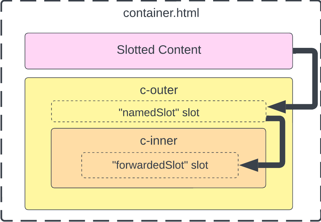
container.html passes the <span> with slotted content into <c-outer>.
In LWC API v61.0 and later:
You can forward content from a parent’s light DOM slot to a child’s slot using only the slot attribute. You no longer have to create a wrapper around any of the slots.
For these versions of LWC, here’s an example of a valid c-outer component.
namedSlot receives content from the <span> in container.html because it has the property name="namedSlot". Additionally, namedSlot passes its content to the slot named forwardedSlot because it has the slot="forwardedSlot property.
The “Named slot content” string renders in the slot named forwardedSlot for <c-inner>.
In LWC API v60.0 and earlier:
To forward light DOM slot content into another slot, you have to wrap the outermost <slot> element in another element and assign the slot attribute to the element.
Here’s an example of a c-outer component with a <div> wrapper around namedSlot.
The same applies to default slots.
As a result, the “Named slot content” string renders in the forwardedSlot slot for <c-inner>.
With scoped slots, you can access data in a child component and render it in slotted content inside of a parent component. Binding data from the child component to the scoped slot allows the parent component to reference the child component’s data in the slotted content. This data is slotted in the child component’s light DOM.
In this example, the child component <c-child> binds its item data to the scoped slot <slot>. In the parent component <c-parent>, the scoped slot fragment references {item.id} and {item.name} in the markup that will be slotted to <c-child>.
Because the scoped slot fragment is in the parent component’s template, the parent component owns the slotted content. So if the parent component references a scoped style sheet, those styles also apply to the content of the scoped slot.
The parent component partially renders the content of the scoped slot, so it must be enclosed in <template></template> tags. In the example, the scoped slot content is <span>{item.id} - {item.name}</span>. The parent component creates this partial fragment.
The parent component also renders each item, and the child component controls the loop logic. <c-child> creates as many slots as needed using the same template fragment passed from <c-parent>.
To use scoped slots, the child component must use light DOM. Scoped slots in shadow DOM aren’t supported. The parent can be a light DOM or shadow DOM component.
The final HTML looks as follows.
To introduce scoped slots into your components, add the directives lwc:slot-bind and lwc:slot-data. For more information, see Directives for Slots and Directives for Nested Templates.
A child component can have multiple named scoped slots, but it can have only one default scoped slot.
You can bind different scoped slots to the same source of data. In the example below, the default scoped slot and the two named scoped slots render content from slotdata.
You can bind a scoped slot to only one source of data. For example, binding the named scoped slot namedslotA to two different sets of data, slot1data and slot2data, results in a compiler error.
If you try to bind a default scoped slot to multiple different sets of data, the compiler throws the same error.
Because you can only have one default slot in a component, you can’t place a standard default slot and a default scoped slot in the same component. The following code results in an error.
Within a child component, a named scoped slot and a standard named slot can’t share the same name. The following code results in an error.
When binding a scoped slot in a parent component to data from a child component, the components must contain the same type of slot. For example, if a parent component contains a scoped slot bound to a child component, that child component must also have a scoped slot. Otherwise, the slotted content isn’t rendered. If you enable debug mode, an error is also logged in the dev console.
You can nest a scoped slot inside another scoped slot.
Scoped slots can reference component bindings and scope bindings.
In light DOM, you can use scoped styles to apply CSS to elements on the component only. This behavior is similar to style encapsulation with shadow DOM.
To add scoped styles to a component, create a *.scoped.css file in the component folder.
You can include either one, both, or neither of the CSS files in the example above for shadow DOM components and light DOM components.
In Aura-based containers, light DOM components can only load scoped styles. For example, in Aura-based Experience Builder sites, you must include the *.scoped.css file for your custom components instead of the *.css file.
Let’s examine a light DOM component with scoped styles.
The scoped style results in:
If a *.css file is used with a *.scoped.css file, the *.css stylesheets are injected before the *.scoped.css stylesheets. The scoped style CSS selectors have precedence over the unscoped ones because they’re declared last.
If a scoped stylesheet and an unscoped are used on the template, both style sheets are applied. The injection order influences which styles are applied by the browser when you have duplicated selectors. See tree proximity ignorance.
In this case, c-light-cmp uses the scoped styles, but the styles from the unscoped stylesheet can bleed out of the component.
In the preceding example, the paragraph in c-app inherits the styles from lightCmp.css. To override the styles from lightCmp.css, include a scoped stylesheet app.scoped.css.
We don’t recommend using the !important rule as it makes debugging more difficult. When you use !important on a style declaration in both your scoped and unscoped stylesheet, the scoped style has greater specificity and its style is applied to the component.
When you use *.scoped.css, the CSS selectors are scoped to all elements in the component HTML file.
In the following CSS, all selectors match the elements in the template, and only those elements.
The root element c-light-cmp can be targeted using :host, even in a light DOM component.
CSS scoping uses custom CSS classes to prevent styles from leaking out of the component.
As light DOM styles aren’t scoped by default, the :host pseudo selector refers to the closest shadow root host element (if any). With light DOM scoped styles, the :host selector refers to the root element of the light DOM component, which is the root of the scoped DOM region.
Let’s say you have an unscoped and scoped stylesheet on a light DOM component.
The component renders:
In the preceding example, :host is transformed for the scoped style.
The :host-context() selector isn’t supported.
Light DOM scoped styles have some differences from LWC’s synthetic shadow scoped styles.
- Light DOM scoped styles use classes for scoping, but synthetic shadow DOM uses HTML attributes.
- Light DOM scoped styles don’t support
@importwithin scoped stylesheets. - Light DOM scoped styles don’t apply to content that’s manually injected into the template inside of
lwc:dom="manual", for example, content injected usingElement.appendChildorElement.innerHTML.
To easily convert components from shadow DOM to light DOM, use the lwc-codemod tool. The tool modifies the files in a component bundle, which includes adding the renderMode property in the JavaScript file and the lwc:render-mode directive in the HTML file.
For more information, see the lwc-codemod documentation.
See Also