Branding and Theming
The Agentforce iOS SDK provides comprehensive theming capabilities for customizing the visual appearance of chat interfaces and UI components.
The Agentforce iOS SDK includes a sophisticated theming system built on top of Salesforce's design system. The theming system provides:
- Color Theming: Complete color palette customization with semantic tokens
- Light/Dark Mode Support: Automatic switching and explicit mode setting
- System Integration: Adapts to iOS appearance preferences
- Reactive Updates: Observable state management for real-time theme changes
- AgentforceThemeManager: Central theme management interface
- AgentforceDefaultThemeManager: Default implementation with Agentforce Cosmos design tokens
- AgentforceThemeMode: Configuration for theme modes (light, dark, system)
- AgentforceColors: Protocol for color palettes with semantic color tokens
The theming system provides comprehensive color tokens organized by purpose.
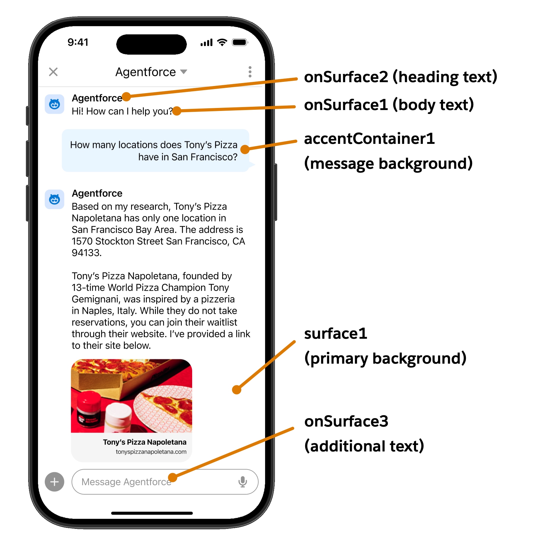
surface1: Primary view backgroundsurface2: Secondary view backgroundsurfaceContainer1: Default container background (cards, modals)surfaceContainer2: Darker container backgroundsurfaceContainer3: Darkest container background
onSurface1: Lightest text/icon fill (body text, labels)onSurface2: Darker text/icon fill (headings, input fields)onSurface3: Additional text/icon variant
accent1: Button icons and interactive elementsaccent2: Links, hover states, primary actionsaccent3: Selected statesaccentContainer1: Branded button backgroundsonAccent1: Text/icons on accent containers
error1: Error text and iconserrorContainer1: Error alert backgroundsonError1: Text on error containersborderError1: Error button borderssuccessContainer1: Success alert backgroundsonSuccess1: Success text and iconsborderSuccess1: Success button borders
disabledContainer1: Disabled white component backgroundsdisabledContainer2: Disabled dark component backgroundsonDisabled1: Text on light disabled containersonDisabled2: Text on dark disabled containers
brandBase50: Primary brand colorerrorBase50: Error brand colorfeedbackWarning1: Warning text colorfeedbackWarningContainer1: Warning container backgroundinfo1: Information text colorinfoContainer1: Information container background
The following sections show how to implement theming in your iOS application.
Currently, only color theming is supported. Fonts, dimensions, and shapes are not yet implemented in the theming system.
The following best practices ensure effective theming implementation.
- Use Semantic Colors: Always use semantic color tokens rather than hardcoded colors
- Test Both Modes: Ensure your custom colors work well in both light and dark modes
- System Integration: Use
.systemmode to respect user preferences - Inheritance: Extend base color classes rather than implementing from scratch
- Accessibility: Ensure sufficient color contrast for accessibility compliance
- UI Components: See iOS UI Components for component theming
- Configuration: See AgentforceConfiguration for setup