Datatable Accessibility
lightning-datatable allows user interaction via two modes—navigation mode and action mode. Use navigation mode to navigate from one data cell to another. Use action mode to move from one data cell to another and focus on actionable elements in a cell.
This documentation uses the term lightning-datatable component and datatable interchangeably.
To enter navigation mode, begin by pressing Tab to go into the datatable. The first data cell in the table body receives focus, skipping over the checkbox column and header. Use the arrow keys to move to other cells. If you move to another cell and then click away from the datatable, tab back into the datatable to place focus on the last cell you were on.
In navigation mode, when you tab to a cell with an actionable element such as an email link or a button, press the Enter key or spacebar to switch to action mode and focus the item. If the cell contains only one actionable item, such as a record link, pressing the enter key or spacebar activates the item.
In navigation mode, actionable elements render with tabindex="-1".
For example, a telephone number that uses the standard phone type renders like this.
To enter action mode, press the Enter key or Spacebar. Navigate to each actionable element in the table using the Tab or arrow keys.
In action mode, pressing tab or shift+tab moves between actionable elements in the table as expected. Press the arrow keys to move between actionable elements in that direction. Focus moves to the next cell in the given direction, as long as the cell doesn’t contain any actionable elements.
In action mode, actionable elements render with tabindex="0".
For example, a telephone number that uses the standard phone type renders like this.
When an actionable element is in focus and you press Enter, the action is triggered. For example, if you tab to a telephone link and press Enter, the link’s tel protocol causes the browser to prompt you to open the default application to dial the number.
In both navigation mode and action mode, you can use the arrow keys to move around the table.
| Arrow Key | Description |
|---|---|
| Up (↑) | Moves focus to a cell above the current cell. If pressed on the header row, this key does not move focus. |
| Right (→) | Moves focus to the next cell. If pressed on the last cell of a row, this key does not move focus. |
| Down (↓) | Moves focus to a cell below the current cell. If pressed on a cell in the bottom row, this key does not move focus. |
| Left (←) | Moves focus to the previous cell. If pressed on the row numbering column, this key does not move focus. If the row numbering column isn’t available and this key is pressed on the checkbox column, this key does not move focus. |
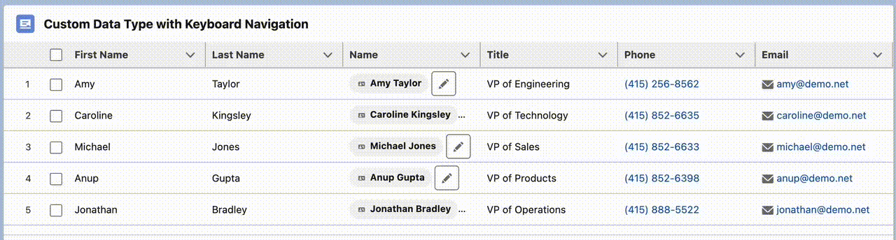
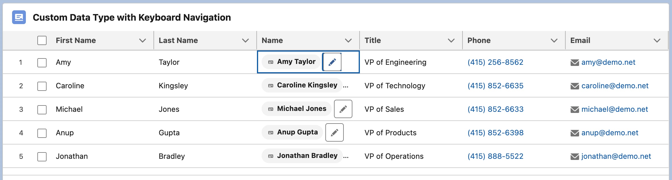
In navigation mode, elements in a standard or custom data type don’t participate in keyboard navigation. When you tab or press the arrow keys, focus moves to the cell but not to the elements within a standard or custom data type.
In this screen capture, the Name column uses a custom data type.
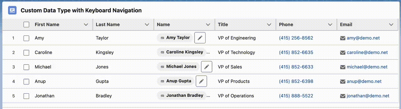
In action mode, interactive elements such as links and buttons can be focusable and become part of the tabbing order. For custom data types to participate in action mode, you must enable keyboard navigation on the elements in the component’s custom data type template.
In this screen capture, the Name column uses a custom data type.
To enable keyboard navigation in custom data types:
- Pass the attribute
tabindex="internalTabIndex"to any component or element in the custom type. If you don’t want an element to be focusable, settabindex=-1. - Set
data-navigation="enable"on any elements within the custom type that you want to be keyboard navigable. Also setdata-navigation="enable"on any element that has a child component that’s focusable.
lightning-datatable passes the accessibility attribute values to the custom data type as it reacts to the user’s keyboard navigation and focus actions.
In your custom data type template, pass in the accessibility attributes on a component or element to make it focusable and part of the tabbing order.
Let’s say you have a custom data type template customName.html.
This example makes the button icon in the custom data type focusable.
Add the data-navigation="enable" and tabindex={internalTabIndex} attributes to an element or multiple elements in your template, which makes the element focusable and part of the tabbing order.
In your JavaScript file, define the custom data type template for lightning-datatable.
Since the JavaScript file imports the custom data type template customName.html, you don’t need the myCustomTypeDatatable.html file. If you include it, use only an empty root <template> tag in the file.
Use your custom datatable in a component. For example:
Load the record data on your datatable.
In your JavaScript file, define your column data and get your record data.
The Apex controller for this example looks like this.
To work with dynamic custom data types, use the customdatatypes slot on lightning-datatable. See How to Define Custom Data Types.
If you use a slot for a custom data type, the custom data type can also participate in the datatable’s keyboard navigation. As described in the previous sections, you must first use the data-navigation and tabindex accessibility attributes on elements in the custom data type template.
In some cases, you may want to use a custom data type with a child component. For example, the child component can include JavaScript code to handle a click event.
Let’s say you have a custom data type template customPicture.html that’s defined in myCustomTypeDatatable.js.
This example makes an image element focusable in the child custom data type. It builds on the custom data type with slot example to add keyboard navigation support. The accessibility attributes pass from a child component to the custom data type template.
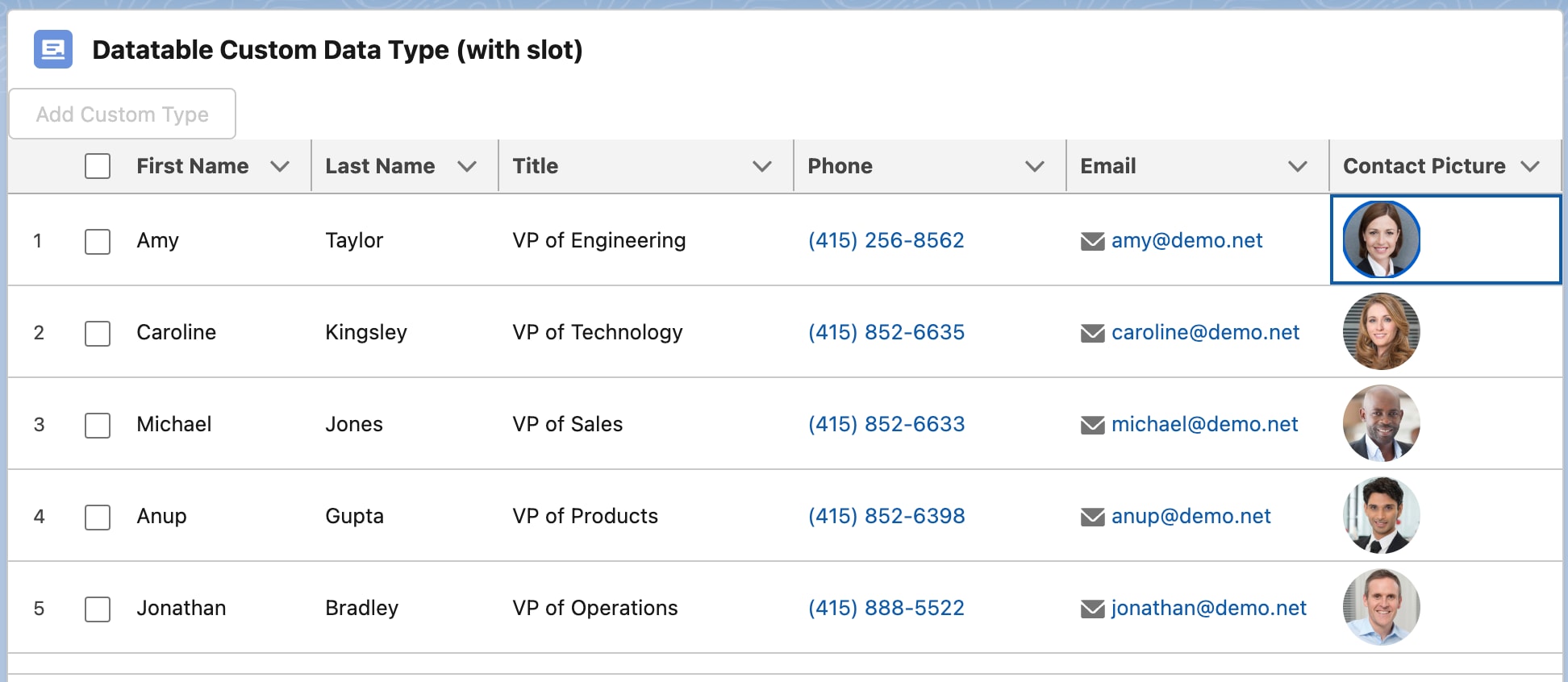
The customPicture.html template contains a child component customPic, which handles the click event. Note that the parent customPicture component uses internal-tab-index={internalTabIndex} instead of tabindex={internalTabIndex}.
In the JavaScript file, use the getDataTypes() function to return your custom data type template. Use the pictureUrl attribute to provide the source path of the contact image. Use recordId attribute to navigate to the corresponding contact record page when you click a contact image on the datatable.
The internalTabIndex property is exposed as a public property on the customPic child component.
The child component also uses the data-navigation and tabindex accessibility attributes. It contains an image for the contact record. Using the accessibility attributes on the image ensures that it’s focusable and part of the tabbing order.
When clicked, the image redirects you to the contact record page using the lightning/navigation module.
Use your custom datatable in a component. For example:
Load the record data on your datatable. This example includes a button that when clicked displays the custom data type via the customdatatypes slot.
In your JavaScript file, define your column data and get your record data.
The Apex controller for this example looks like this.
See Also