Create a Custom Data Type for lightning-datatable
The lightning-datatable component formats data based on the type you specify for the column.
Before you create your own data type, check the standard data types to see if one meets your requirements. You can use type attributes to customize the output for many types. The standard data types are:
actionbooleanbuttonbutton-iconcurrencydatedate-localemaillocationnumberpercentphonetext(default)url
For more information on standard data types and their type attributes, see the lightning-datatable reference documentation.
Additionally, consider SLDS styling hooks before you create your own data type. SLDS styling hooks help you customize a supported data type across the shadow DOM. For example, you can use an SLDS styling hook to apply a different color on a button data type.
This documentation uses the term lightning-datatable component and datatable interchangeably.
The lightning-datatable component supports these approaches for defining custom types.
- Extend the
LightningDatatableclass. If your use case is simple, create a new datatable component that defines the custom type. A simple use case means the custom type can use a standard cell layout supplied by the datatable, and you don’t require use of dynamic custom types. See Define Your Custom Type by Extending LightningDatatable. - Use a slot. If you want to use dynamic custom types, pass the custom type into the
lightning-datatablecomponent in a slot. See Pass in Custom Data Types Using a Slot.
Create your own data type to implement a custom cell, such as a delete row button or an image, or even a custom text or number display. You can also apply a custom class for each row on your custom data type.
To define and use a custom data type, extend the LightningDatatable class of the lightning-datatable component in a new component.
You can extend from LightningDatatable only to create a datatable with custom data types. Unless stated otherwise, extending any class besides LightningElement to create a Lightning web component isn’t supported.
Create a Lightning web component and define your type in an HTML template in the component folder. The template can contain the complete UI for a simple data type that doesn’t require JavaScript. The template can also embed a component that you define in another folder. For example, use a separate component when you want to include logic that determines what to display.
The UI that you include in the template can be whatever suits your use case and usability requirements.
Let’s look at the folder structure for the component myCustomTypeDatatable, which defines two custom types.
In your JavaScript file myCustomTypeDatatable.js, extend the LightningDatatable class and specify your type’s name and template file. This example creates a custom name type and custom number type using the customName.html and customNumber.html templates.
The names of the type and template don’t have to match. The example uses customName for both the type name and the template file name. We recommend that you import the templates with different names to make it clear where you specify the type name and template name.
You can extend from LightningDatatable only to create custom data types. You can also handle custom data types using slots without extending LightningDatatable. See Pass in Custom Data Types Using a Slot.
Pass in the following properties to the customTypes object.
| Custom Type Property | Type | Description |
|---|---|---|
template | string | The name of your type’s imported HTML template. |
typeAttributes | array | The comma-separated list of attributes to pass to the custom data template. Access your data using the typeAttributes.attributeName syntax. |
standardCellLayout | boolean | Specifies whether the standard layout is used. The default is false. The standard layout is used by all standard data types. The default layout for custom data types is the bare layout. See Customize Data Type Layout and Styles. You can use the standardCellLayout to style cells for your custom data type to make them look similar to the standard data types. The standardCellLayout also supports accessibility and keyboard navigation. |
In your custom data template customName.html, add the markup for your data type. This example creates a custom type that renders a text label using a lightning-badge component.
The customNumber.html template uses the default bare layout because myCustomTypeDatatable.js sets standardCellLayout: false for customNumber. You can add your own styling. This example adds a small padding around the cell and floats the number to the right. An icon is displayed if the number matches criteria specified in the data definition.
These example custom data types are simple and can be expressed with only HTML. If your custom type is more complex, create a separate component with JavaScript, HTML template, and XML configuration file. Use the custom data HTML template as a container for the component. A separate component is used in Edit Template Example for Custom Data Types.
Let’s implement a datatable that uses the custom types. The first column displays the account name using the custom type we created in the previous section. The fieldName property matches the Name field on the account object.

Display 10 account records in the datatable using an Apex controller.
To implement the custom type datatable, create a wrapper component to contain your extended datatable component, define the datatable’s columns, and fetch data. Here we use myDatatable as the wrapper.
When defining the columns, you can pass in SLDS utility classes using the cellAttributes property.
myDatatable.js shows several ways to apply styling on a custom cell. The Industry column uses the slds-text-color_success class only if the field value matches Energy. The NumberOfEmployees column uses the slds-theme_alert-texture class on all rows of the column. Additionally, the customNumber type that’s used for the NumberOfEmployees column includes layout and padding classes implemented directly in the customNumber.html markup.
Next, pass the data returned by the getAccountList Apex controller to the data attribute in your custom type datatable component.
The datatableCustomDataType component in the lwc-recipes repo creates a custom data type for lightning-datatable.
You can determine which custom data types to load dynamically at run time based on context. For example, you can pass one set of data types when the datatable displays data from a specific object and then have a different set of data types for another object.
To dynamically load a custom data type, use a data provider component and pass in your templates via the customdatatypes slot. To create a data provider component, import your template files and use an @api annotated getDataTypes() method in your component class.
Return the template names and properties using getDataTypes() instead of the static customTypes property. You also don’t need to extend LightningDatatable to create a custom type.
Your lightning-datatable component passes in the custom data types using a customdatatypes slot.
When passing in custom data types using a slot, the lightning-datatable component listens to slot changes and updates the columns accordingly.
Custom data types passed in a slot can also support keyboard navigation. See Accessibility for Custom Data Types.
Let’s implement a datatable with a button that loads a Contact Picture column using a custom data type.
This example modifies the datatableCustomDataType component in the lwc-recipes GitHub repo.
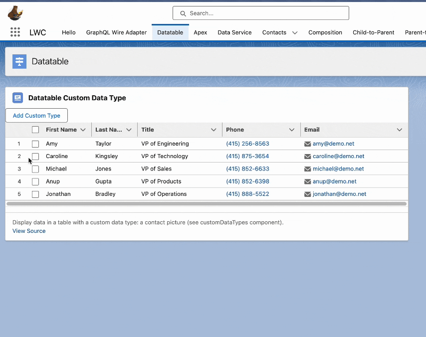
When you click the Add Custom Type button, the Contact Picture column is only displayed using the customdatatypes slot. The button is disabled after you load the custom data type.
Create your custom data type and add the custom data type component in the same folder. For example, the customProvider.html file contains an empty <template> tag and the customPicture.html file contains the UI for a custom data type that displays an image.
The customProvider.js file imports and defines the custom data type within the same folder. It extends LightningElement instead of LightningDatatable, and it returns the custom data type definition via the public getDataTypes() method.
The customPicture.html file displays the picture using the typeAttributes column property pictureUrl.
Next, create your lightning-datatable component wrapper.
Pass in the custom data type using the customdatatypes slot.
Define your column data and pass in the customPictureType custom data type.
On initialization, the custom data type column is empty because the showCustomTypes property is false. The constructor() method removes the customPictureType column from the columns object and the addCustomTypes() method sets all columns on the columns object.
If the standard data types don’t meet your requirements, use a custom data type to define how a cell displays your data. With custom data types, you can also customize data type layout and styles. Similar to a standard data type, you can make a custom data type editable. To support keyboard navigation in a custom data type, see Accessibility for Custom Data Types.
When sorting with a standard data type, you can identify which column is being sorted via the onsort event handler using event.detail.fieldName. For an example, see the lightning-datatable reference documentation.
However, when sorting a custom data type, you can’t use event.detail.fieldName as it returns undefined. To sort a custom data type, pass in the field name to your sorting function. This example shows how to sort when your custom data type returns the Picture__c field name.
Using a connectedCallback() method in a custom class that extends LightningDatatable overrides the parent connectedCallback()
implementation on the lightning-datatable component. If you provide your own connectedCallback() method,
run super.connectedCallback() before your own code to ensure the datatable is initialized correctly.
Using a lightning-datatable within a custom data type cell isn’t supported. The rendering of a lightning-datatable as a child of another lightning-datatable leads to undesired style inheritance or styles leaking from the parent data table to the child data table.
See Also