Styling hooks went GA with the Spring ’22 release. This feature opens the door to the customization of Lightning base components and much more. With styling hooks, you can easily change the appearance of a standard user interface by modifying a few lines of CSS:

We won’t debate tastes and colors in this post, but we’ll cover what CSS custom properties and styling hooks are and how you can leverage them to style Lightning base components and build themeable and reusable components. We’ll use a styling hook recipe from the LWC Recipes sample application as an example. Last, but not least, you’ll get the chance to participate in our LWC Style Challenge!
About CSS custom properties and styling hooks
Before we dive into Salesforce-specific concepts, we need to step back and talk about web standards.
When building an app with web components, we benefit from encapsulation thanks to the Shadow DOM. This means that each component’s CSS is self-contained and there are no styling leaks between components. However, this powerful behavior goes against the traditional use of CSS where style cascades (as the name implies) down the component hierarchy. Style inheritance is the foundation that allows designers to build rich design systems, so we need an alternative to work with web components.
This is where CSS custom properties (also referred to as CSS variables) come in handy. Unlike CSS rules, custom properties traverse the Shadow DOM and allow you to share style across web components. This makes them a great tool for customizing web components in a coherent way.
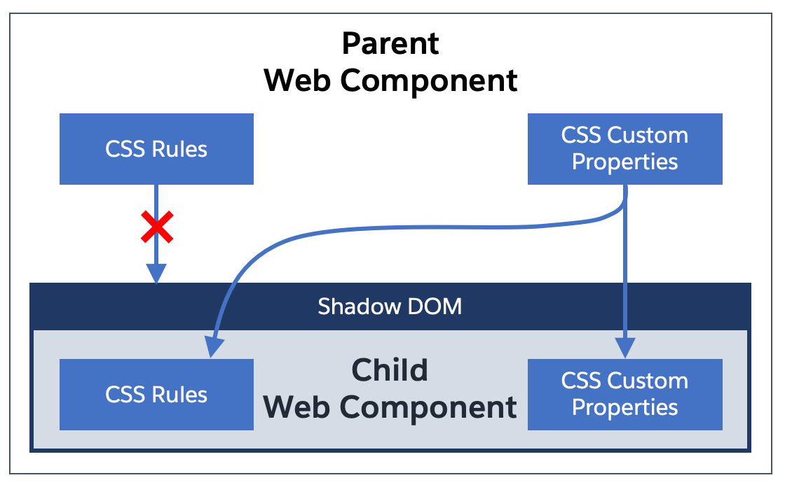
Thanks to this behavior, you no longer need to rely on a combination of HTML attributes and JS to dynamically configure the style of child web components.
Custom properties are quite simple to use. You declare them like a standard attribute within a CSS rule, but with a double dash prefix (--). For example, the following code declares a “main text color” property as red in a rule with the :host selector:
We can then reference the value of our custom property thanks to the var() function (see docs):
Going back to the Salesforce ecosystem, styling hooks are a set of CSS custom properties exposed by the Lightning Design System (LDS) component blueprints. In other words, you use styling hooks to customize Lightning base components and custom components that use LDS.
Styling Lightning base components
Most Lightning base components offer a set of styling hooks that let you overwrite some of their style. Not every single style attribute can be customized, but the list of available hooks increases with each Salesforce release.
For example, let’s take the checkbox toggle component. Looking at the documentation for this component’s blueprint, we can see an overview of the styling hooks that it supports:

All it takes to customize this toggle is to overwrite some of these styling hooks in the CSS of a parent component:
Note: the slds styling hook prefix from the blueprint documentation is turned into sds when applied to LWC code.
Thanks to these few lines of CSS, we turn a standard blue toggle into a green toggle:

Styling hooks and custom CSS properties are not limited to base components, you can also take advantage of them to create and share themeable and reusable components.
Building themeable and reusable components
Just like Lightning base components, you too can produce themeable and reusable components thanks to CSS custom properties. The key to this is the ability to specify a fallback value as a second argument when using the val function to retrieve custom property values.
For example, this bit of code taken from the viewSource component (see source) of LWC Recipes opens the door to the customization of the text color in a recipe’s description.
By default, the description text will be grey, and if a parent component of viewSource specifies a --source-text-color custom property, the value of the property will overwrite the default text color (the fallback value).
When building your own theme, follow the pattern that we demonstrated in the styling hooks recipe:
- Declare some base custom properties at the root of your parent component
- Overwrite base component and child component styling hooks with your custom properties
As a general rule, and whenever possible, use your base custom properties in your CSS rules instead of hardcoding values.
Here’s see how this looks in practice. We’ll start by defining some variables for our theme. In our case, we have a primary and a secondary color that both have alternate shades:
After this, we use our custom properties to overwrite styling hooks for the child component, whether it is a base component like a Lightning card or a custom component like viewSource:
Closing words and challenge
This concludes our tour of CSS custom properties and styling hooks. You’ve learned how they operate and how they are a game changer for customizing Lightning Web Components. You saw how you can leverage them to customize Lightning base components, as well as create your own reusable and themeable custom components. Be sure to take a look at the LWC Recipes sample app for a practical example.
LWC Style Challenge
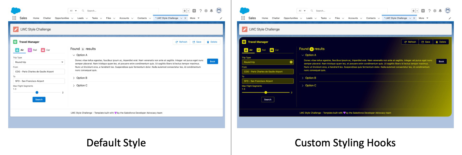
Let’s have a friendly challenge: post a screenshot of your coolest style customization of the LWC Style Challenge app with the #LWCStyleChallenge hashtag on Twitter or LinkedIn by July 31. We’ll review submissions and retweet the best contributions. Get creative and impress us with your CSS skills!
Resources
- Styling hook recipe in LWC Recipes
- Podcast episode: SLDS and Styling Hooks with Brandon Ferrua
- Styling hooks reference in the Lightning Design System component blueprints
- Documentation for styling LWC in the LWC Developer Guide
- Using CSS custom properties (variables) on MDN
About the author
Philippe Ozil is a Principal Developer Advocate at Salesforce where he focuses on the Salesforce Platform. He writes technical content and speaks frequently at conferences. He is a full stack developer and enjoys working on DevOps, robotics, and VR projects. Follow him on Twitter @PhilippeOzil or check his GitHub projects @pozil.