

Make component configuration for your Experience Builder users more convenient and intuitive by creating custom property editors and types for your custom Lightning Web Components. You can now replace basic text boxes and dropdowns with custom UIs such as date pickers, color selectors, and button groups. This blog post shows you how to make your Lightning Web Components visually interactive and easy to configure.
Creating a custom property editor
With custom property editors, you can create any type of UI field for configuring a property value in Experience Builder. For instance, instead of a text field where your users type in a date, you can offer a date selector with a pop-up calendar in the component property panel, where users can click to select a date.
Because a custom property editor is simply a Lightning Web Component, creating one is just like creating any other Lightning Web Component, just with a few extra details. Let’s take a look at how to create one, using text alignment as an example.
Scenario: Say that you’re working with a custom Lightning Web Component named CustomArticle. For the textAlignment property, instead of the default String editor, you envision having a button group where users can adjust alignment with one click.
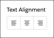
To create this button group, you can create a Lightning Web Component that acts as a custom property editor for the textAlignment property of the String type. Let’s call this new custom editor alignmentCPE. To create it, follow these basic steps.
Step 1: Create a component class
For the alignmentCPE component to act as a custom property editor, it must adhere to the property editor contract. The contract requires your custom property editor component to include certain public properties in its element class: label, value, errors, and schema. See the documentation for more information about the property editor contract, including other public properties that it exposes.
Here’s a basic class snippet for creating a component class.
1export default class AlignmentCPE extends LightningElement {
2    @api value;
3    @api label;
4    @api schema; // Derived from the associated property type.
5    @api errors;
6    @track buttons = [...]
7
8    handleAlignmentClick(event) {
9        const value = event.target.value;
10        this.value = value;
11        this.dispatchEvent(
12            new CustomEvent('valuechange', { detail: { value: this.value } })
13        );
14    }
15}
Note the custom event being dispatched by the click handler. The event name must be exactly valuechange, and the detail must include the value property as part of the property editor contract.
Step 2: Create the component UI
Next, craft a user-friendly UI for your property editor using HTML and CSS, just as you would for other Lightning Web Components.
Here’s a code snippet for the alignmentCPE component.
1<template>
2    <label>Text Alignment</label><div>
3        <lightning-button-group onclick="{handleAlignmentClick}">
4            <template>
5                <lightning-button-icon-stateful key="{button.value}" value="{button.value}" selected="selected" icon-name="{button.icon}">
6                </lightning-button-icon-stateful>
7            </template>
8        </lightning-button-group>
9    </div><p>
10</p></template>
Step 3: Update the component’s metadata configuration
Finally, ensure that the js-meta.xml file of your component recognizes alignmentCPE as a property editor by adding the lightning__PropertyEditor target.
1<?xml version="1.0" encoding="UTF-8"?>
2<LightningComponentBundle xmlns="http://soap.sforce.com/2006/04/metadata">
3  <apiVersion>66.0</apiVersion>
4  <isExposed>true</isExposed>
5  <masterLabel>Alignment Editor Component</masterLabel>
6  <targets>
7    <target>lightning__PropertyEditor</target>
8  </targets>
9</LightningComponentBundle>
Creating a custom property type
While a single custom property editor is powerful, you can go even further. For example, you may have multiple properties on your custom Lightning Web Component, and you may want to group these properties in a specific way, such as in tabs or in accordion sections. Or, you may have multiple properties that you want to reuse in different Lightning Web Components.
In these cases, you can create a custom property type. With a custom property type, you can:
- Group properties in tabs or accordions
- Put multiple properties in a custom property type and reuse this custom type without having to re-create each of these properties for each component
- Add more validation rules to certain properties. For example, for a URL field, you can specify which protocols to allow, such as https or http.
A custom property type is defined using a new metadata type called LightningTypeBundle. To create a custom property type, follow the steps below.
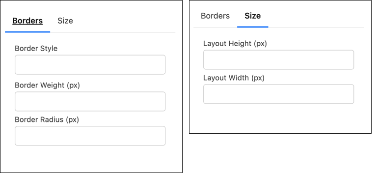
Scenario: Say that you’re working with your custom Lightning Web Component, CustomArticle. You want to create a complex property type, layoutProperty, that includes sub-properties for borderStyle, borderWeight, borderRadius, layoutHeight, and layoutWidth. You also want to organize these properties on tabs named Borders and Size.
To create this complex type, follow these steps.
Step 1. Structure the LightningTypeBundle
First set up the folder for the new metadata type. Create a lightningTypes folder to describe layoutProperty, the custom property type in this example.
1+--myMetadataPackage
2     +--lightningTypes
3          +--layoutProperty
4              +--experienceBuilder
5                  +--editor.json
6              +--schema.json
Step 2. Define the schema: schema.json
A schema.json file is integral to defining the structure, type, and validation of a property. By adhering to the JSON Schema specifications, you ensure that the property values that you set for your component align with the necessary structure and format, maintaining data integrity and component functionality.
See our documentation for a full list of keywords that you can specify in a schema.json file. Unless otherwise noted, the keywords follow the JSON Schema specification.
Here’s the schema JSON for the complex layoutProperty property type:
1{
2    "title": "Layout Properties",
3    "lightning:type": "lightning__objectType",
4    "properties": {
5        "borderStyle": {
6            "lightning:type": "lightning__textType",
7            "title": "Border Style"
8        },
9        "borderWeight": {
10            "lightning:type": "lightning__integerType",
11            "title": "Border Weight (px)"
12        },
13        "borderRadius": {
14            "lightning:type": "lightning__integerType",
15            "title": "Border Radius (px)"
16        },
17        "layoutHeight": {
18            "lightning:type": "lightning__integerType",
19            "title": "Layout Height (px)"
20        },
21        "layoutWidth": {
22            "lightning:type": "lightning__integerType",
23            "title": "Layout Width (px)"
24        }
25    },
26    "required": []
27}
In the schema.json file, you specify a lightning:type for each property in your complex property type. Salesforce offers several Lightning property types out of the box that act as the basic types. See our documentation for the full list of Lightning types. Each Lightning property type is associated with a default property editor in Experience Builder, so if you do use one of these property types, you don’t have to create a property editor yourself.
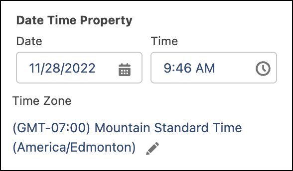
For example, here’s the default property editor for the Lightning type lightning__dateTimeType.
Step 3. Define the editor: editor.json
This optional step covers what to do when you want to create a custom property editor for your custom property type. Whereas schema.json defines a property type structure, the optional editor.json file lets you override the property editors for a property and lay out the property as you wish, such as in a vertical layout, on tabs, or in accordion sections.
See our documentation for the full list of keywords that you can specify in an editor.json file. Unless otherwise noted, the keywords follow the JSON Schema specification.
Here’s an example of an editor.json file for laying out properties on tabs for layoutProperty.
1{
2  "editor": {
3    "layout": {
4      "definition": "lightning/tabSetLayout",
5      "children": [
6        {
7          "definition": "lightning/tabLayout",
8          "attributes": {
9            "label": "Borders"
10          },
11          "children": [
12            {
13              "definition": "lightning/propertyLayout",
14              "attributes": {
15                "property": "borderStyle"
16              }
17            },
18            {
19              "definition": "lightning/propertyLayout",
20              "attributes": {
21                "property": "borderWeight"
22              }
23            },
24            {
25              "definition": "lightning/propertyLayout",
26              "attributes": {
27                "property": "borderRadius"
28              }
29            }
30          ]
31        },
32        {
33          "definition": "lightning/tabLayout",
34          "attributes": {
35            "label": "Size"
36          },
37          "children": [
38            {
39              "definition": "lightning/propertyLayout",
40              "attributes": {
41                "property": "layoutHeight"
42              }
43            },
44            {
45              "definition": "lightning/propertyLayout",
46              "attributes": {
47                "property": "layoutWidth"
48              }
49            }
50          ]
51        }
52      ]
53    }
54  }
55}
Linking custom property editors and types to a Lightning Web Component
After you create a custom property editor or custom property type, the final step is to link them to your Lightning Web Component. Here’s an example of an XML configuration that integrates the custom property editor alignmentCPE and the custom property type layoutProperty.
1<?xml version="1.0" encoding="UTF-8"?>
2<LightningComponentBundle xmlns="http://soap.sforce.com/2006/04/metadata">
3    <apiVersion>66.0</apiVersion>
4    <isExposed>true</isExposed>
5    <targets>
6        <target>lightningCommunity__Page</target>
7        <target>lightningCommunity__Default</target>
8    </targets>
9    <targetConfigs>
10        <targetConfig targets="lightningCommunity__Default">
11            <!-- Linking the Custom Property Editor for Text alignment-->
12            <property name="textAlignment" type="String" editor="c/alignmentCPE" label="Text Alignment" />
13            <!-- Linking the Custom Property Type for Layout & border style -->
14            <property name="layoutProperty" type="c__layoutProperty" label="Layout & border style" />
15        </targetConfig>
16    </targetConfigs>
17    <masterLabel>Custom Article</masterLabel>
18</LightningComponentBundle>
This example shows how to use a custom property editor and custom property type together, but you can choose to use either independently, depending on your component’s needs.
Conclusion
Custom property editors and custom property types empower developers to dramatically improve the configuration experience for users in Experience Builder. By moving beyond basic fields to create intuitive, interactive UIs, you can make your Lightning Web Components easier to configure and reuse. Whether you need fine-grained control over a single property’s UI with a custom editor, or you need to group and structure multiple related properties with a custom type, these tools give you the flexibility you need to deliver a superior low-code development experience.
Resources
- Create a Custom Property Editor or Type for a Custom Component in Experience Builder: A comprehensive resource for creation through deployment
- Lightning Types Developer Guide: A detailed resource for developing new Lightning Types
- Code samples: Ready-to-use sample components
About the authors
Henry Chen is a Software Engineer on the Salesforce Platform team, working on low-code builders. He enjoys spending his free time playing video games, ice skating, and watching movies.
Sudheer Kumar Reddy Gowrigari is an Engineering Manager on the Salesforce Platform team leading the content builder and builder framework areas. Outside work, he loves playing cricket, diving into books, and watching movies.