


Force.com Platform Fundamentals
 j
j
No Results
Search Tips:
- Please consider misspellings
- Try different search keywords
Try It Out: Add a Pie Chart
The final step is to display a chart with the report. In our case, we want a pie chart.
- Click Add Chart and choose the pie chart type.
The chart builder automatically knows that we want the values to be the record count, and the wedges to be the different functional areas. That's because chart values correlate to a report's summary fields, and pie chart wedges correlate to a report's groupings. Since we have a second grouping by Region, we can choose a different field to display in the wedges. But we’ll keep the default selections.
Now let's finish up our chart and generate our final report.
- Click OK.
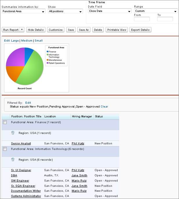
- Group, summarize data by a different field. For example instead of Functional Area, you can summarize by Hiring Manager.
- Export data into an Excel spreadsheet or CSV (comma separated values) format.
- Clear any filters applied.
- Refine results with standard filters such as date or range.
Because our report meets all of our criteria, let's save it to the Recruiting Reports folder.
- Near the top of the report, click Save.
- In the Report Name field, enter Open Positions by Functional Area and Region.
- In the Report Description field, enter Which functional areas have the most new or open positions by region?
- In the Report Unique Name field, enter Open_Positions_by_Functional_Area if that's not already the value.
- From the Report Folder drop-down list, select Recruiting Reports.
- Click Save.
Now if we view the Recruiting Reports folder, we can see our new summary report. Next, we'll make a matrix report that takes advantage of some of the more advanced reporting features.