Salesforce1 App Developer Guide
 j
j
No Results
Search Tips:
- Please consider misspellings
- Try different search keywords
Test the Page Layout
- Open the Salesforce1 app on your mobile device and log in.
- Tap
 to access the navigation menu.
 - In the Recent section, tap Accounts. You may have to tap More... to find it.
- Tap the Search bar.
- Enter Bar.
- Tap Search.
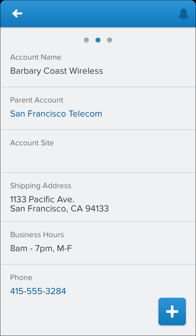
- Tap the Barbary Coast Wireless record
preview card. You’re on the record detail
page, which is the default view when accessing a record. Scroll down
a bit, and you should see the same fields we added to the page layout,
in the same order.
- Swipe left to the related information page. You should see the Parent Account lookup card and the preview card
for the Visualforce page first.Scroll down and you should also see the related lists that we added to the page layout. Tap a related list to see its details.
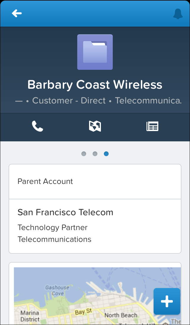
Now that we’ve created this specialized page layout and added the fields our mobile technicians will need, their jobs will be much easier when they go on site. When they visit an account record’s related information page in Salesforce1, they won’t have to shuffle through a long list of unnecessary fields to find the ones they really want. And, since we added the Visualforce page as a mobile card, they’ll be able to see the location of an account on a Google map.
In the Publisher Actions chapter, we’ll enhance this page layout with special actions we’ve created just for our mobile technicians. But for now, let’s go over some recommendations for paring down existing page layouts to make them more mobile friendly.