


Force.com Platform Fundamentals
 j
j
No Results
Search Tips:
- Please consider misspellings
- Try different search keywords
Try It Out: Add a Chart and Conditional Highlighting
We're almost done. Now, in addition to creating a horizontal bar chart that shows the average number of days open, recruiters, and whether the position requires travel, we also want to conditionally highlight data to help us quickly analyze which recruiters are performing well and which need to work on filling their positions faster.
- Click Add Chart.
- Select the Vertical Bar Chart type.
- In the Y-Axis drop-down list, choose Average Days Open.
- In the X-Axis drop-down list, choose Position: Owner Name.
- In the Group-By drop-down list, choose Travel Required and keep the side-by-side grouping format.
- Leave the Plot additional values checkbox empty.
A combination chart plots multiple sets of data on a single chart. Each set of data is based on a different field, so values are easy to compare. You can also combine certain chart types to present data in different ways in a single chart. The report we're building doesn't need a combination chart, but they are useful when comparing data, charting trends, and so forth.
- Click the Formatting tab.
- In the Chart Title field, enter Avg Days to Hire With and Without Travel.
- Click OK.
All three of our summary fields are available to highlight, but we just want to emphasize one: Average Days Open. That's because we want to highlight which recruiters are closing positions in less than 30 days, less than 60 days, or more than 60 days.
- Click the Show drop-down list and select Conditional Highlighting.
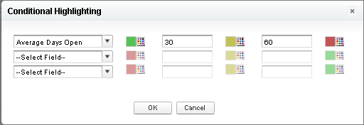
- In the first row, set Select Field to Average Days Open.
- In the first color picker, select a shade of green. This is the low color.
- In the first text field, enter 30. This is the low breakpoint.
- In the second text field, enter 60. This is the high breakpoint.
- In the third color picker, select a shade of red. This is the high color.
- Click OK.
- Click Run Report.
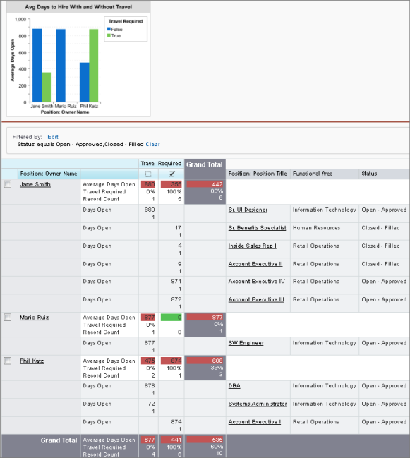
- Click Customize to return to the report builder.
- Near the top of the report, click Save.
- In the Report Name field, enter Avg Days to Hire With and Without Travel.
The Report Unique Name field is automatically populated.
- In the Report Description field, enter On average, how many days does it take each recruiter to fill a position with or without required travel?
- From the Report Folder drop-down list, select Recruiting Reports.
- Click Save.
- Click Close, and then click Save & Close to return to the Reports tab.
As we've seen, custom reports can provide a lot of interesting data, giving insight into the challenges that an organization faces. However, unless a user visits these reports often, much of their benefit remains untapped. How can we give users a way of keeping tabs on the information in reports without wasting their time? The answer, as we'll see next, lies with dashboards.