ISVforce Guide
 j
j
No Results
Search Tips:
- Please consider misspellings
- Try different search keywords
Newer Version Available
Usage Metrics Visualization
The Usage Metrics Visualization app, available from Salesforce Labs on the AppExchange, enables you to visualize trends in usage metrics data for your app. You can use the Usage Metrics Visualization app to generate charts showing changes in various app metrics, over a specified duration, for one or more customer organizations.
The app must be installed in your Usage Metrics reporting organization and requires Usage Metrics to be enabled in advance, so some data is available for analysis. You can analyze data going back a maximum of 30 days. If Usage Metrics wasn’t enabled for the entire time period that you specify, only partial data is plotted.
The app is intended as a reference implementation, for illustration purposes only. It’s distributed as an unmanaged package, so you can review its components and extend or customize it to meet your requirements. If your visualization needs are more complex, you can export the raw metrics data from the reporting organization and analyze it by using custom code or a third-party tool .
- Go to the AppExchange and search for the Usage Metrics Visualization app.
- Click Get It Now.
- Enter the credentials for your reporting organization, and then click the login button.
- Click Install.
You’ll see a message describing the progress and a confirmation message after the installation is complete.
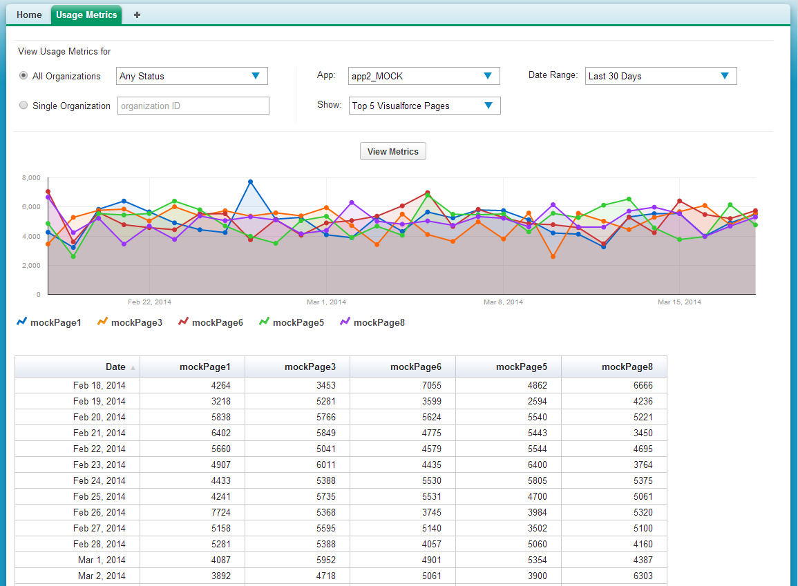
- Specify the app whose metrics you want to view by selecting it from the App menu.
- Specify the organization(s) that you want to view metrics for
by choosing one of these options.
- For a single organization, enter its Organization ID in the Single Organization field.
- For a group of organizations, select one of the following from
the All Organizations menu.
- Any Status
- All Active: These are organizations used by paying customers.
- All Free: These are Developer Edition (DE) organizations.
- All Trial: These are trial organizations, which expire after a specified period.
- Specify the type of metric that you want to visualize by selecting
one of these values from the Show menu.
- Total Visualforce Page Views
- Top 5 Visualforce Pages
- Total Record Count
- Top 5 Objects by Record Count
- Specify the time period to cover by selecting one of these values
from the Date Range menu.
- Last 30 Days
- Last 7 Days
- Last 2 Days
- Click View Metrics.
The data you specified is displayed on the page as a chart and as a table. To visualize a different data set, change the parameters, and then click View Metrics again.