


Force.com Platform Fundamentals
 j
jNewer Version Available
Try It Out: Add a Chart Component
Let's start by adding a chart that shows the number of open positions by functional area:
- Drag a pie chart component onto the left column of your dashboard.
- Click Edit Title, and enter Open Positions by Functional Area.
- Click the Data Sources tab and find and select the Open Positions by Functional Area report.
- Drag the report and drop it onto the pie chart component.
 on the pie to open the component
editor. On the Component Data tab, notice that
on the pie to open the component
editor. On the Component Data tab, notice that 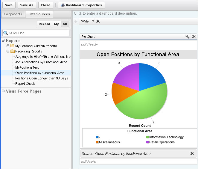
Ta-da! We now have a pie chart in our dashboard! If a user clicks on the chart, they're taken to the report from which the chart was generated.