Force.com Platform Fundamentals
 j
jReport Formats
The platform supports four different report formats, each with
varying degrees of functionality and complexity.
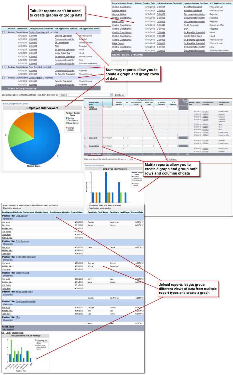
- Tabular reports are the simplest and fastest way to look at your data. Similar to a spreadsheet, they consist simply of an ordered set of fields in columns, with each matching record listed in a row. While easy to set up, they can't be used to create groups of data or graphs. Consequently, they're best used just for tasks like generating a mailing list.
-
Summary reports are similar to tabular reports, but also allow users to group rows
of data, view subtotals, and create charts. For example, in the sample
Employee Interviewer reports that appear in the following screenshot,
the summary report groups the rows of reviews by the possible values
of the Owner Name field, allowing us to see at
a glance subtotals of how many times the two interviewers have talked
to candidates and entered reviews for them.
While a little more time-consuming to set up, summary reports give us many more options for manipulating and organizing the data, and, unlike tabular reports, they can be used in dashboards. Summary reports are the workhorses of reporting—you'll find that most of your reports tend to be of this format.
- Matrix reports allow you to group records both by row and by column. For example, in the following sample Employee Interviewer reports, the matrix report groups the review rows by the possible values of the Owner Name field, and also breaks out the possible values of the Position field into columns. Consequently, the report gives us summarized information such as the number of times an interviewer has interviewed candidates and entered reviews for a particular position. These reports are the most time-consuming to set up, but they also provide the most detailed view of our data. Like summary reports, matrix reports can have graphs and be used in dashboards.
- Joined reports let you create different views of data from multiple report types. In a joined report, data is organized in blocks. Each block acts like a “sub-report,” with its own fields, columns, sorting, and filtering. You can add a chart to a joined report. For example, in the following sample, the joined report pulls data from two report types related to the Positions object. Together, the report shows applications received from job ads posted for each position.