Salesforce1 Mobile App Admin Guide
 j
jRethink Your Page Layouts for Mobile
Page layouts containing dozens of fields and lots of related lists might be manageable when viewing records on a computer screen, but on a small mobile device, viewing that same record can be overwhelming. People accessing information using a mobile device are looking for a quick way to get what they need, and making your users sift through hundreds of fields and related lists just doesn’t make sense.
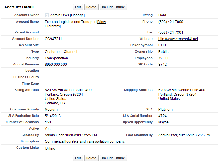
For example, let’s say you have a custom account page layout for Express Logistics and Transport, which has 32 standard and custom fields. That may not seem like a lot of fields, but in a mobile context, fields add up quickly. In the full Salesforce site, the account detail page for Express Logistics and Transport would look like this:
In Salesforce1, the same account detail page looks like this:
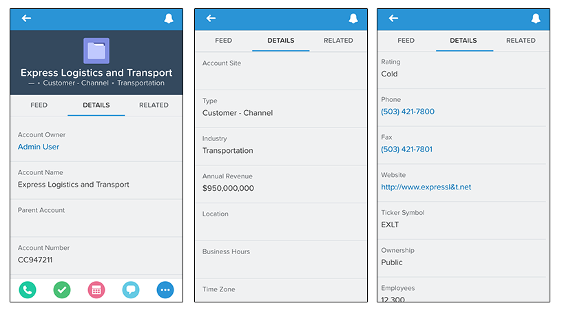
Three pages of scrolling, and that’s from a page layout with only 32 fields! If you were a mobile user trying to find specific fields in a record detail with dozens of fields on your phone, you’d have to scroll... and scroll... and scroll. It’s not the best user experience and it’s definitely not good for your users’ productivity.
You have two options for handling page layouts for your mobile users: re-engineer your existing page layouts, or create new page layouts that are mobile-friendly from the outset.