Lightning Components Developer Guide
 j
jNewer Version Available
lightning:notificationsLibrary
Messages can be displayed in notices and toasts. Notices alert users to system-related issues and updates. Toasts enable you to provide feedback and serve as a confirmation mechanism after the user takes an action. Include one <lightning:notificationsLibrary aura:id="notifLib"/> tag in the component that triggers the notifications, where aura:id is a unique local ID. Only one tag is needed for multiple notifications.
Notices
Notices interrupt the user's workflow and block everything else on the page. Notices must be acknowledged before a user regains control over the app again. As such, use notices sparingly. They are not suitable for confirming a user’s action, such as before deleting a record. To dismiss the notice, only the OK button is currently supported.
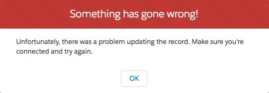
Here’s an example that contains a button. When clicked, the button displays a notice with the error variant.
1<aura:component>
2    <lightning:notificationsLibrary aura:id="notifLib"/>
3    <lightning:button name="notice" label="Show Notice" onclick="{!c.handleShowNotice}"/>
4</aura:component>
Your client-side controller displays the notice.
1({
2    handleShowNotice : function(component, event, helper) {
3        component.find('notifLib').showNotice({
4            "variant": "error",
5            "header": "Something has gone wrong!",
6            "message": "Unfortunately, there was a problem updating the record.",
7            closeCallback: function() {
8                alert('You closed the alert!');
9            }
10        });
11    }
12})
To create and display a notice, pass in the notice attributes using component.find('notifLib').showNotice(), where notifLib matches the aura:id on the lightning:notificationsLibrary instance.
Notices inherit styling from prompts in the Lightning Design System.Attributes
| Attribute Name | Attribute Type | Description | Required? |
|---|---|---|---|
| header | String | The heading that’s displayed at the top of the notice. | |
| title | String | The title of the notice, displayed in bold. | |
| message | String | The message within the notice body. New lines are replaced by <br/> and text links by anchors. | |
| variant | String | Changes the appearance of the notice. Accepted variants are info, warning, and error. This value defaults to info. | |
| closeCallback | Function | A callback that’s called when the notice is closed. |
Toasts
Toasts are less intrusive than notices and are suitable for providing feedback to a user following an action, such as after a record is created. A toast can be dismissed or can remain visible until a predefined duration has elapsed.

Here’s an example that contains a button. When clicked, the button displays a toast with the info variant and remains visible until you press the close button, denoted by the X in the top right corner.
1<aura:component>
2    <lightning:notificationsLibrary aura:id="notifLib"/>
3    <lightning:button name="toast" label="Show Toast" onclick="{!c.handleShowToast}"/>
4</aura:component>
Your client-side controller displays the toast.
1({
2    handleShowToast : function(component, event, helper) {
3        component.find('notifLib').showToast({
4            "title": "Notif library Success!",
5            "message": "The record has been updated successfully."
6        });
7    }
8})Toasts inherit styling from toasts in the Lightning Design System.
Attributes
| Attribute Name | Attribute Type | Description | Required? |
|---|---|---|---|
| title | String | The title of the toast, displayed as a heading. | |
| message | String | A string representing the message. It can contain placeholders in the form of {0} ... {N}. This placeholders will be replaced with the action links on the message data. | |
| messageData | Object | Array of inlined action links to replace within the toast message template. | |
| variant | String | Changes the appearance of the toast. Accepted variants are info, success, warning, and error. This value defaults to info. | |
| mode | String | Determines how persistent the toast is. The default is dismissable. Valid modes are:
|