Visualforce Developer Guide
 j
jNewer Version Available
Style Existing Visualforce Pages with Lightning Experience Stylesheets
To style your Visualforce page to match the Lightning Experience UI when viewed in Lightning Experience or the Salesforce app, set lightningStylesheets="true" in the <apex:page> tag. When the page is viewed in Salesforce Classic, it doesn’t get Lightning Experience styling.
1<apex:page lightningStylesheets="true">If lightningStylesheets="true", the CSS scoping class slds-vf-scope is automatically applied to the Visualforce page’s <body> element. The scoping class is applied so that your content matches the Lightning Experience UI. If you set applyBodyTag or applyHtmlTag to false, you must manually add the scoping class slds-vf-scope.
Here is a standard Visualforce page
without the lightningStylesheets attribute. The page
is styled with the Classic UI.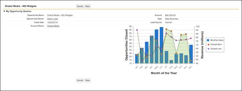
Here is the same Visualforce page with
the lightningStylesheets attribute set to
true.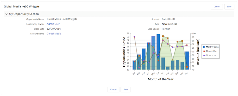
You can style most commonly used Visualforce components with the lightningStylesheets attribute. However, some components differ slightly in style from Lightning Experience. For example, <apex:selectOptions>, <apex:selectRadio>, <apex:inputFile>, and some <apex:inputField> elements use the browser’s default styling instead. Commonly used Visualforce components that don’t require styling, such as <apex:form>, <apex:outputText>, and <apex:param>, are still supported.
To include SLDS components that aren’t part of the Visualforce component library, you can use the <apex:slds /> tag with custom SLDS code in addition to the lightningStylesheets attribute. ThelightningStylesheets attribute doesn’t affect custom styling, so custom code and must be updated to match the page’s SLDS styling.
The following Visualforce components support the lightningStylesheets attribute or don’t require styling.
- analytics:reportChart
- apex:actionFunction
- apex:actionPoller
- apex:actionRegion
- apex:actionStatus
- apex:actionSupport
- apex:areaSeries
- apex:attribute
- apex:axis
- apex:barSeries
- apex:canvasApp
- apex:chart
- apex:chartLabel
- apex:chartTips
- apex:column
- apex:commandButton
- apex:commandLink
- apex:component
- apex:componentBody
- apex:composition
- apex:dataList
- apex:dataTable
- apex:define
- apex:detail
- apex:dynamicComponent
- apex:enhancedList
- apex:facet
- apex:flash
- apex:form
- apex:gaugeSeries
- apex:iframe
- apex:image
- apex:include
- apex:includeLightning
- apex:includeScript
- apex:inlineEditSupport
- apex:input
- apex:inputCheckbox
- apex:inputField
- apex:inputFile
- apex:inputHidden
- apex:inputSecret
- apex:inputText
- apex:inputTextArea
- apex:insert
- apex:legend
- apex:lineSeries
- apex:listViews
- apex:map
- apex:mapMarker
- apex:message
- apex:messages
- apex:outputField
- apex:outputLabel
- apex:outputLink
- apex:outputPanel
- apex:outputText
- apex:page
- apex:pageBlock
- apex:pageBlockButtons
- apex:pageBlockSection
- apex:pageBlockSectionItem
- apex:pageBlockTable
- apex:pageMessage
- apex:pageMessages
- apex:panelBar
- apex:panelBarItem
- apex:panelGrid
- apex:panelGroup
- apex:param
- apex:pieSeries
- apex:radarSeries
- apex:relatedList
- apex:remoteObjectField
- apex:remoteObjectModel
- apex:remoteObjects
- apex:repeat
- apex:scatterSeries
- apex:scontrol
- apex:sectionHeader
- apex:selectCheckboxes
- apex:selectList
- apex:selectOption
- apex:selectOptions
- apex:selectRadio
- apex:stylesheet
- apex:tab
- apex:tabPanel
- apex:toolbar
- apex:toolbarGroup
- apex:variable
- chatter:feed
- chatter:feedWithFollowers
- chatter:follow
- chatter:newsFeed
- flow:interview
- site:googleAnalyticsTracking
- site:previewAsAdmin
- topics:widget