Lightning Components Developer Guide
 j
jNewer Version Available
CSS in Components
Add CSS to a component bundle by clicking the STYLE button in the Developer Console sidebar.
For external CSS resources, see Styling Apps.
All top-level elements in a component have a special THIS CSS class added to them. This, effectively, adds namespacing to CSS and helps prevent one component's CSS from overriding another component's styling. The framework throws an error if a CSS file doesn't follow this convention.
Let's look at a sample helloHTML.cmp component. The CSS is in helloHTML.css.
Component source
1<aura:component>
2  <div class="white">
3    Hello, HTML!
4  </div>
5
6  <h2>Check out the style in this list.</h2>
7
8  <ul>
9    <li class="red">I'm red.</li>
10    <li class="blue">I'm blue.</li>
11    <li class="green">I'm green.</li>
12  </ul>
13</aura:component>
CSS source
1.THIS {
2    background-color: grey;
3}
4
5.THIS.white {
6    background-color: white;
7}
8
9.THIS .red {
10    background-color: red;
11}
12
13.THIS .blue {
14    background-color: blue;
15}
16
17.THIS .green {
18    background-color: green;
19}
Output
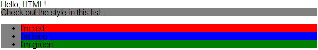
The top-level elements, h2 and ul, match the THIS class and render with a grey background. Top-level elements are tags wrapped by the HTML body tag and not by any other tags. In this example, the li tags are not top-level because they are nested in a ul tag.
The <div class="white"> element matches the .THIS.white selector and renders with a white background. Note that there is no space in the selector as this rule is for top-level elements.
The <li class="red"> element matches the .THIS .red selector and renders with a red background. Note that this is a descendant selector and it contains a space as the <li> element is not a top-level element.