Visualforce Developer Guide
 j
jNewer Version Available
Building a Complex Chart with Visualforce Charting
Use Visualforce charting to assemble a variety of chart components into a complex chart that represents multiple sets of related data. The end result can be quite sophisticated and attention getting.
The Chart Controller
The examples later in this topic use the following controller, which is a modest expansion of the controller in A Simple Charting Example. It includes more data, and methods that can be called by remote JavaScript invocation:
1public class ChartController {
2    // Return a list of data points for a chart
3    public List<Data> getData() {
4        return ChartController.getChartData();
5    }
6
7    // Make the chart data available via JavaScript remoting
8    @RemoteAction
9    public static List<Data> getRemoteData() {
10        return ChartController.getChartData();
11    }
12
13    // The actual chart data; needs to be static to be
14    // called by a @RemoteAction method
15    public static List<Data> getChartData() {
16        List<Data> data = new List<Data>();
17        data.add(new Data('Jan', 30, 90, 55));
18        data.add(new Data('Feb', 44, 15, 65));
19        data.add(new Data('Mar', 25, 32, 75));
20        data.add(new Data('Apr', 74, 28, 85));
21        data.add(new Data('May', 65, 51, 95));
22        data.add(new Data('Jun', 33, 45, 99));
23        data.add(new Data('Jul', 92, 82, 30));
24        data.add(new Data('Aug', 87, 73, 45));
25        data.add(new Data('Sep', 34, 65, 55));
26        data.add(new Data('Oct', 78, 66, 56));
27        data.add(new Data('Nov', 80, 67, 53));
28        data.add(new Data('Dec', 17, 70, 70));
29        return data;
30    }
31
32    // Wrapper class
33    public class Data {
34        public String name { get; set; }
35        public Integer data1 { get; set; }
36        public Integer data2 { get; set; }
37        public Integer data3 { get; set; }
38        public Data(String name, Integer data1, Integer data2, Integer data3) {
39            this.name = name;
40            this.data1 = data1;
41            this.data2 = data2;
42            this.data3 = data3;
43        }
44    }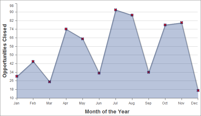
45}Creating a Simple Line Chart
Here is a simple line chart that graphs one of
the three data series in the data set, “Opportunities Closed-Won,”
over a calendar year:
1<apex:page controller="ChartController">
2    <apex:chart height="400" width="700" data="{!data}">
3    	  <apex:axis type="Numeric" position="left" fields="data1"
4            title="Opportunities Closed" grid="true"/>
5    	  <apex:axis type="Category" position="bottom" fields="name"
6            title="Month of the Year">
7    	</apex:axis>
8    	<apex:lineSeries axis="left" fill="true" xField="name" yField="data1"
9          markerType="cross" markerSize="4" markerFill="#FF0000"/>
10   </apex:chart>
11</apex:page>
Things to note about this example:
- Line and bar charts require you to define the X and Y axes for the chart.
- The vertical axis is defined on the left side of the chart, and measures the dollar amount of the Opportunities closed in that month.
- The horizontal axis is defined on the bottom of the chart, and represents the months of the calendar year.
- The actual line chart, the <apex:lineSeries> component, is bound to a specific axis.
- There are a number of marker attributes that you can use to differentiate each line in the chart.
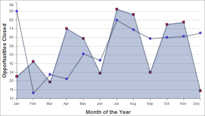
Adding a Second Data Series
Adding a second data series with the same unit of
measure is simple. Here, the “Opportunities Closed-Lost”
data set is added as a second line series:
1<apex:page controller="ChartController">
2    <apex:chart height="400" width="700" data="{!data}">
3    	  <apex:axis type="Numeric" position="left" fields="data1,data2"
4            title="Opportunities Closed" grid="true"/>
5    	  <apex:axis type="Category" position="bottom" fields="name"
6            title="Month of the Year">
7    	  </apex:axis>
8    	  <apex:lineSeries axis="left" fill="true" xField="name" yField="data1"
9        	  markerType="cross" markerSize="4" markerFill="#FF0000"/>
10    	  <apex:lineSeries axis="left" xField="name" yField="data2"
11            markerType="circle" markerSize="4" markerFill="#8E35EF"/>
12    </apex:chart>
13</apex:page>
The important thing to note is how both data1 and data2 fields are bound to the vertical <apex:axis> by the fields attribute of that component. This allows the charting engine to determine appropriate scale and tick marks for the axis.
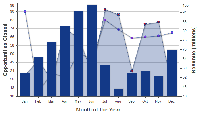
Adding a Bar Chart Series with a Second Axis
To add another data series, but
charted against a different set of units, you need to add a second
vertical axis. The following example shows a data series, “Revenue
by Month,” added as a bar chart:
1<apex:page controller="ChartController">
2    <apex:chart height="400" width="700" data="{!data}">
3    	  <apex:axis type="Numeric" position="left" fields="data1,data2"
4            title="Opportunities Closed" grid="true"/>
5        <apex:axis type="Numeric" position="right" fields="data3"
6            title="Revenue (millions)"/>
7    	  <apex:axis type="Category" position="bottom" fields="name"
8            title="Month of the Year"/>
9    	  <apex:lineSeries axis="left" fill="true" xField="name" yField="data1"
10        	  markerType="cross" markerSize="4" markerFill="#FF0000"/>
11    	  <apex:lineSeries axis="left" xField="name" yField="data2"
12            markerType="circle" markerSize="4" markerFill="#8E35EF"/>
13        <apex:barSeries orientation="vertical" axis="right"
14            xField="name" yField="data3"/>
15    </apex:chart>
16</apex:page>
Notice the following:
- To add a data series with a new unit of measure, you need to add a second vertical axis on the right side of the chart.
- You can have up to four different axes, one for each edge of the chart.
- The bar chart is set to a vertical orientation and bound to the right axis. Bind a horizontal bar chart to the top or bottom axis.
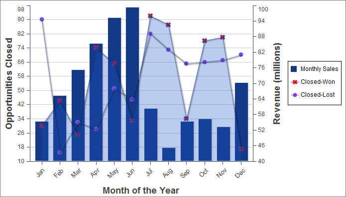
Adding a Legend, Labels, and Chart Tips
You can improve the comprehensibility of
the chart by adding a chart legend, series labels, and by making sure
that chart labels are readable:
1<apex:page controller="ChartController">
2    <apex:chart height="400" width="700" data="{!data}">
3        <apex:legend position="right"/>
4        <apex:axis type="Numeric" position="left" fields="data1"
5            title="Opportunities Closed" grid="true"/>
6        <apex:axis type="Numeric" position="right" fields="data3"
7            title="Revenue (millions)"/>
8        <apex:axis type="Category" position="bottom" fields="name"
9            title="Month of the Year">
10            <apex:chartLabel rotate="315"/>
11        </apex:axis>
12        <apex:barSeries title="Monthly Sales" orientation="vertical" axis="right"
13            xField="name" yField="data3">
14            <apex:chartTips height="20" width="120"/>
15        </apex:barSeries>
16        <apex:lineSeries title="Closed-Won" axis="left" xField="name" yField="data1"
17            fill="true" markerType="cross" markerSize="4" markerFill="#FF0000"/>
18        <apex:lineSeries title="Closed-Lost" axis="left" xField="name" yField="data2"
19            markerType="circle" markerSize="4" markerFill="#8E35EF"/>
20    </apex:chart>
21</apex:page>
Note the following about the additions:
- The order of the data series components determines the layering of the chart elements when drawn. In the prior example, the bar chart was in the foreground. In this example, the bar chart has been placed in the background because the <apex:barSeries> component is before the two <apex:lineSeries> components.
- The <apex:legend> component can be in any of four positions: left, right, top, or bottom. The legend is placed within the boundary of the chart; in this example the legend has compressed the horizontal width of the chart itself.
- Add legend titles using the data series component title attribute.
- To rotate the labels for the bottom chart axis, the <apex:chartLabel> component is enclosed in the <apex:axis> component it affects.
- The <apex:chartTips> component enables rollover tool tips that provide additional information about each data point in the series that encloses it.