Bar charts are one of several linear data series charts available in Visualforce.
Linear series charts are charts plotted against a standard rectangular grid.
Each data element in a linear series is described by an X,Y
coordinate. The data series defines how to draw the coordinate on the grid. The <apex:barSeries> charts draw bars stretching
between an origin axis and the X,Y coordinates. The orientation attribute determines whether the origin
axis is the left axis (Y) or the bottom axis (X). Set <apex:barSeries orientation="horizontal"> for bars that originate on
the left side of the chart, and <apex:barSeries
orientation="vertical"> for a column chart with bars that rise from the
bottom of the chart.
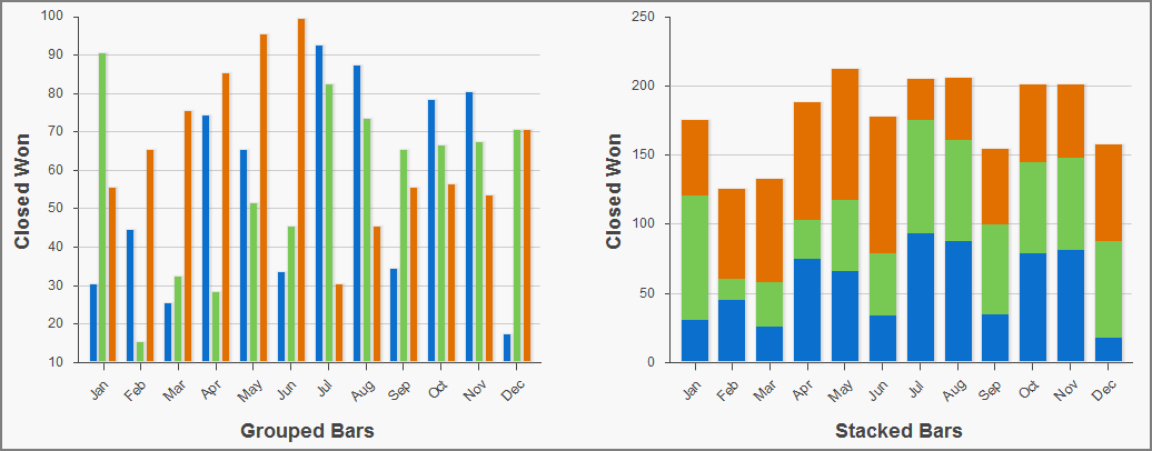
To plot multiple data points for each bar interval, group or stack the bars within a
single
<apex:barSeries> tag. Multiple
<apex:barSeries> tags in a single chart draw on
top of each other, obscuring all but the last data series. To create a vertical column
chart, add all fields to be grouped or stacked to the
yField
attribute:
By
default, data fields in an
<apex:barSeries>
are grouped on a chart. To stack them on top of each other, set
stacked="true".
Use the gutter attribute to adjust spacing
between grouped bars. Use the groupGutter
attribute to adjust spacing between groups. Use the xPadding and yPadding attributes
to adjust the spacing between the chart axes and the bars themselves.
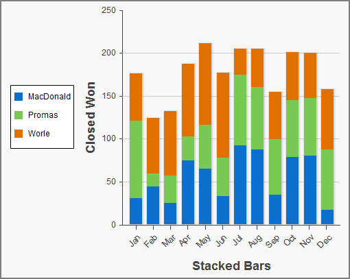
By default, legend titles for stacked or grouped bar charts use the names of fields in
the
yField attribute. In the previous example,
the default titles are “data1”, “data2”, and
“data3”. To give the legend more meaningful titles, use the
title attribute of the
<apex:barSeries> component. Use commas to
separate items. For example,
title="MacDonald,Promas,Worle":
 j
j