Visualforce Developer Guide
 j
jNewer Version Available
Other Linear Series Charts
Other linear data series charts include <apex:areaSeries>, <apex:lineSeries>, and <apex:scatterSeries>.
You can combine linear data series charts on the same graph, but
to create meaningful charts, keep the following in mind:
- Data series charts draw on top of each other in the order you define them in Visualforce markup.
- Define <apex:barSeries> charts first because they usually need to be in the background because they can’t be transparent.
The <apex:areaSeries> components are similar to stacked bar charts, except that the chart
is drawn as shaded areas defined by a line connecting the points of
the series instead of as individual bars. To combine <apex:areaSeries> with other data
series, use the opacity attribute
to make the area chart partially transparent. The opacity attribute is a floating point number between 0.0 and 1.0, with 0.0
being fully transparent and 1.0 being fully opaque. Here’s
an area series combined with a bar series:
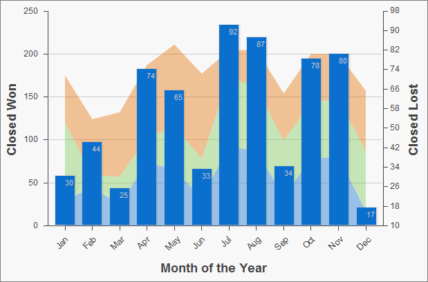
1<apex:chart height="400" width="700" animate="true" data="{!data}">
2    <apex:legend position="left"/>
3    <apex:axis type="Numeric" position="left" title="Closed Won" grid="true"
4        fields="data1,data2,data3">
5        <apex:chartLabel />
6    </apex:axis>
7    <apex:axis type="Numeric" position="right" fields="data1"
8        title="Closed Lost" />
9    <apex:axis type="Category" position="bottom" fields="name"
10        title="Month of the Year">
11        <apex:chartLabel rotate="315"/>
12    </apex:axis>
13    <apex:areaSeries axis="left" tips="true" opacity="0.4"
14        xField="name" yField="data1,data2,data3"/>
15    <apex:barSeries orientation="vertical" axis="right"
16        xField="name" yField="data1">
17        <apex:chartLabel display="insideEnd" field="data1" color="#333"/>
18    </apex:barSeries>
19</apex:chart>
By default, legend titles for area charts use the names of fields
in the yField attribute. In
the previous example, the default titles are “data1”,
“data2”, and “data3”. To give the legend
more meaningful titles, use the title attribute of the <apex:areaSeries> component. Use commas to separate items. For example, title="MacDonald,Promas,Worle":
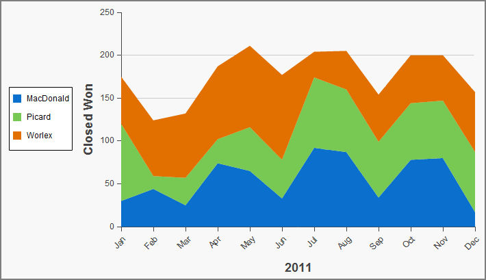
1<apex:chart height="400" width="700" animate="true" data="{!data}">
2    <apex:legend position="left"/>
3    <apex:axis type="Numeric" position="left" fields="data1,data2,data3"
4        title="Closed Won" grid="true">
5        <apex:chartLabel />
6    </apex:axis>
7    <apex:axis type="Category" position="bottom" fields="name" title="2011">
8        <apex:chartLabel rotate="315"/>
9    </apex:axis>
10    <apex:areaSeries axis="left" xField="name" tips="true"
11        yField="data1,data2,data3" title="MacDonald,Picard,Worlex"  />
12</apex:chart>
Like <apex:areaSeries> charts, <apex:lineSeries> charts use lines to connect a series of points. You can fill the
area under the line. Unlike <apex:areaSeries> charts, <apex:lineSeries>charts don’t stack. When <apex:lineSeries>charts aren’t filled, you might choose to put several series
in the same chart. Line series can display markers for the data points
and you can define the color and size of both the markers and the
connecting lines. Here’s a chart that combines three line series,
one of which is filled:
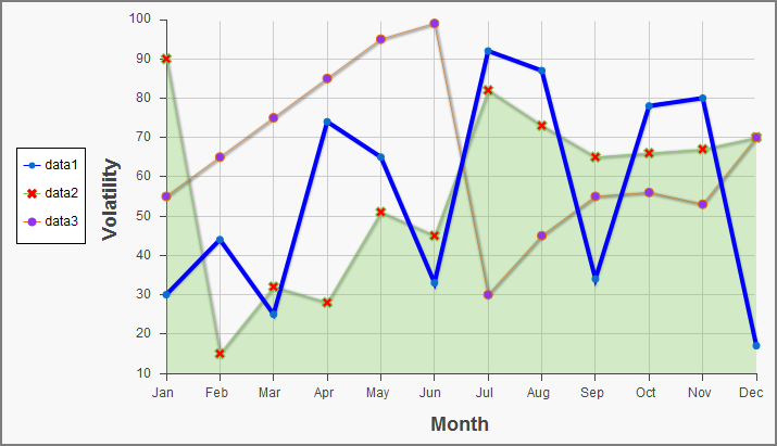
1<apex:chart height="400" width="700" animate="true" legend="true" data="{!data}">
2    <apex:legend position="left"/>
3    <apex:axis type="Numeric" position="left" title="Volatility" grid="true"
4        fields="data1,data2,data3">
5        <apex:chartLabel />
6    </apex:axis>
7    <apex:axis type="Category" position="bottom" title="Month" grid="true"
8        fields="name">
9        <apex:chartLabel />
10    </apex:axis>
11    <apex:lineSeries axis="left" xField="name" yField="data1"
12        strokeColor="#0000FF" strokeWidth="4"/>
13    <apex:lineSeries axis="left" fill="true" xField="name" yField="data2"
14        markerType="cross" markerSize="4" markerFill="#FF0000"/>
15    <apex:lineSeries axis="left" xField="name" yField="data3"
16        markerType="circle" markerSize="4" markerFill="#8E35EF">
17        <apex:chartTips height="20" width="120"/>
18    </apex:lineSeries>
19</apex:chart>The <apex:scatterSeries> charts are like <apex:lineSeries> charts without the connecting lines. By varying the marker size, type, and color, it’s easy to plot many scatter series on the same chart.