Visualforce Developer Guide
 j
jNewer Version Available
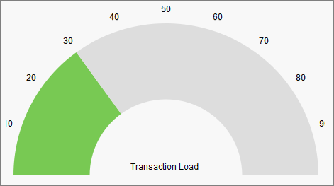
Gauge Charts
Gauge charts show a single measurement against a defined
axis or scale. Although it charts a single number, you can vary the
axis and chart colors to communicate what that number means.
Use the minimum and maximum attributes of the <apex:axis> tag to define the range
of values. Use the colorSet attribute of the <apex:gaugeSeries> tag to indicate whether the current value is good or bad. Here’s
a chart that indicates the metric is well within an acceptable range: