Mobile and Offline Developer Guide
 j
jNewer Version Available
Use Mobile Validation with Salesforce Lightning Design System
SLDS defines a wide range of tokens that standardize user interface style descriptors and units. For example, you can use SLDS tokens to specify text style attributes such as font, font size, and font color. Tokens make it easy to ensure that your design is consistent, and simplify updates as your design evolves.
SLDS provides its own validator extension for Visual Studio Code. The SLDS validator scans your Lightning web component code looking for expressions that stray from SLDS guidelines. If it finds issues, the validator suggests an appropriate SLDS token or provides other advice for improving the underlined expression.
For mobile readiness, the validator performs additional checks that address mobile accessibility. Accessibility on mobile devices demands stricter guidelines than on desktop browsers, for the benefit of all users. On smaller phone screens, for example, fonts that fall below certain size thresholds can be difficult to read even for customers with excellent eyesight. Word wrapping also becomes more important on limited screen sizes that don’t support horizontal scrolling. SLDS validator warnings keep you informed when your settings appear to degrade a component’s mobile effectiveness.
SLDS Guidelines for Mobile Accessibility
Warning messages for mobile readiness are based on the following SLDS guidelines.
- Font size
- To improve mobile readability, use an SLDS token from the following value range. If
you must use another unit type, choose a value from one of the equivalent px, pt, em,
rem, or % ranges:
For specific use case recommendations, see Follow Accessible Mobile Design Guidelines.
Unit Recommended value range SLDS token (recommended) $font-size-4 or larger. See “Font Size” in Lightning Design System. px 14 px or larger pt 10.5 pt or larger em, rem 0.875 or larger % 87.5 or larger - Word wrapping in labels
- To avoid truncation at runtime, always use word wrapping in labels. Avoid using the ellipsis.
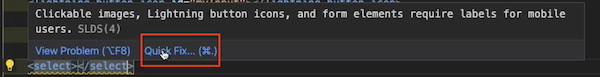
- Clickable images, Button icons, form elements
- To clarify UI behavior, always provide labels for visual elements that support user interaction.
Install the SLDS Validator
SLDS mobile validation requires version 1.4.7 or later of the SLDS Validator for Visual Studio Code.
Enable or Disable the SLDS Validator
You can globally enable or disable the SLDS validator. In VS Code Preferences, go to .
Use SLDS Warnings to Validate Your Code
While you’re coding, the SLDS validator places markers on components that don’t conform to mobile guidelines. For example, if an element of your component uses a text size smaller than $font-size-4, the validator highlights the unsuitable font size with yellow underlining.
To read details about the warning, hover your mouse over the highlighted code.
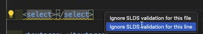
Suppress Selected Mobile Readiness Warnings
Sometimes, you have a good reason to ignore a warning—for example, you’re at a stage of development where you’re focusing only on the “big picture”. In such cases, you can suppress SLDS warnings using the Quick Fix menu.
In HTML or CSS files:
-
Hover over an element that’s underlined in yellow. In the warning window, click Quick Fix.
-
From the Quick Fix submenu, choose to suppress either the warning for the current line only, or all SLDS warnings for the current file.
To remind itself—and you—of suppressed mobile readiness warnings, the SLDS validator inserts code comments. If you’d like to pre-empt these warnings manually in HTML files, you can insert the comments yourself as follows:
-
Any content that is between the following pair of lines is exempt from SLDS validation:
1<!-- sldsValidatorIgnore -->
2...
3<!-- sldsValidatorAllow -->
-
The following line exempts the immediate next line from SLDS validation:
1<!-- sldsValidatorIgnoreNextLine -->
-
If the line <!-- sldsValidatorAllow --> doesn’t exist elsewhere in the HTML file, the following line at the top of the file exempts the file’s entire content from SLDS validation:
1<!-- sldsValidatorIgnore -->