


Visualforce Developer Guide
 j
jNewer Version Available
Chart Colors
To provide a set of color definitions to draw data series elements (bars, pie wedges, and so on), use the colorSet attribute. Set <apex:chart colorSet="..."> to specify the colors to be used for every data series in a chart. Set colorSet on a data series component to specify colors for that series only.
A colorSet is a string that is a comma-delimited list of HTML-style hexadecimal color definitions. For example, colorSet="#0A224E,#BF381A,#A0D8F1,#E9AF32,#E07628". Colors are used in sequence. When the end of the list is reached, the sequence starts over at the beginning.
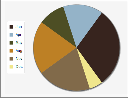
You can use a colorSet with all data series components except <apex:radarSeries>. Additional colorSet details and further options for configuring colors of other chart elements are described for specific data series components.