Mobile and Offline Developer Guide
 j
jNewer Version Available
Create Responsive Layouts
The first step in creating a responsive layout is to implement a fluid grid. The SLDS grid utility provides a mobile-first layout system with granular column control. To implement the grid system in a Lightning web component, use the lightning-layout and lightning-layout-item base components. When implementing fluid grids, the layout starts to break down at specific breakpoints. To resolve this layout issue, media queries determine how the layout should look at each breakpoint. These responsive breakpoints are built into lightning-layout-item, enabling you to define how each column adjusts to the screen size.
Let’s start with a one-column grid. Despite being simple visually, in this example there are three separate levels of containment. The lightning-card base component defines a container with rounded corners around the content. The lightning-layout base component creates a wrapper around the content using the slds-grid class. The lightning-layout-item component creates columns using the slds-col class.
1<!-- Page header here -->
2<!-- Start page content -->
3<lightning-card>
4    <lightning-layout>
5        <lightning-layout-item padding="around-small">
6            <p>Main Content Goes Here</p>
7        </lightning-layout-item>
8   </lightning-layout>
9</lightning-card>
10<!-- End page content -->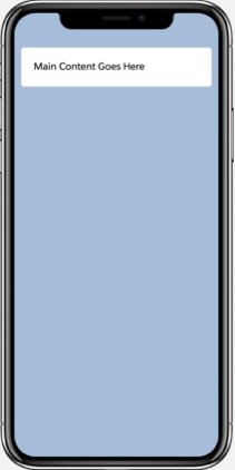
To increase the number of columns, add another lightning-layout-item with some content.
1<lightning-card>
2   <lightning-layout>
3      <lightning-layout-item padding="around-small">
4        <p>Main Content Goes Here</p>
5      </lightning-layout-item>
6      <lightning-layout-item padding="around-small">
7          <p>Sidebar Content Goes Here</p>
8      </lightning-layout-item>
9  </lightning-layout>
10</lightning-card>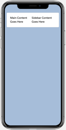
Let’s make some adjustments so that the content is more readable on mobile. To make each column full width, add size="12". The 12-column grid is the most frequently used SLDS grid. On this grid, the size attribute for lightning-layout-item accepts a value from 1 to 12.
The multiple-rows attribute on lightning-layout adds a slds-wrap class to the container, which wraps your column to a new row.
1<lightning-card>
2   <lightning-layout multiple-rows>
3    <lightning-layout-item size="12" padding="around-small">
4      <p>Main Content Goes here</p>
5     </lightning-layout-item>
6     <lightning-layout-item size="12" padding="around-small">
7       <p>Sidebar Content Goes Here</p>
8    </lightning-layout-item>
9  </lightning-layout>
10</lightning-card>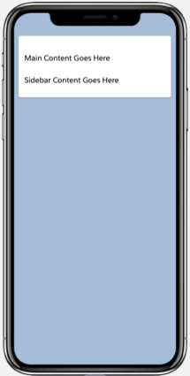
When we view the page on a tablet or desktop, the sidebar column should align horizontally with the main content column. Specify the width of the main content such that it takes up 75% of the container width using small-device-size="9". See lightning-layout-item.
Using just markup, you can provide size details for both desktop/tablet and phone/small mobile. It’s ratio-based and enables the device to effectively pick the right layout based on its own screen size.
1<lightning-card>
2  <lightning-layout multiple-rows>
3     <lightning-layout-item size="12"
4          small-device-size="9"
5          padding="around-small">
6          <p>Main Content Goes Here</p>
7      </lightning-layout-item>
8      <lightning-layout-item size="12"
9          small-device-size="3"
10          padding="around-small">
11          <p>Sidebar Content Goes Here</p>
12      </lightning-layout-item>
13  </lightning-layout>
14</lightning-card>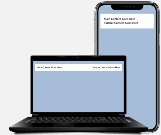
Use Your Component on a Lightning Page
We walked through creating a Lightning web component with a responsive layout. What if you want to make your component available in Lightning Experience or the Salesforce mobile app? You can surface your Lightning web component via a Lightning page or custom tab.
Lightning pages in your org support desktop and mobile form factors by default. Therefore, it’s important that your components follow a responsive design so they work seamlessly across devices.
We recommend that you use the Lightning App Builder to build Lightning pages. In Lightning App Builder, you can select a template with the layout you want and drag your custom components onto the page. The template you choose controls how the page displays on a device. The structure of a Lightning page adapts for the device it’s viewed on. See Lightning Pages in Salesforce Help.
If you don’t find a template you want, create a custom template using an Aura component. See Create a Custom Lightning Page Template Component. Creating a custom template using a Lightning web component isn’t supported.