Experience Cloud Developer Guide
 j
jConfigure Drag-and-Drop Aura Components for Experience Builder
1. Add an Interface to Your Component
To appear as a drag-and-drop component in Experience Builder, a component must implement the forceCommunity:availableForAllPageTypes interface.
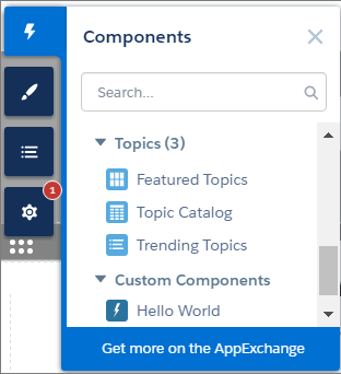
After you create the Aura component, it appears in the Components panel of all Aura sites in your org.
Here’s the sample code for a simple “Hello World” component. A component must be named componentName.cmp.
1<aura:component implements="forceCommunity:availableForAllPageTypes" access="global">
2    <aura:attribute name="greeting" type="String" default="Hello" access="global" />
3    <aura:attribute name="subject" type="String" default="World" access="global" />
4
5    <div>{!v.greeting}, {!v.subject}!</div>
6</aura:component>2. Add a Design Resource to Your Component Bundle
A design resource controls which component attributes are exposed in Experience Builder. The design resource lives in the same folder as your .cmp resource, and describes the design-time behavior of the Aura component—information that visual tools need to display the component in a page or app.
For example, to set a default value for an attribute, or make a Aura component attribute available for administrators to edit in Experience Builder, your component bundle needs a design resource.
1<design:component label="Hello World">
2    <design:attribute name="greeting" label="Greeting" />
3    <design:attribute name="subject" label="Subject" description="Name of the person you want to greet" />
4</design:component>
Optional. Add an SVG Resource to Your Component Bundle
To define a custom icon for your component, add an SVG resource to the component bundle. The icon appears next to the component in the Experience Builder Components panel.
If you don’t include an SVG resource, the system uses a default icon ( ).
).
Here’s a simple red circle SVG resource to go with the “Hello World” component. An SVG resource must be named componentName.svg.
1<?xml version="1.0"?>
2<!DOCTYPE svg PUBLIC "-//W3C//DTD SVG 1.1//EN"
3  "http://www.w3.org/Graphics/SVG/1.1/DTD/svg11.dtd">
4
5<svg xmlns="http://www.w3.org/2000/svg"
6     width="400" height="400">
7  <circle cx="100" cy="100" r="50" stroke="black"
8    stroke-width="5" fill="red" />
9</svg>
Optional. Add a CSS Resource to Your Component Bundle
To style your custom component, add a CSS resource to the component bundle.
Here’s the CSS for a simple class to go with the “Hello World” component. A CSS resource must be named componentName.css.
1.THIS .greeting {
2    color: #ffe4e1;
3    font-size: 20px;
4}1<aura:component implements="forceCommunity:availableForAllPageTypes" access="global">
2 <aura:attribute name="greeting" type="String" default="Hello" access="global" />
3 <aura:attribute name="subject" type="String" default="World" access="global" />
4
5 <div class="greeting">{!v.greeting}, {!v.subject}!</div>
6</aura:component>